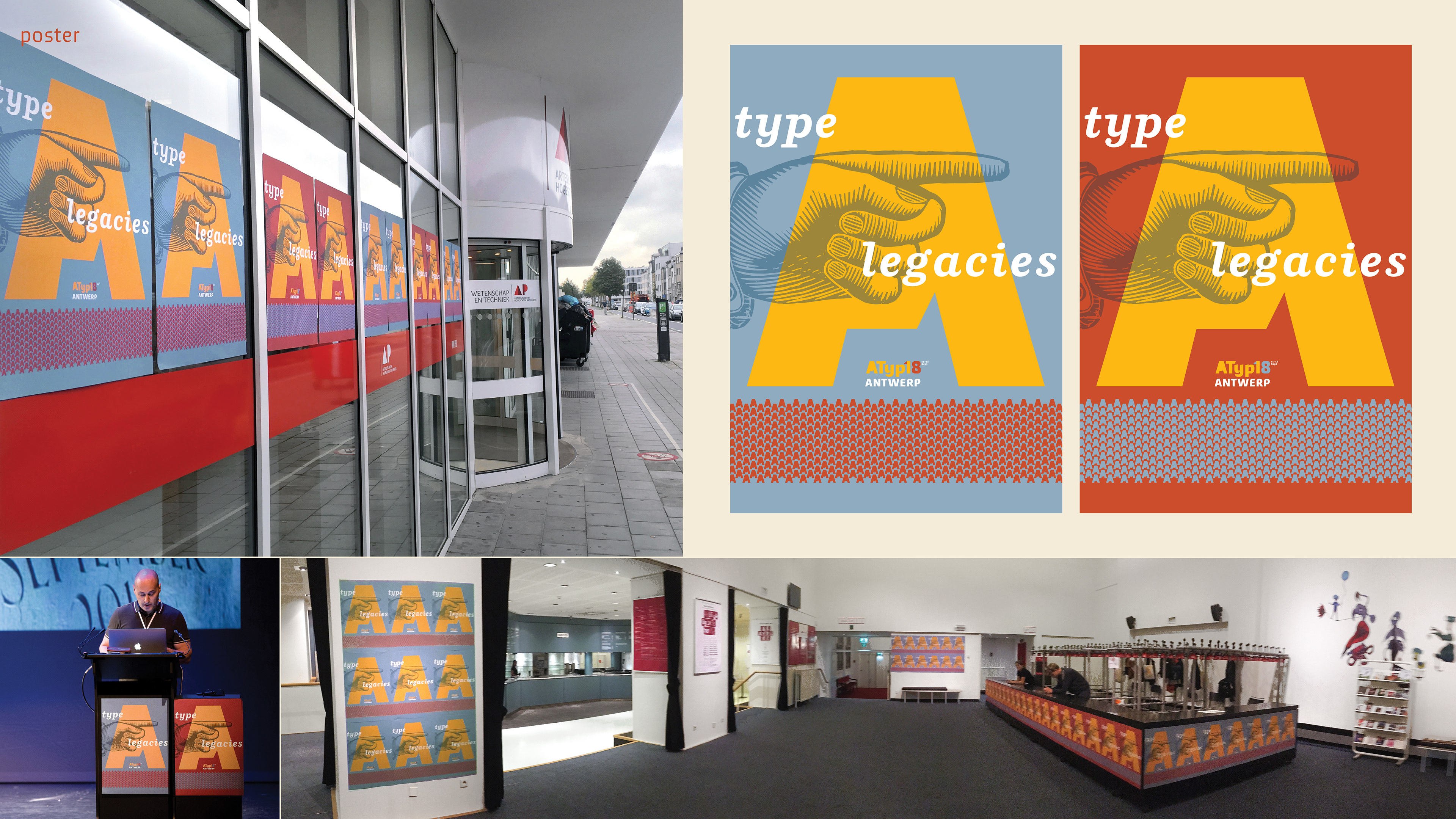
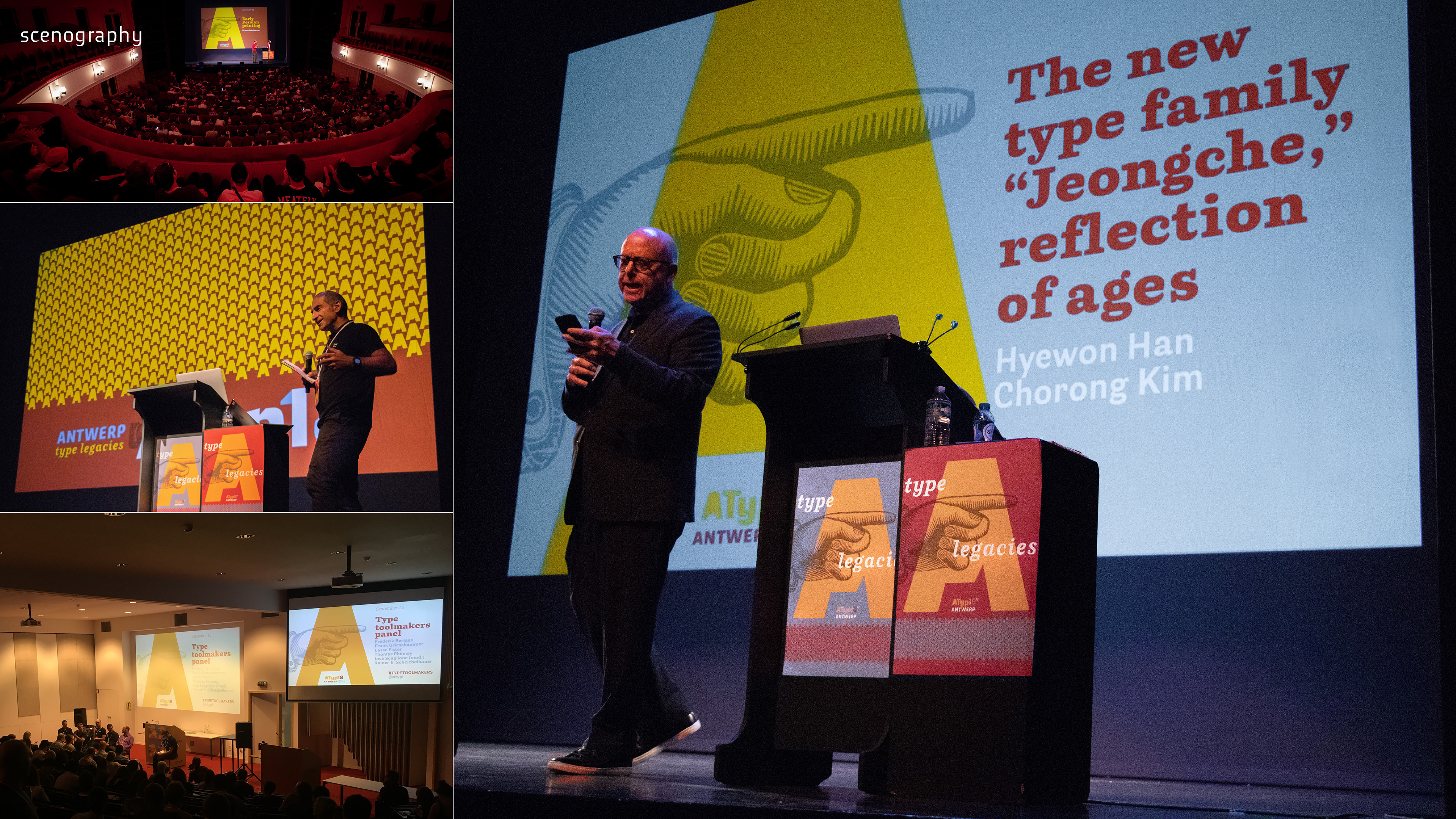
Identity system for the 2018 annual conference of Association Typographique Internationale (ATypI), held in Antwerp, Belgium. The theme of this edition was 'type legacies', referring to the historical importance of Antwerp for the international typographic scenario.
Objectives
The demand to create a great diversity of collateral for a highly specialized audience in typography forged the premise to create an identity that had typographic excellence and referencing to Antwerp and the theme of the event. The biggest challenge was to develop the graphic pieces from abroad, without being familiarized with the venue and local print suppliers.
Approach
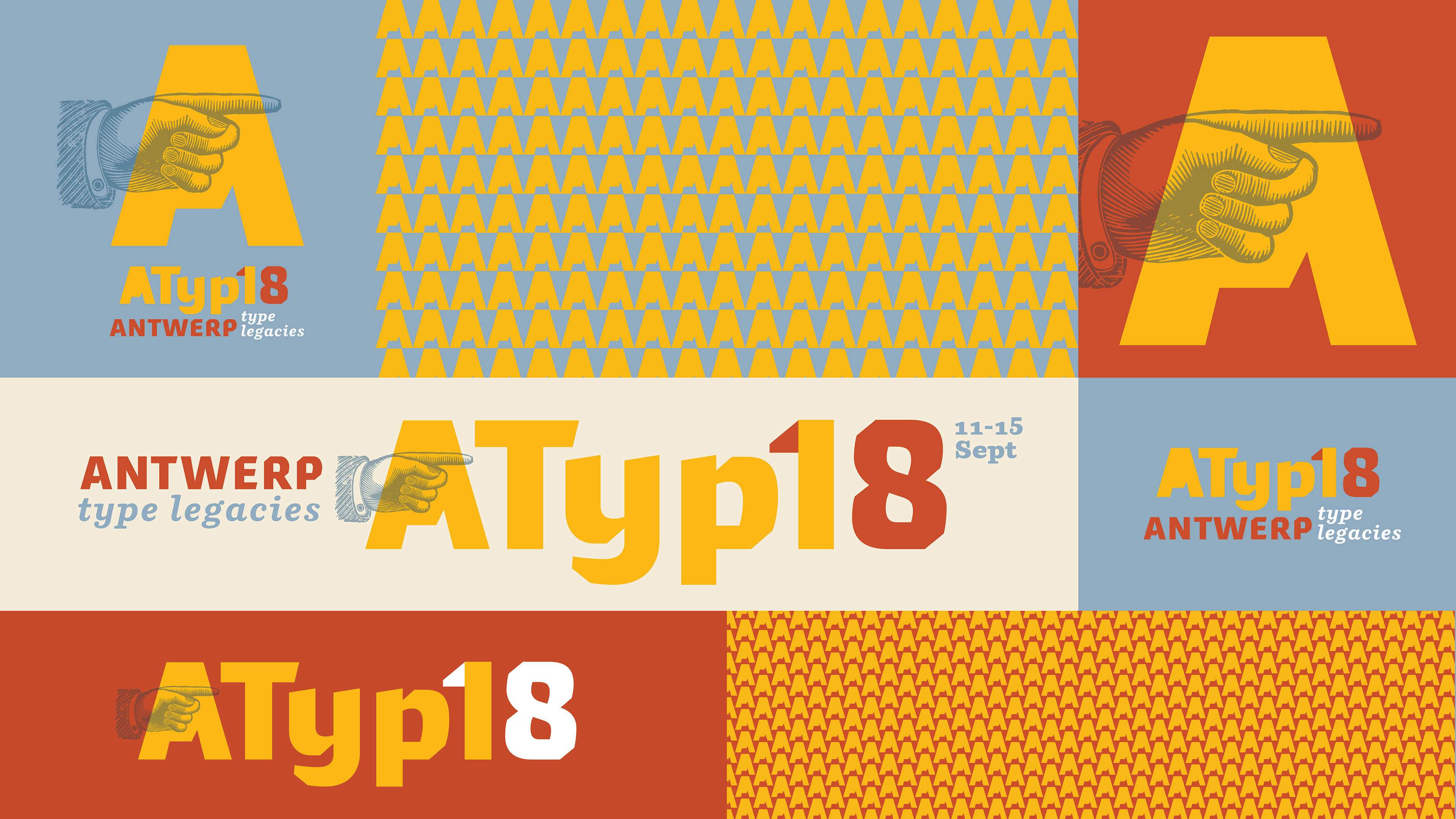
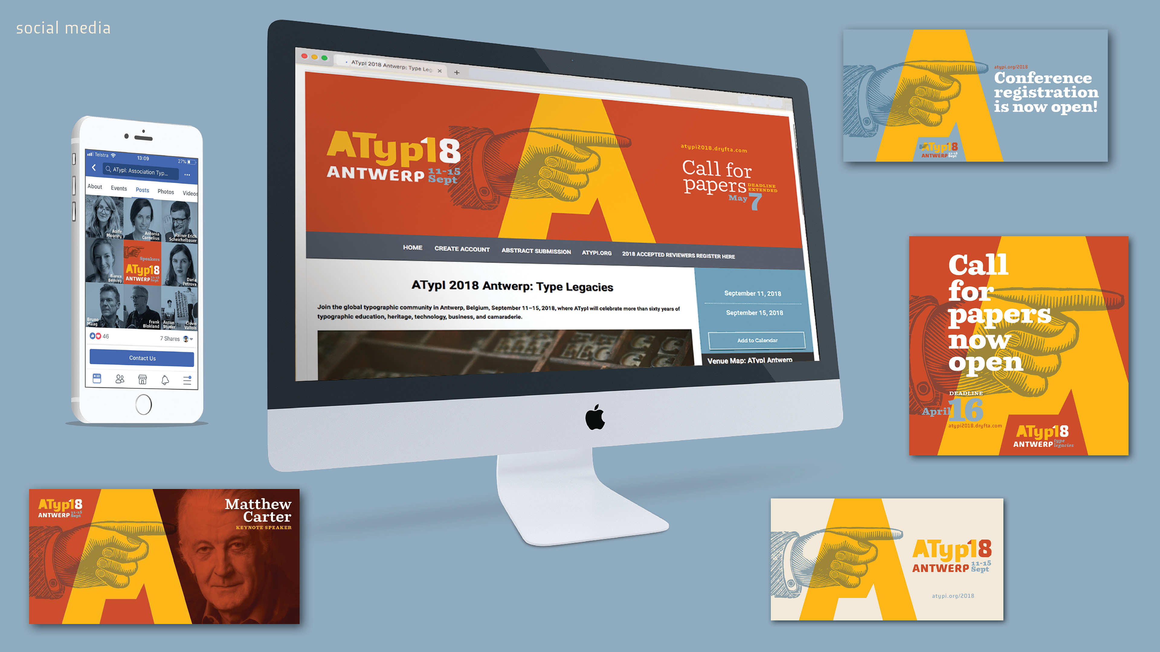
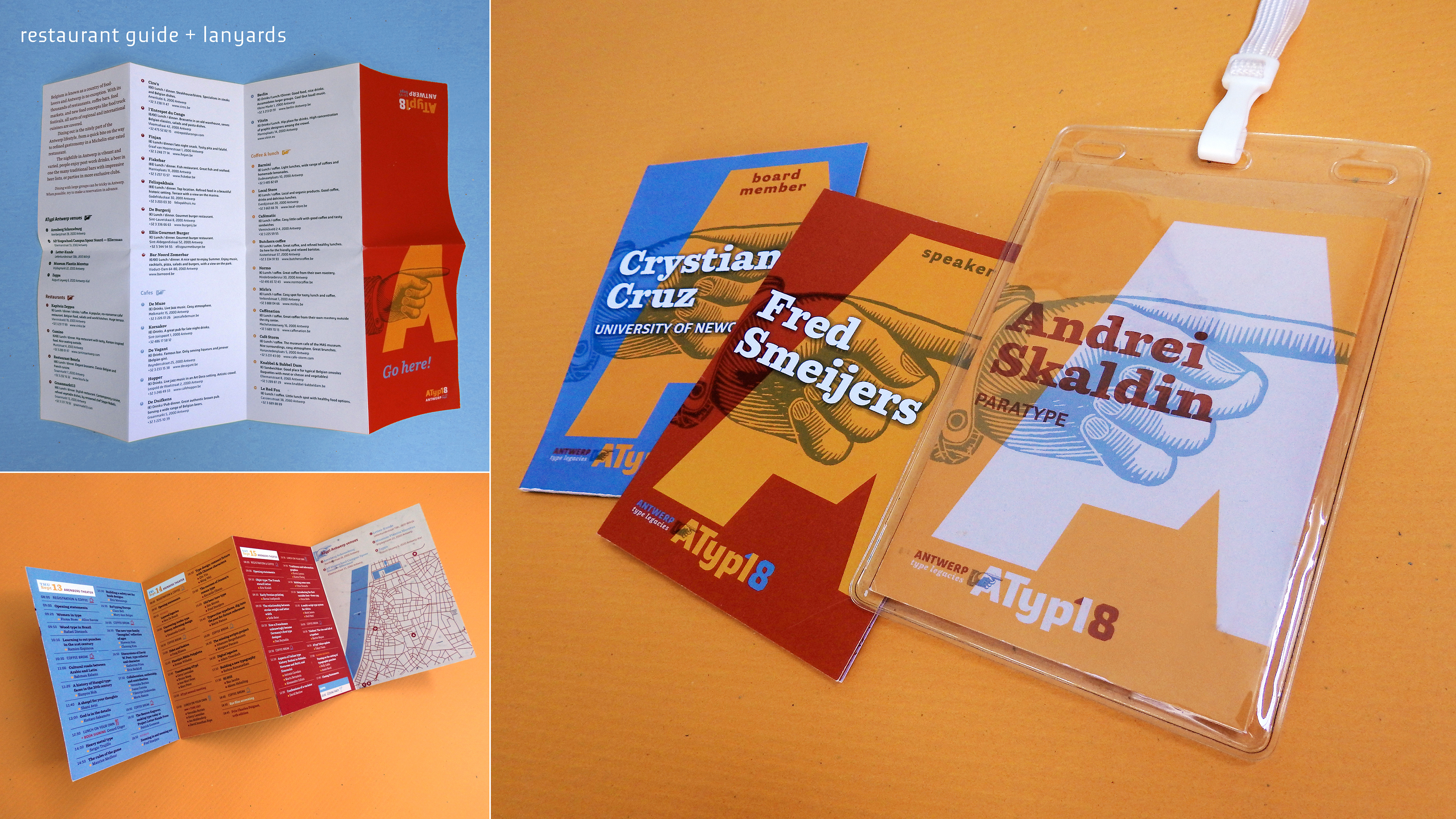
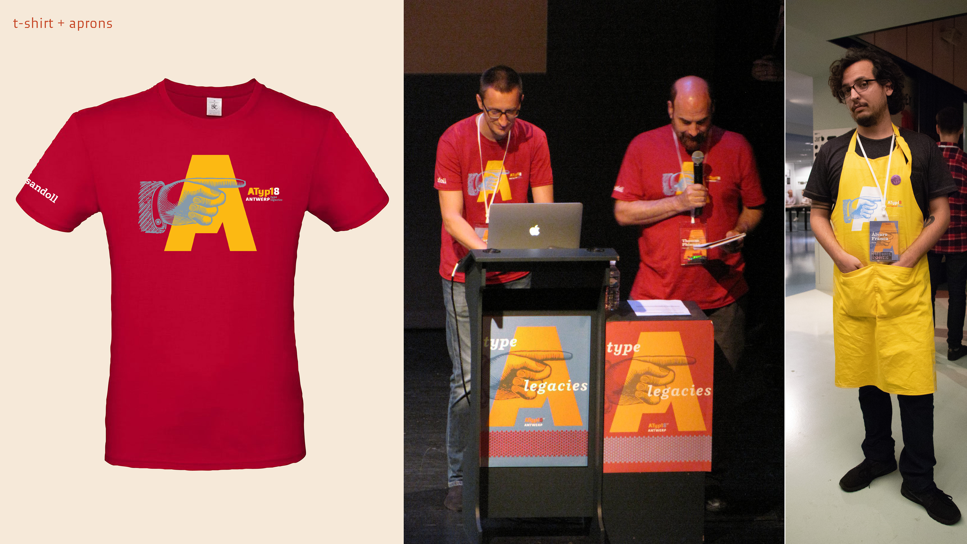
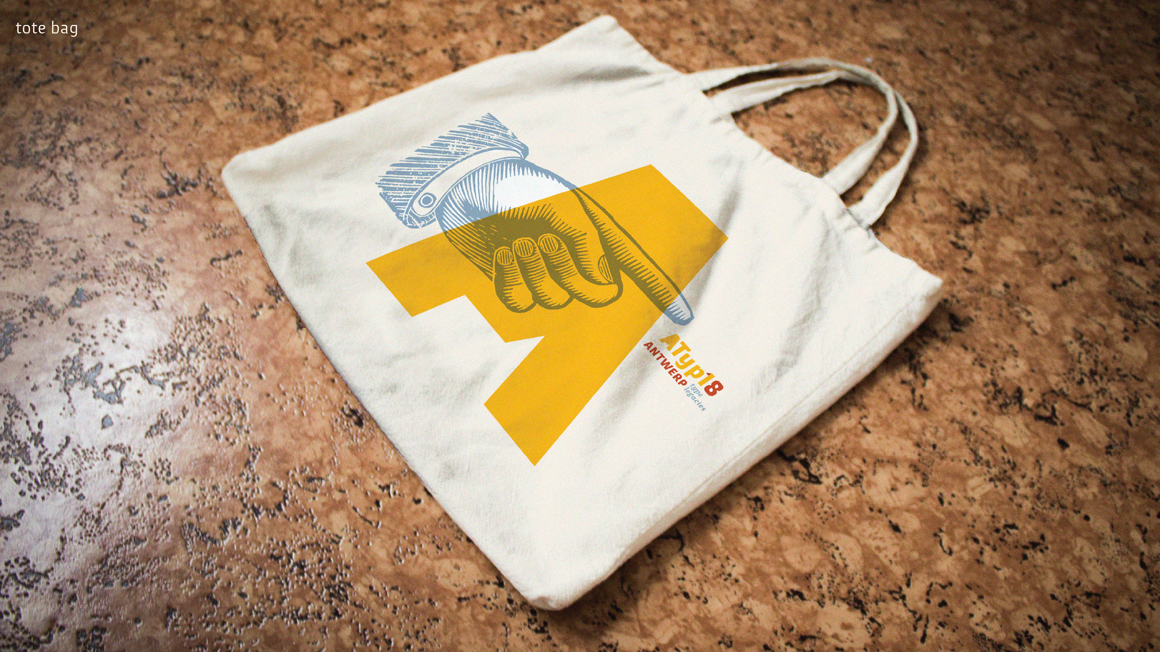
According to folklore, the city acquired its name from the legend of the giant who lived near the Scheldt River and took a toll from passing boatmen. Those who refused had their hands amputated and thrown into the river. Eventually, the hero Antigoon cut off the giant's hands and flung it into the river. Hence the name Antwerpen from the Dutch 'hand' (hand) and 'werpen' (to throw). For this reason, one of the most symbolic clichés of the printing press — the manicule — was chosen for the identity. Antwerp is also known for the diamond market, and this was represented through the cut edges of Meran typography (from the local type foundry Ourtype). Due to the lack of knowledge of the venue, the posters were created as patterns, so they could be used as signage when stacked side by side.
————————
Concept: Crystian Cruz, Laura Meseguer & Yves Peters.
Visual identity / Art Direction: Crystian Cruz & Laura Meseguer.
Design assistance: Joke Gossé & Carolina Laudon.
Print production: Ann Besseman & Yves Peters.