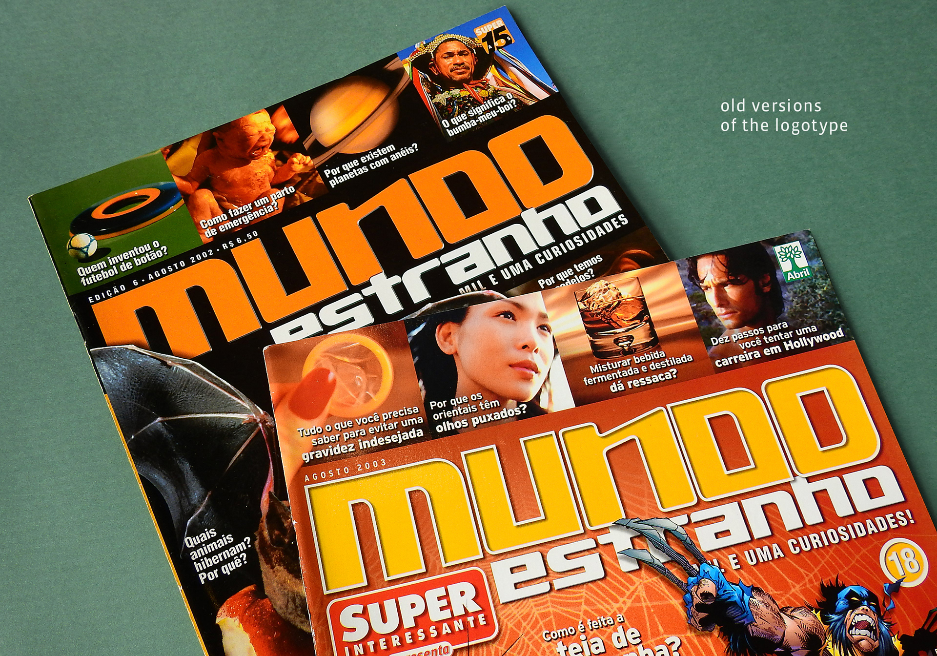
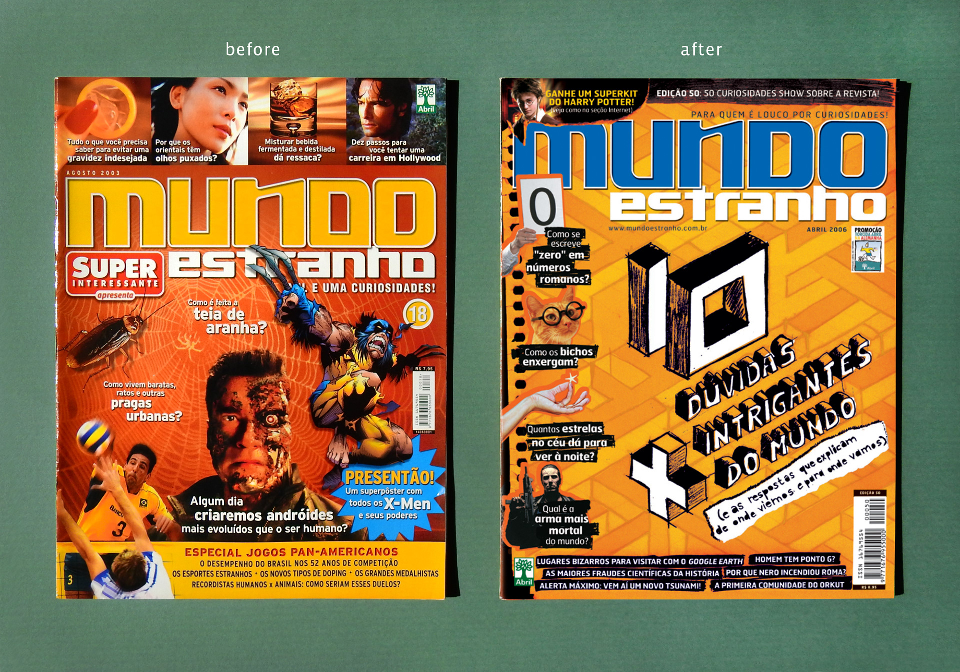
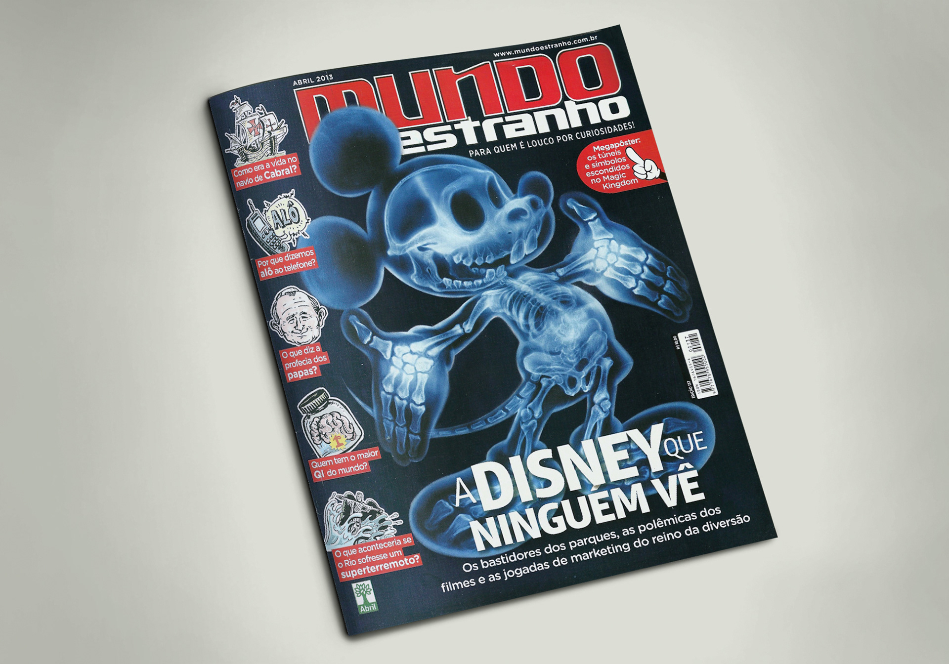
Mundo Estranho is a magazine about curiosities, edited by Abril Publishers. In 2005, the art director Ale Kalko was redesigning the publication and felt the need to update the logo. The previous version was created with a retail font, and that is the reason why sometimes we need to edit some letterforms in order to get a better composition. The logo usually is partially covered by images, so it was noted that it had to be a little more legible.
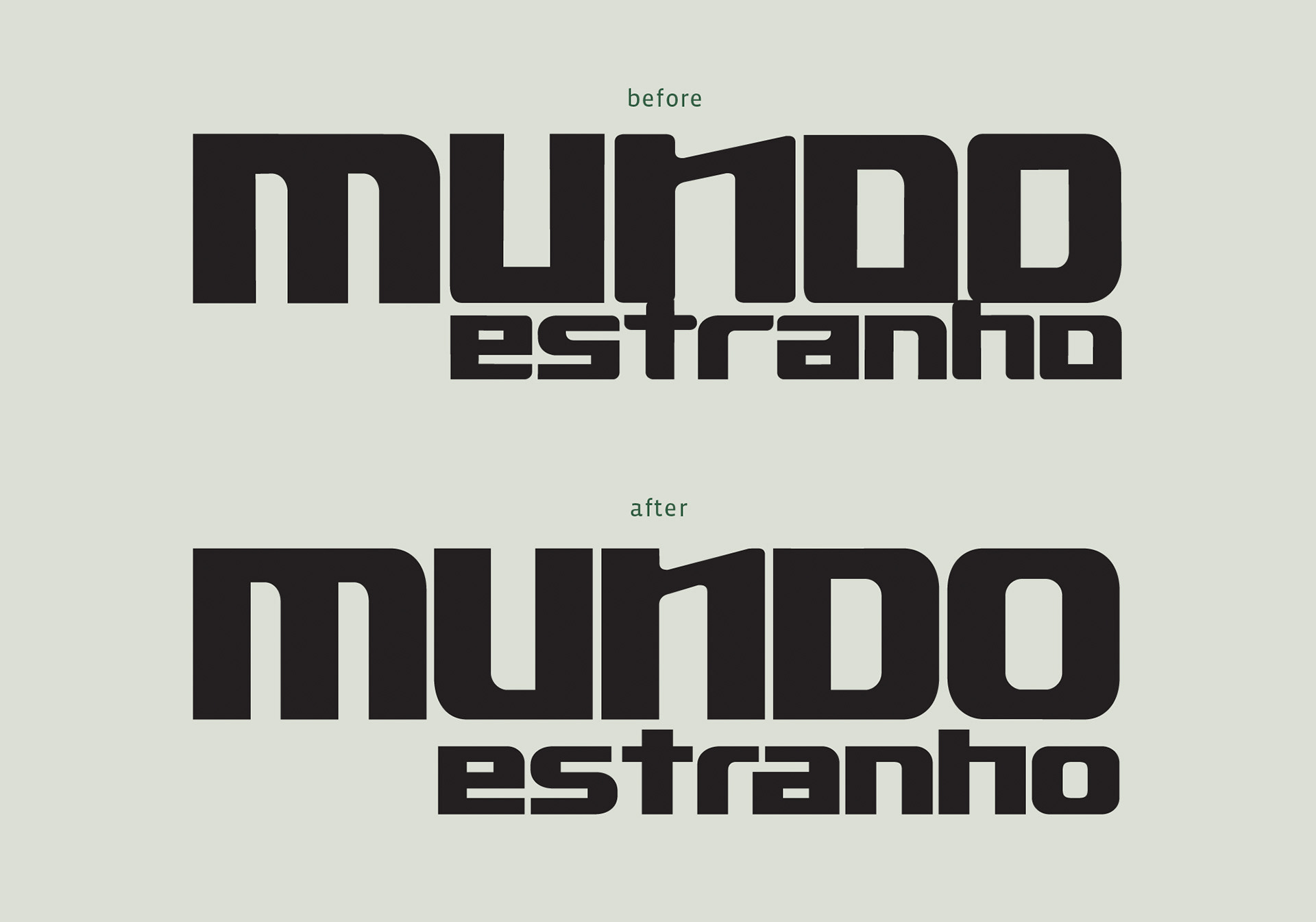
At the word MUNDO, I've corrected some curves, such as the lower left corner of letter U, and also removed the round corners at the letter N, in order to make it compatible to the strokes at letter M. But the main tweak was the lower left corner of letter O, once the old shape was to similar to the letter D. At the word ESTRANHO, I have softened a few corners and created a ligature "ra", reducing the white space between these letters. I have also completely changed the letter o, following the same alteration made on the uppercase O.
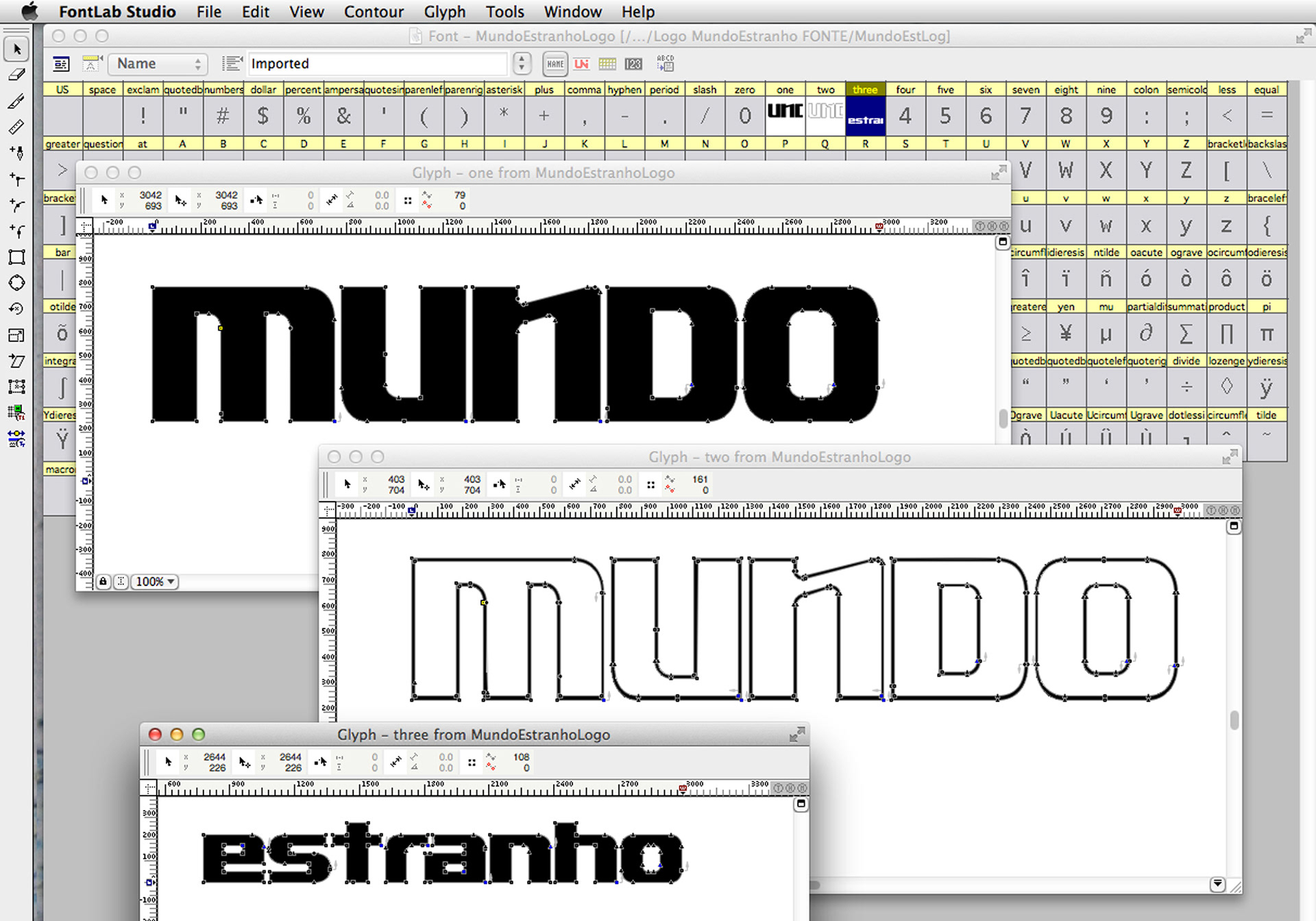
I have also delivered the logo as a font, with each word and outline in a separate glyph. Thus it would become easy to edit the colours while creating the cover.