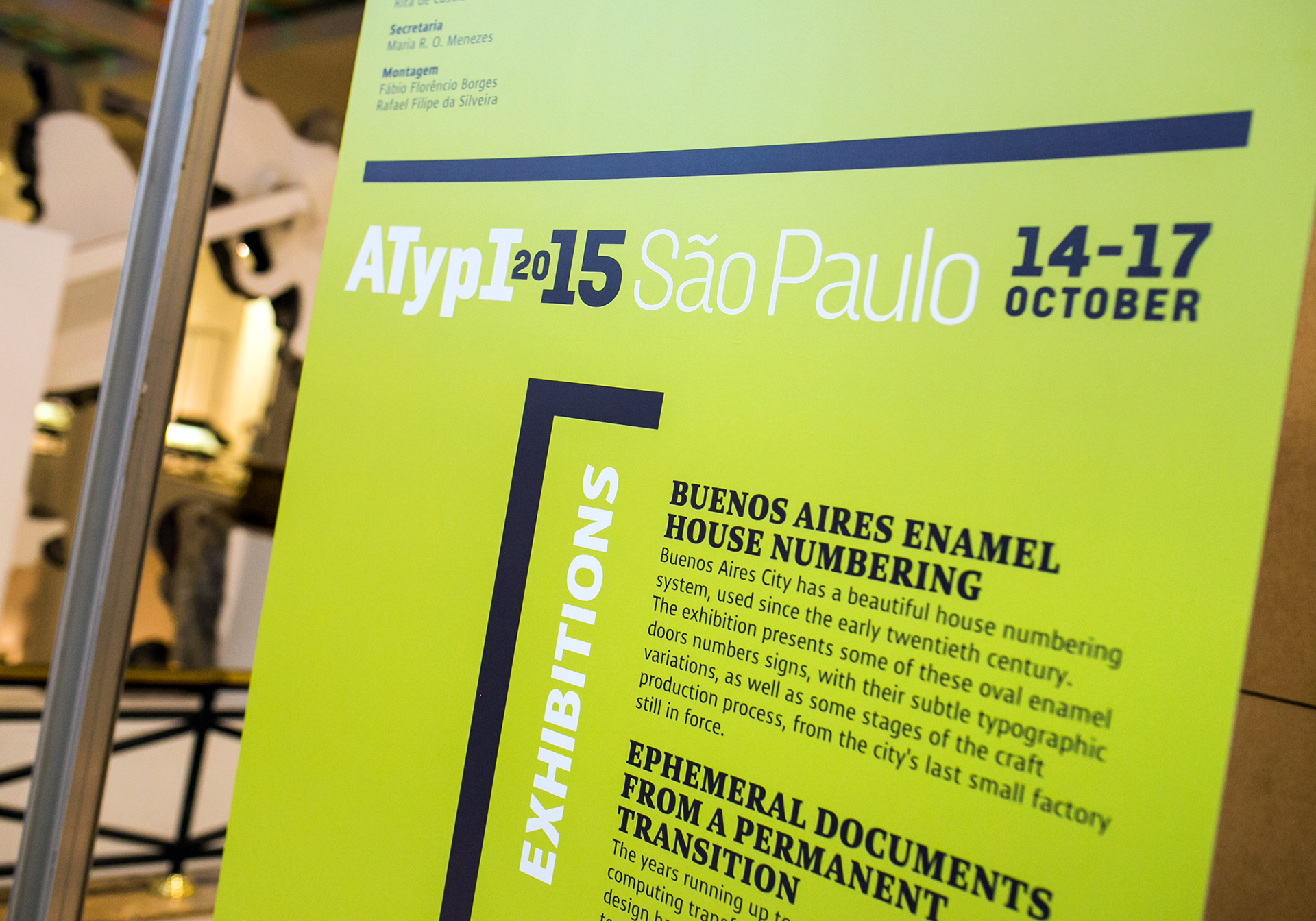
In 2015, Association Typographique Internationale (ATypI) held its annual conference in São Paulo, and I was invited to the take part of the organizing committee, with the task of being responsible for the visuals.
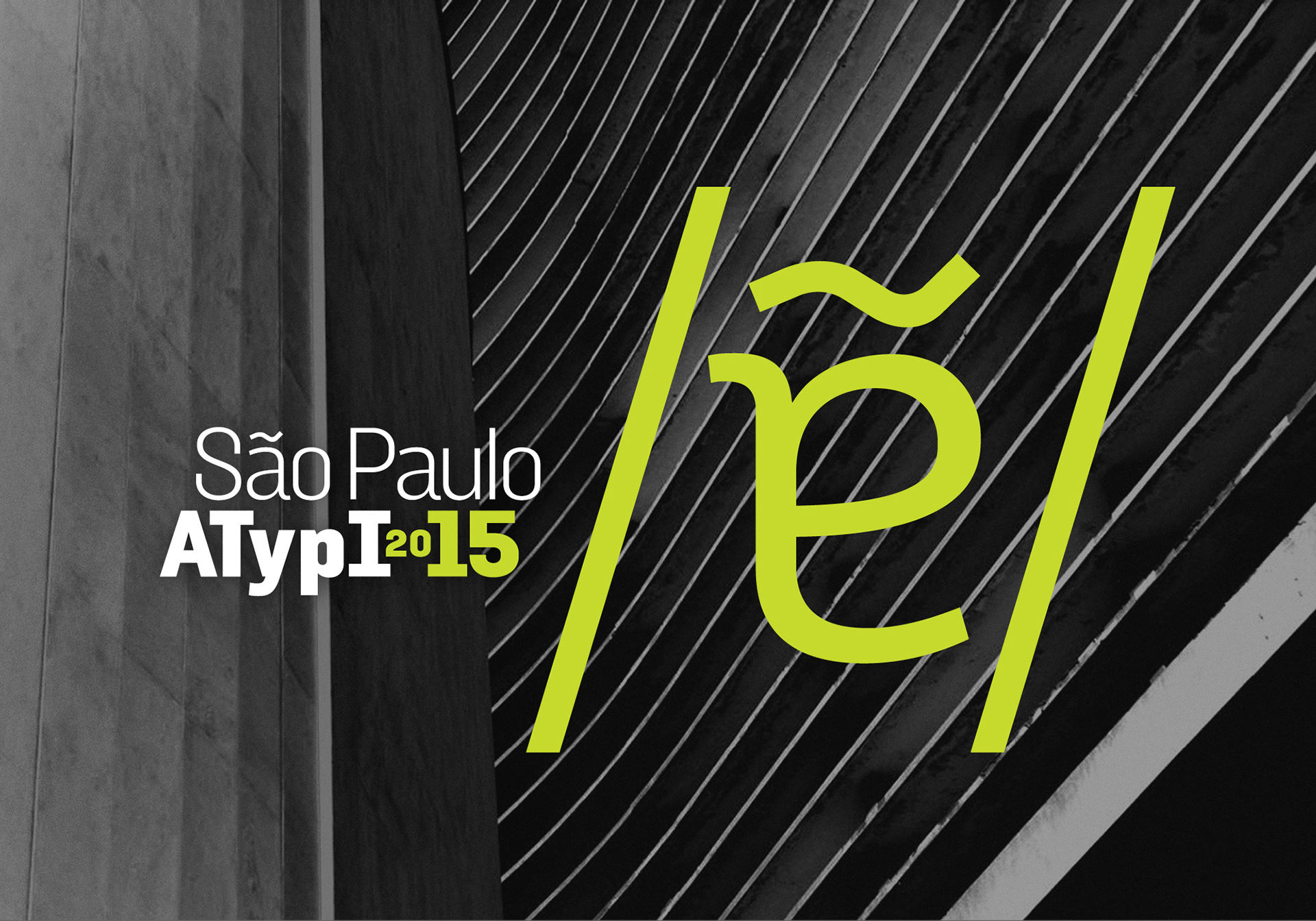
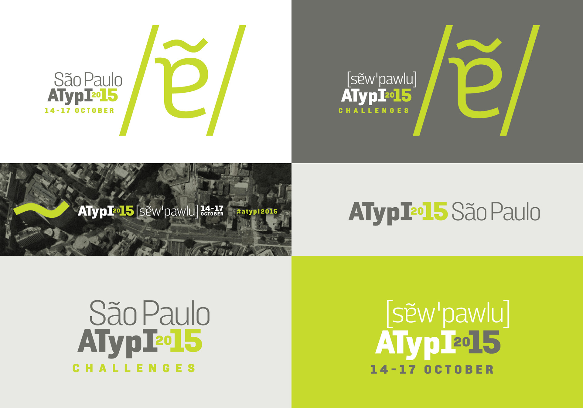
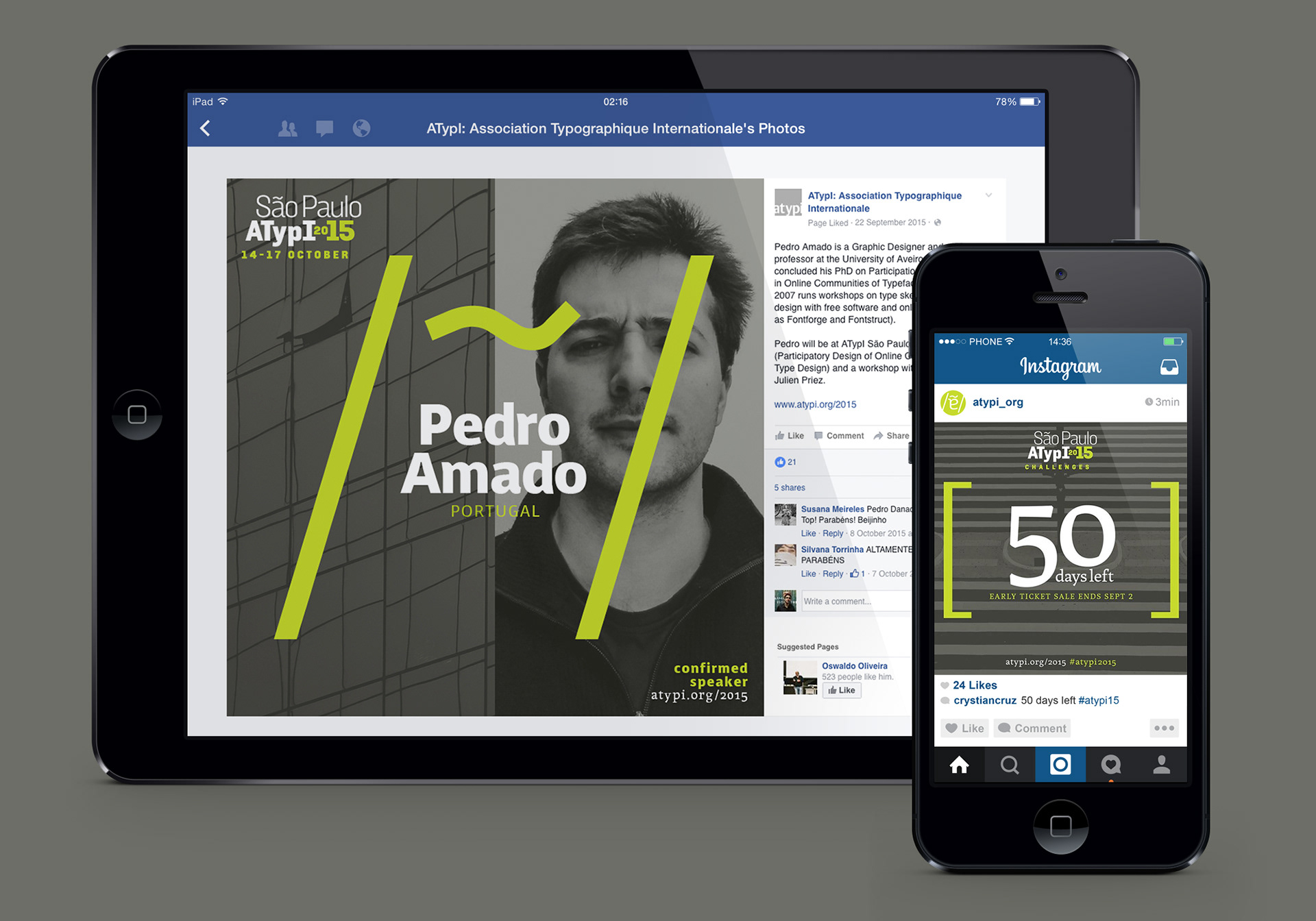
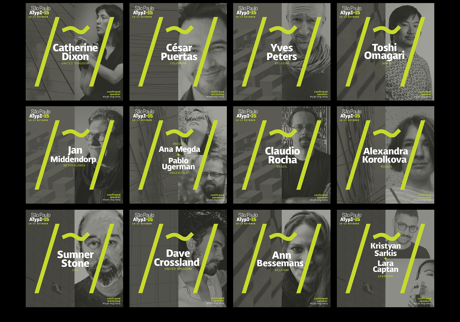
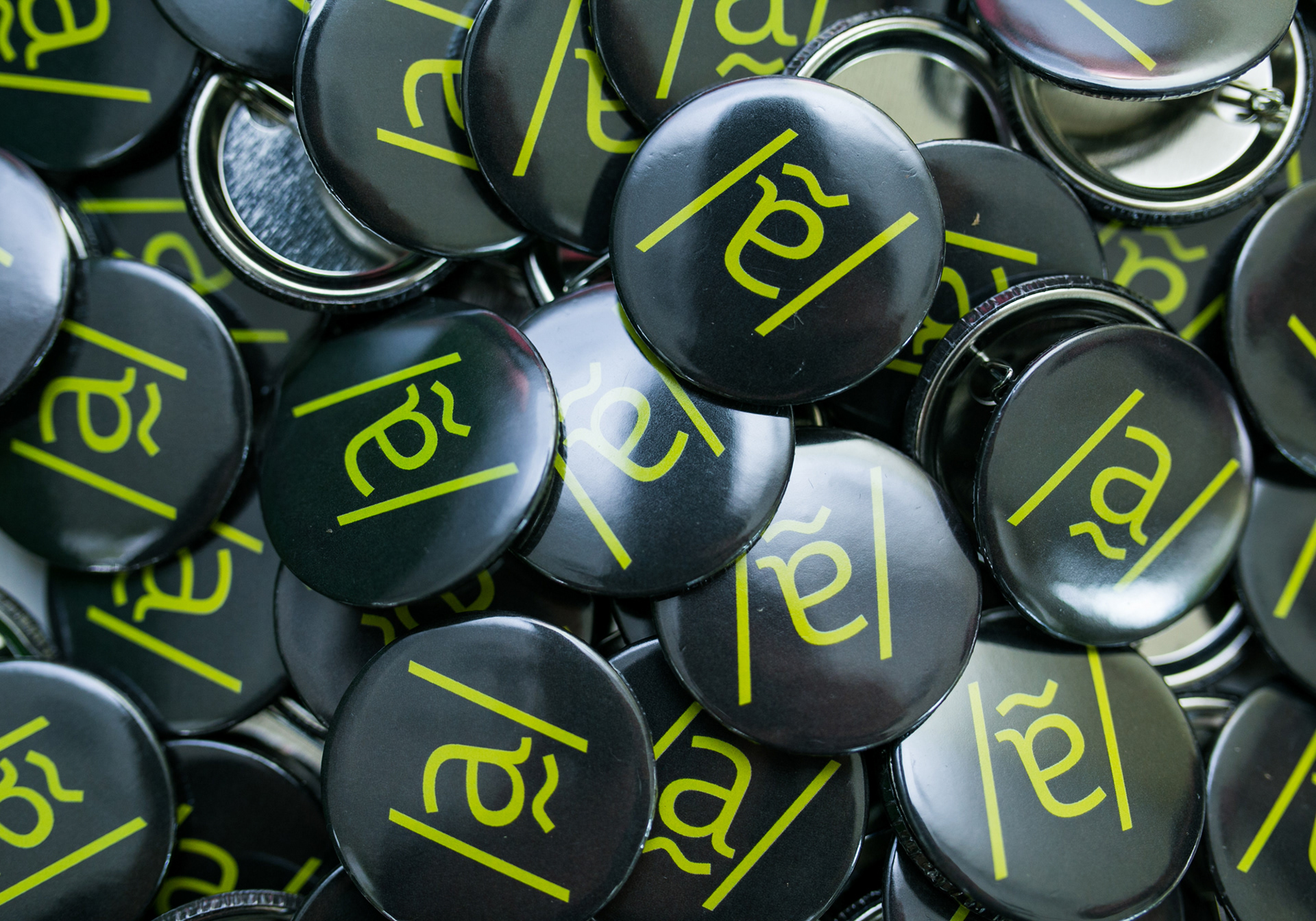
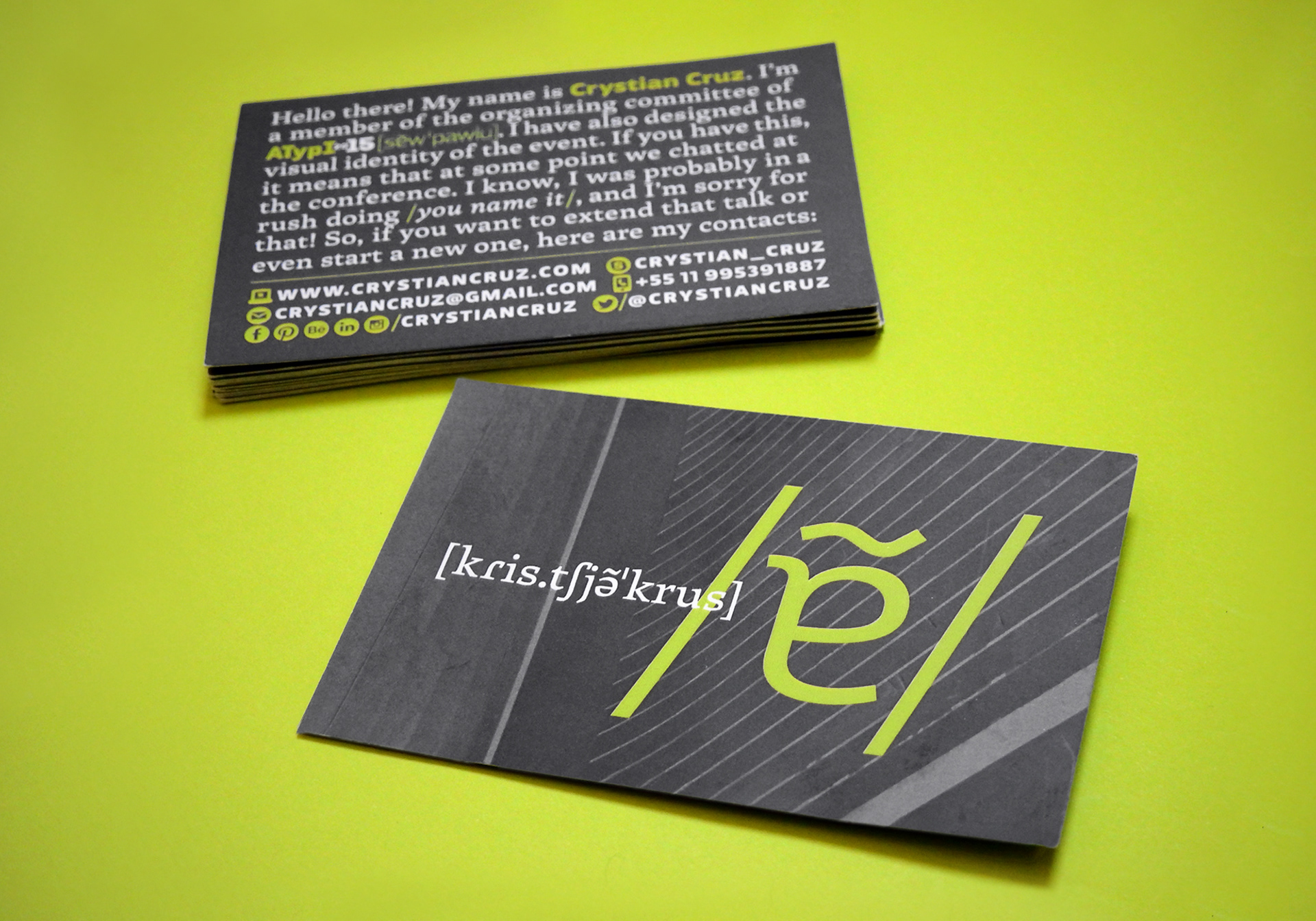
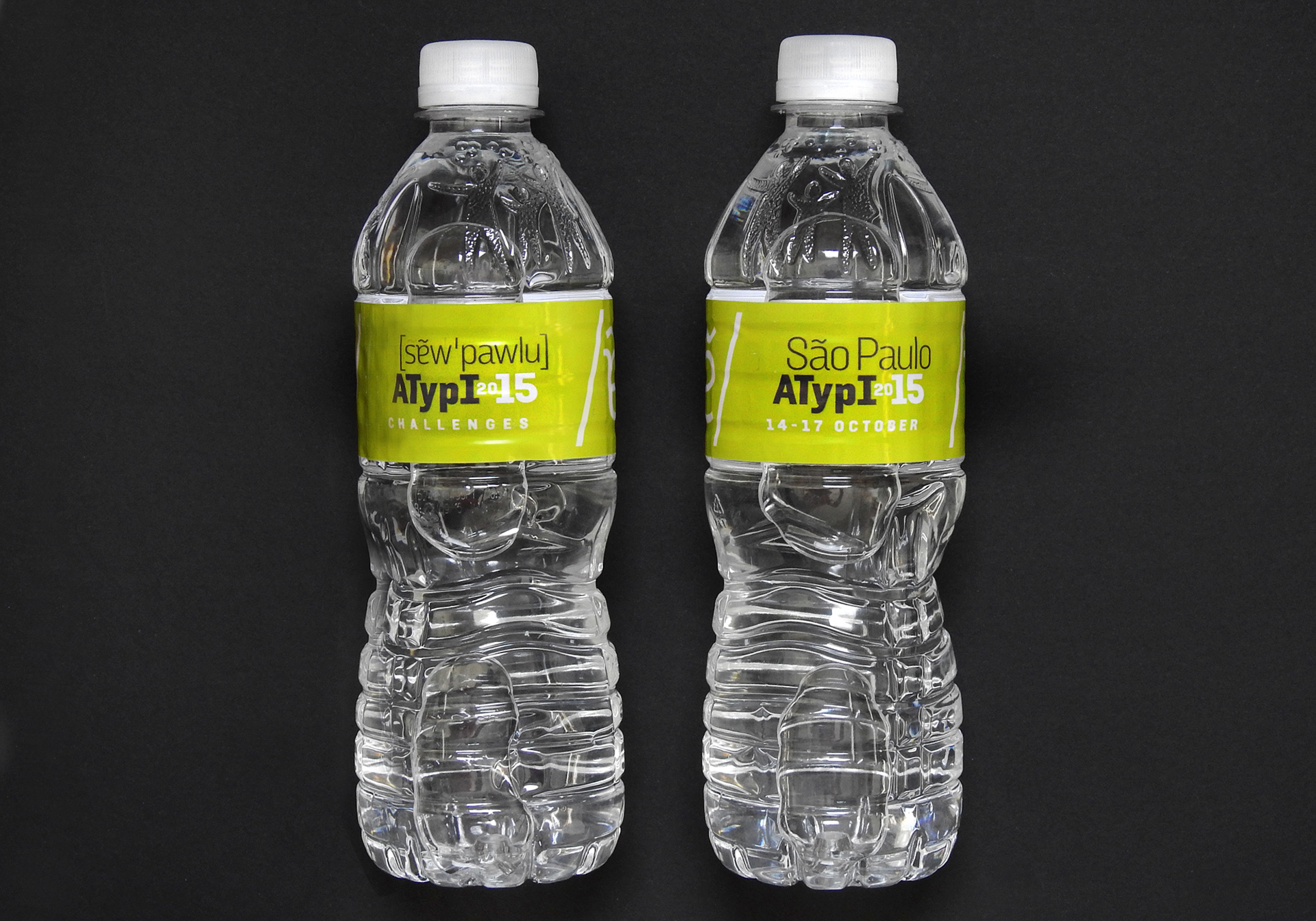
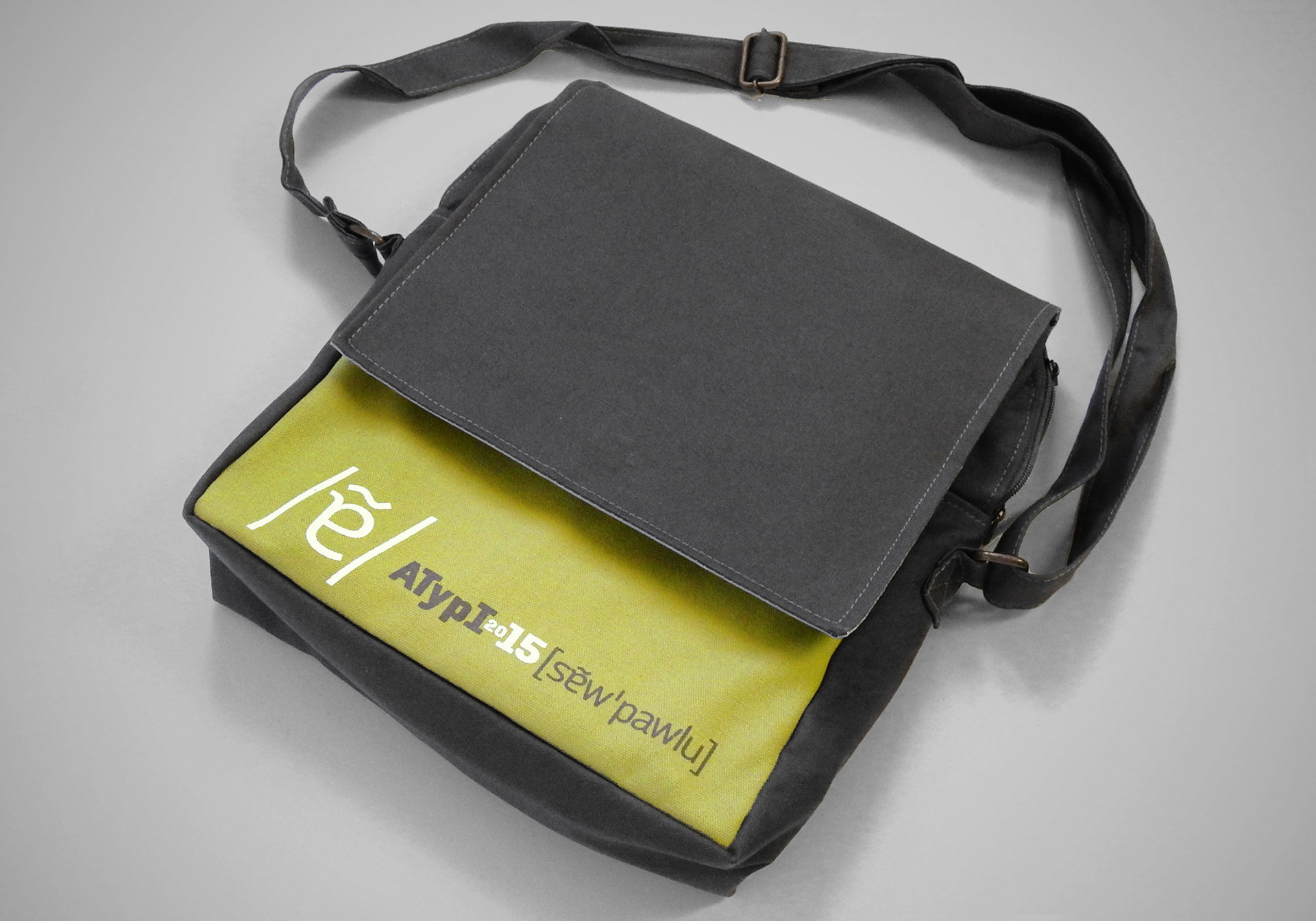
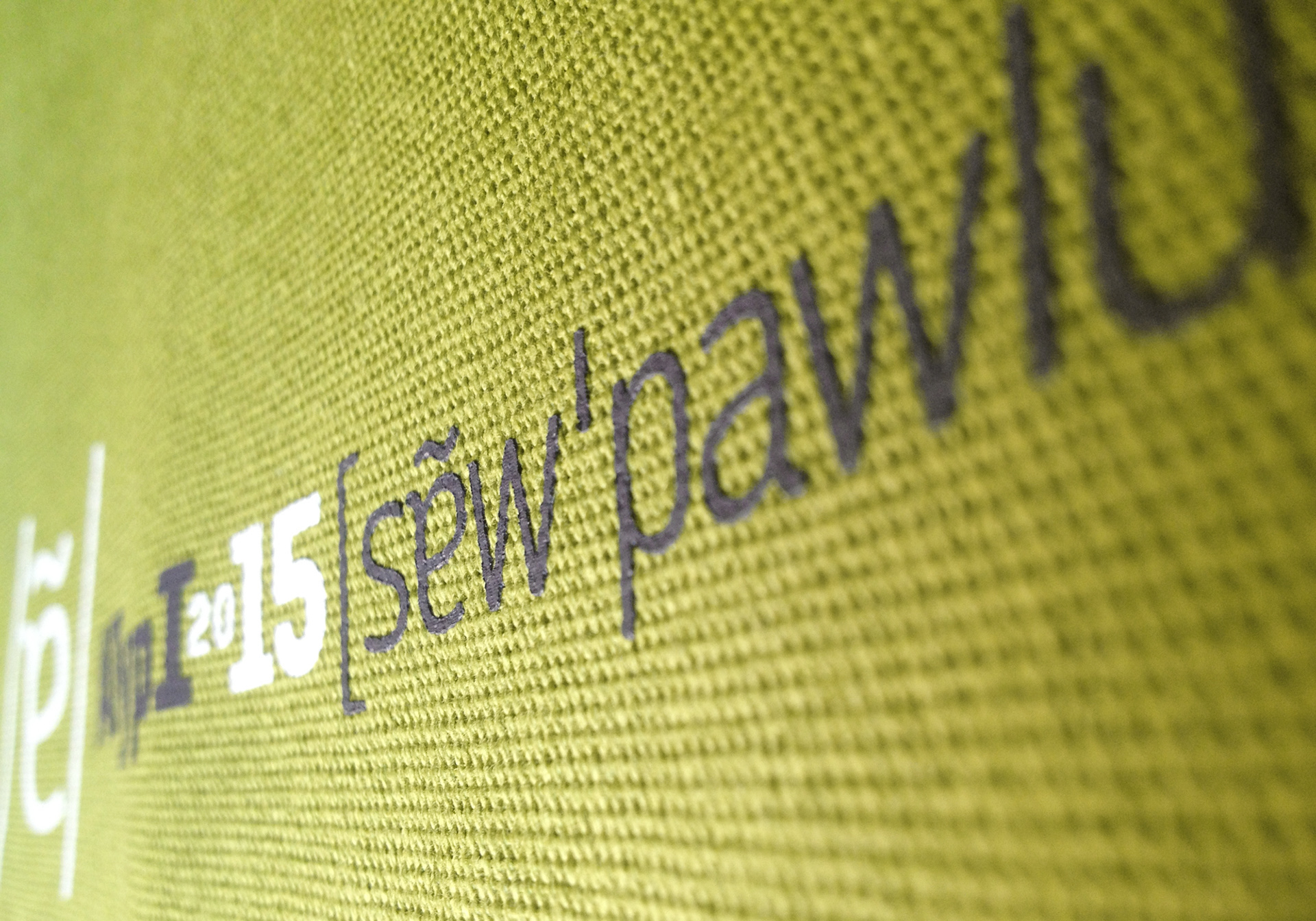
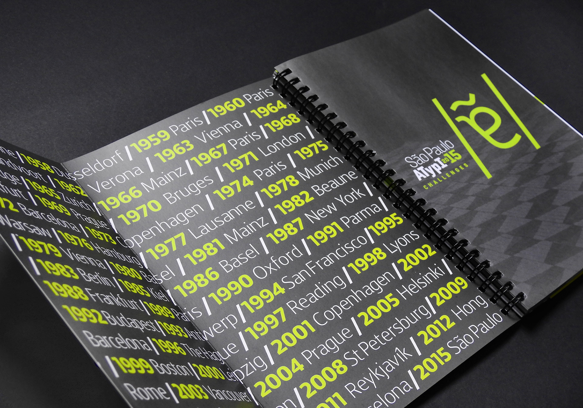
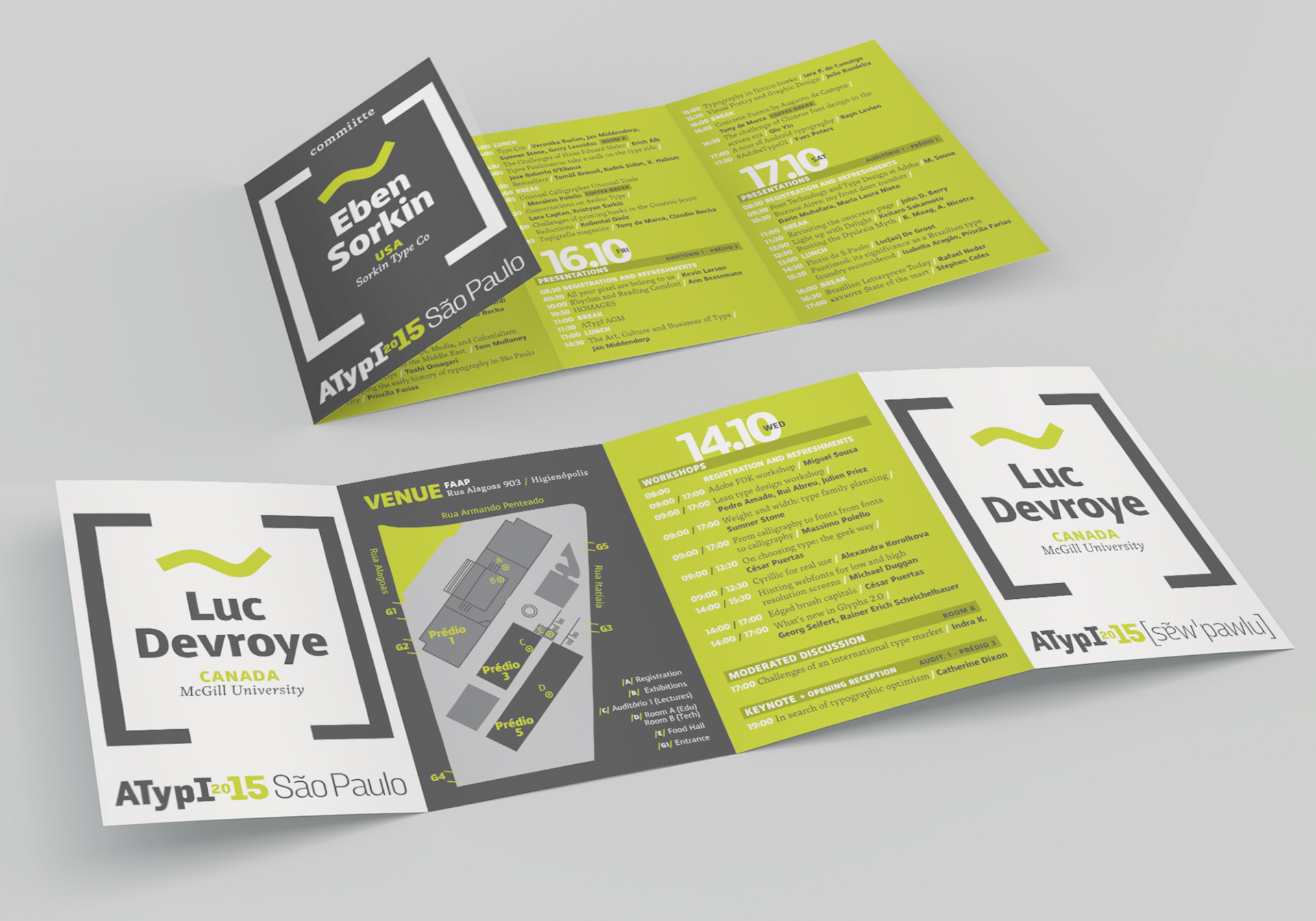
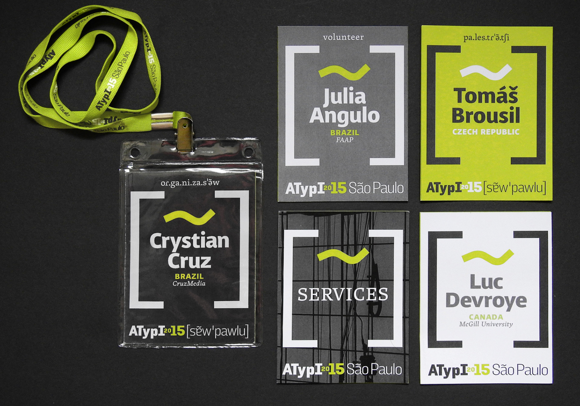
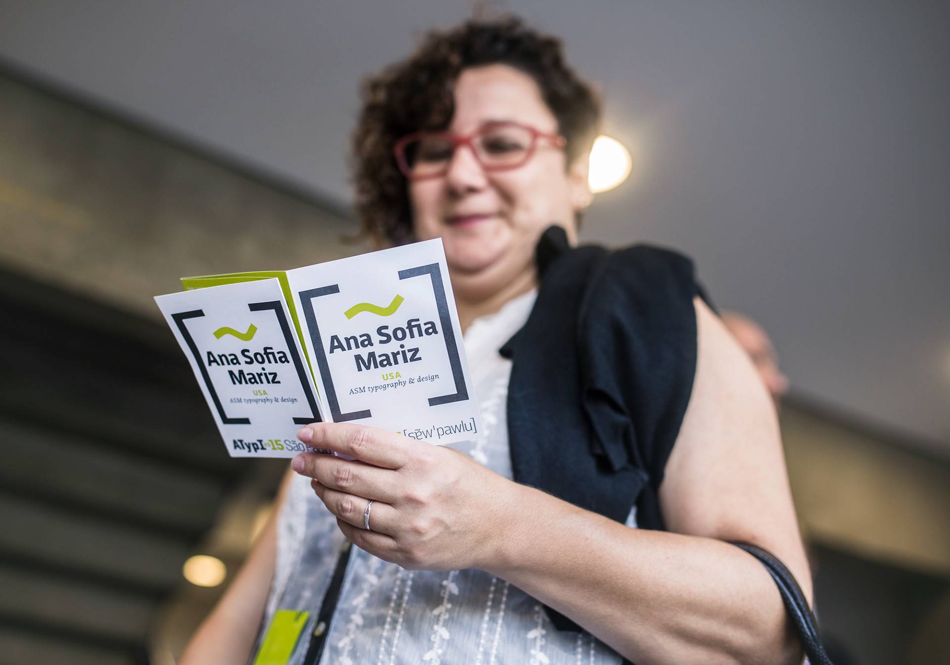
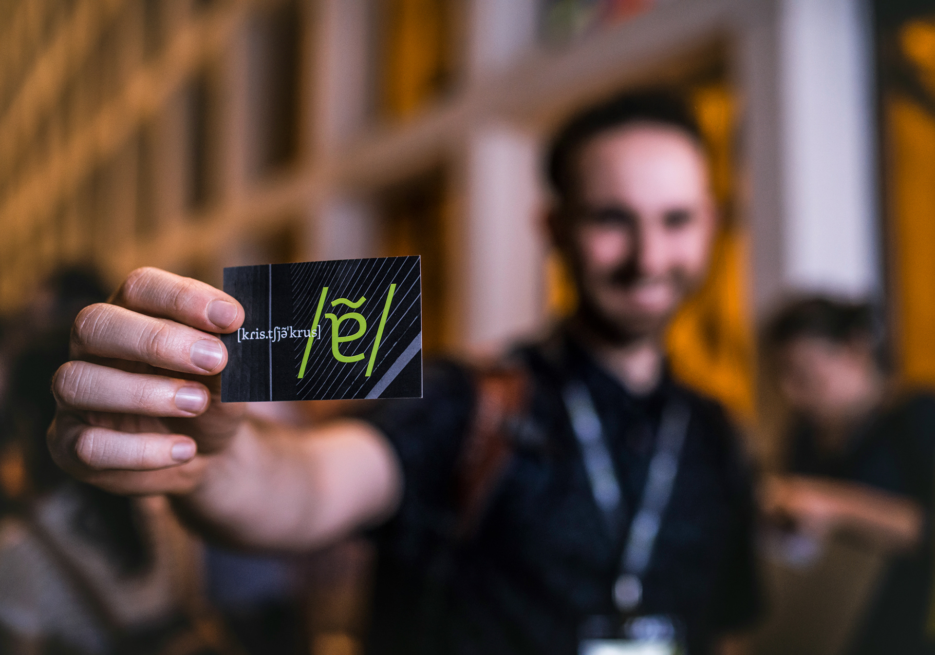
The whole concept for the identity was based on the peculiar ways that foreigners pronounce the ‘ã’ sound, which is the most distinguishable sound in the Portuguese language. As a result, the graphic representation of the ‘ã’ sound in phonetics became the symbol of the identity. The shape of the tilde came from the most iconic landmark of the city: Copan, a building designed by the famous Brazilian architect Oscar Niemeyer. The logo had two variants of how to write São Paulo: standard and phonetics.
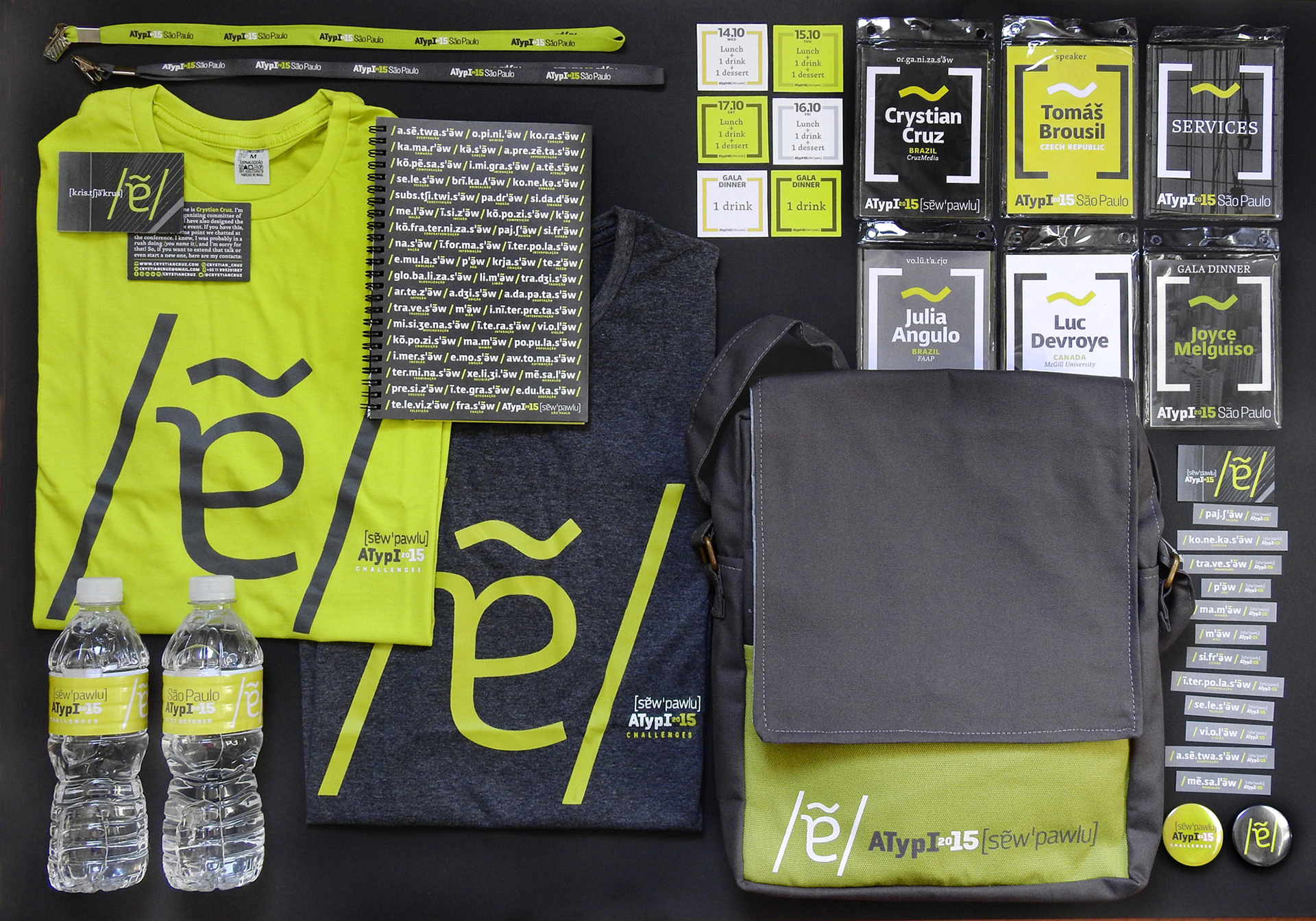
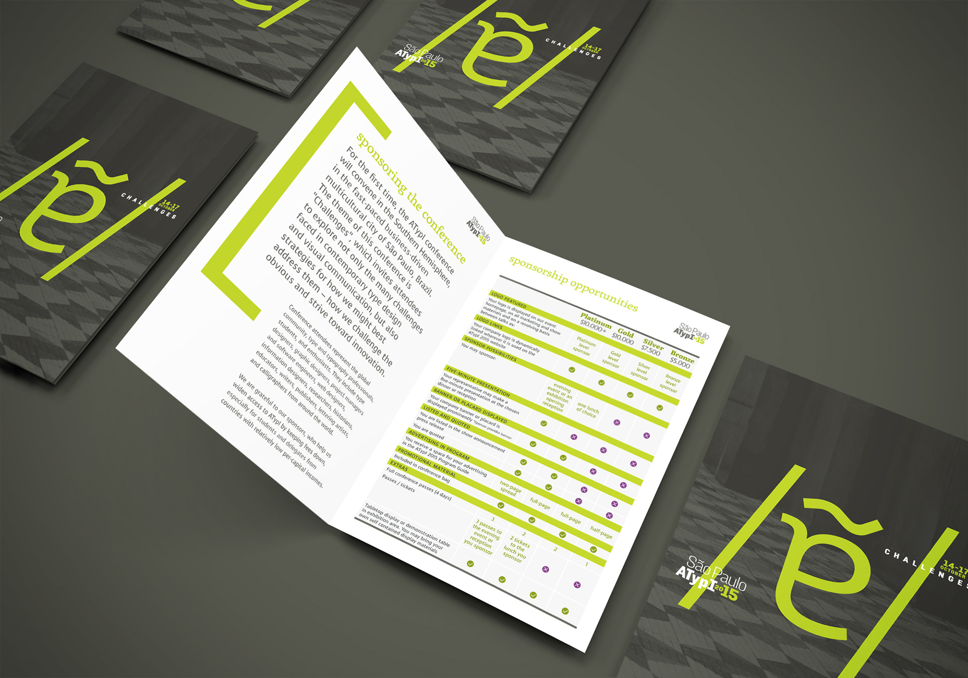
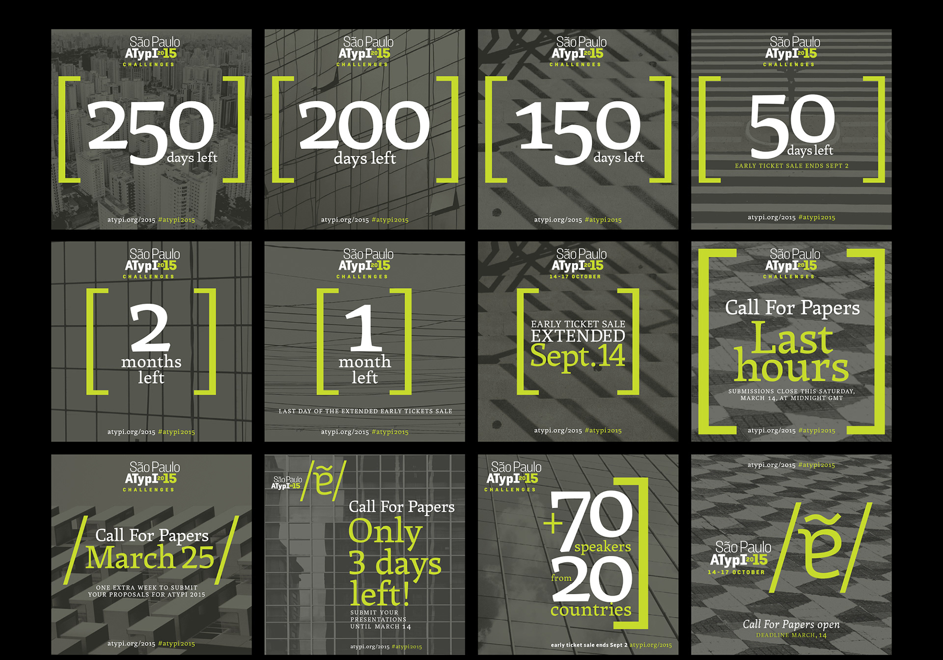
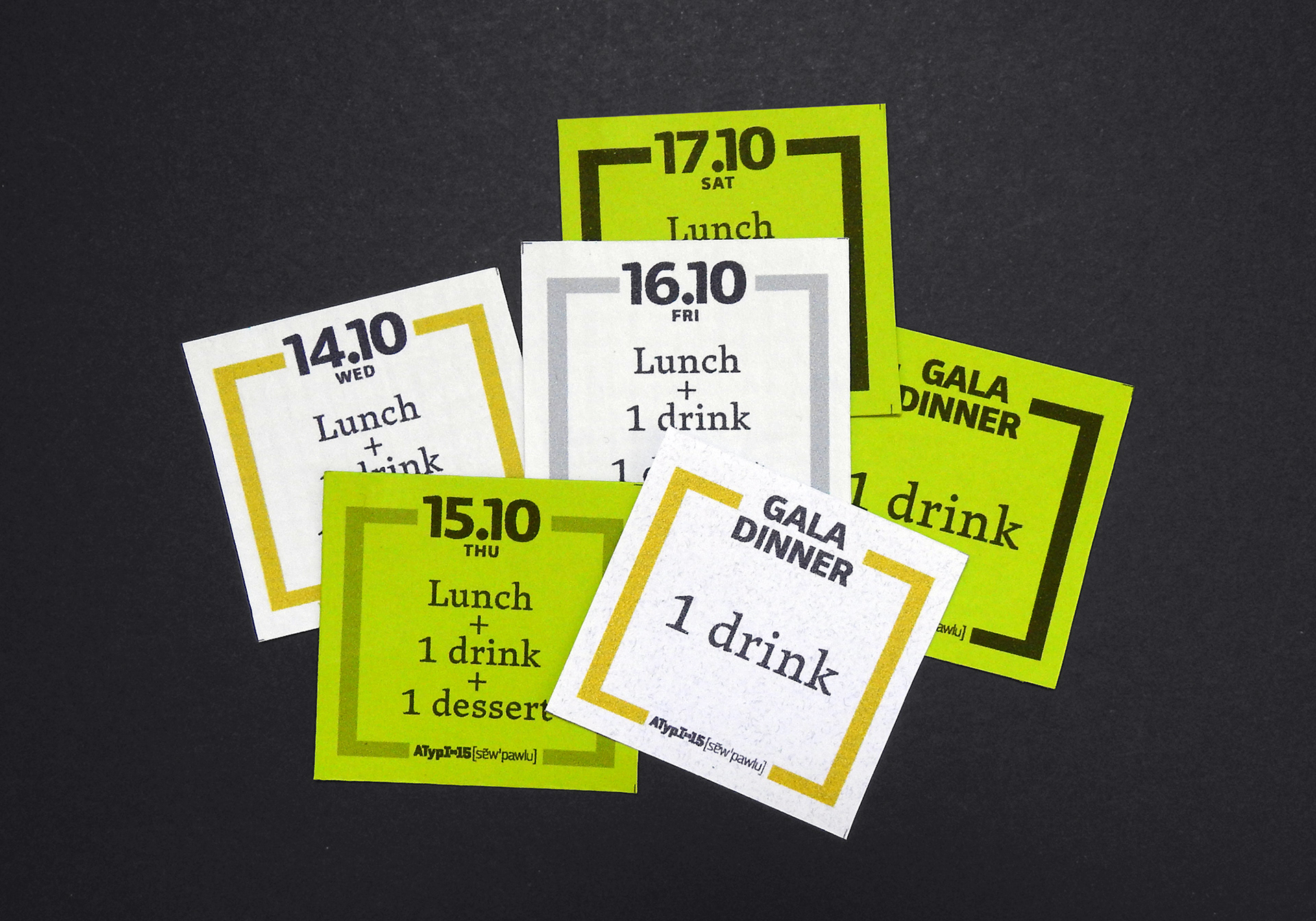
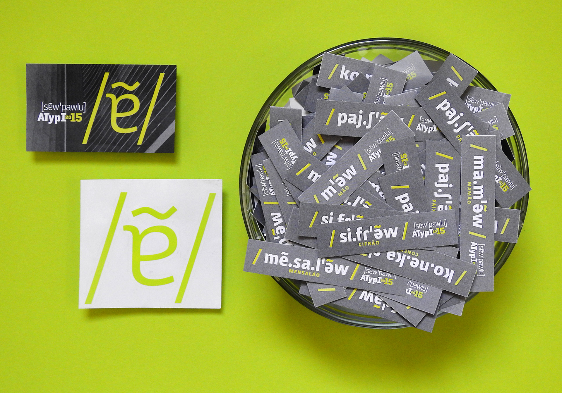
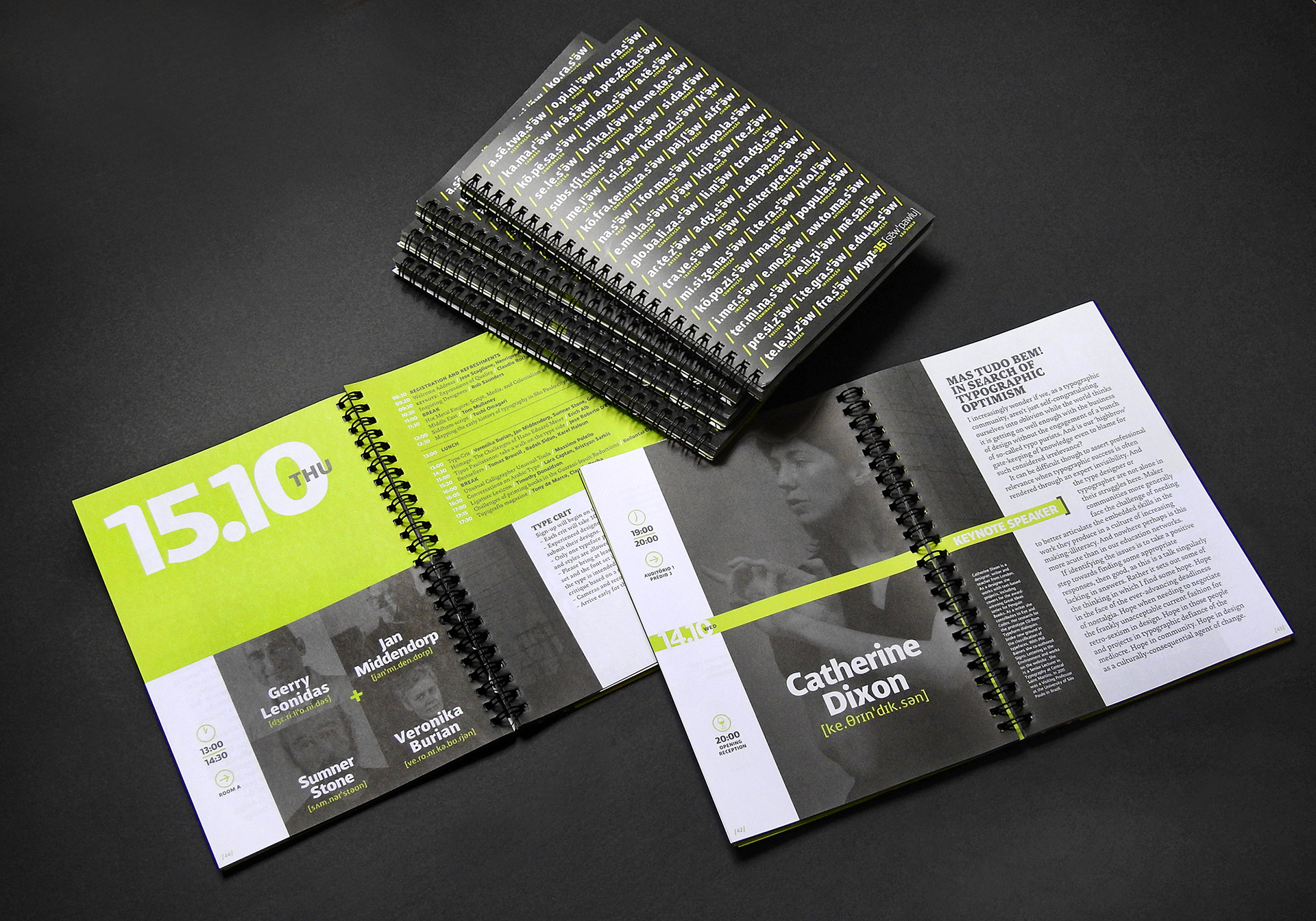
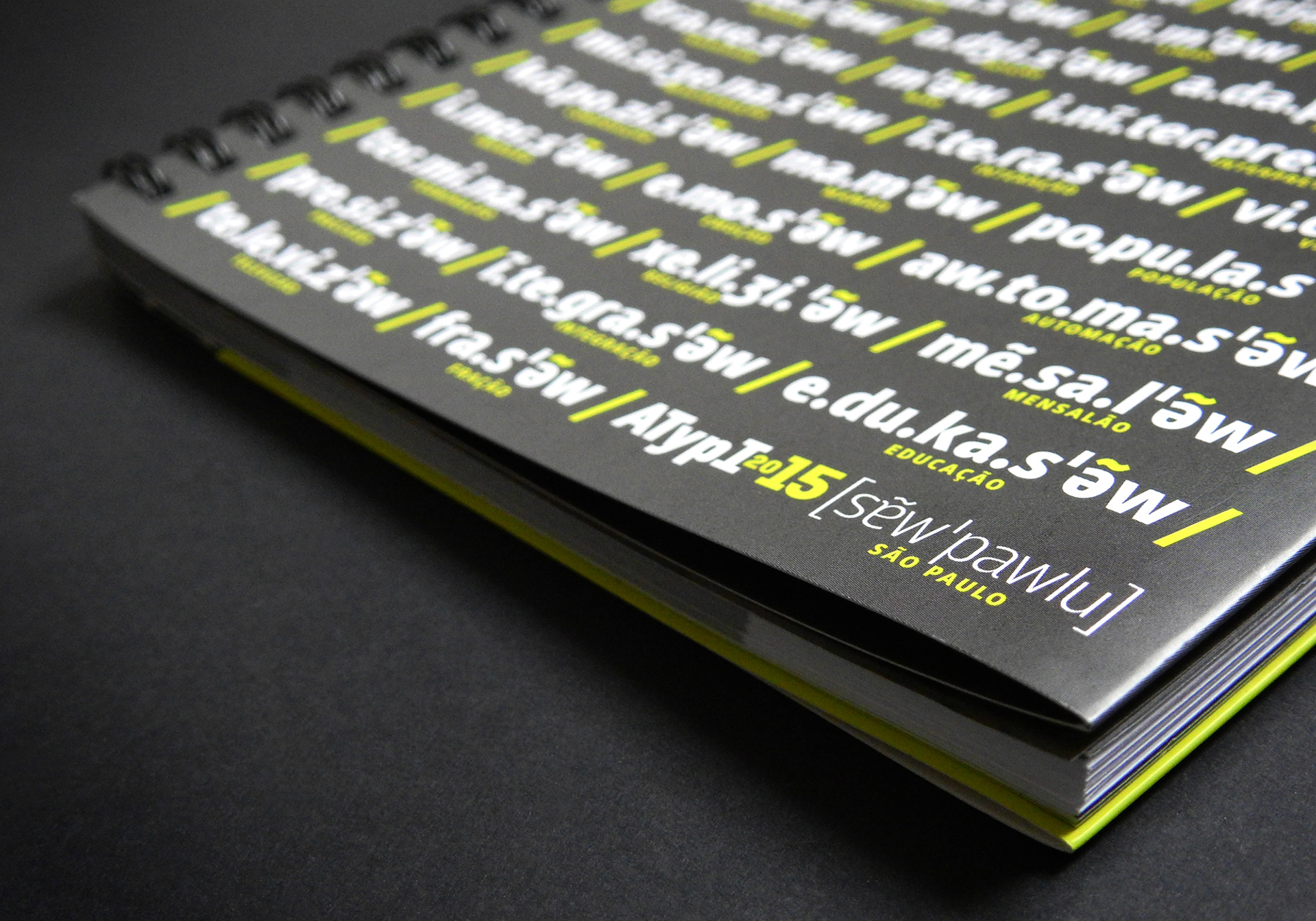
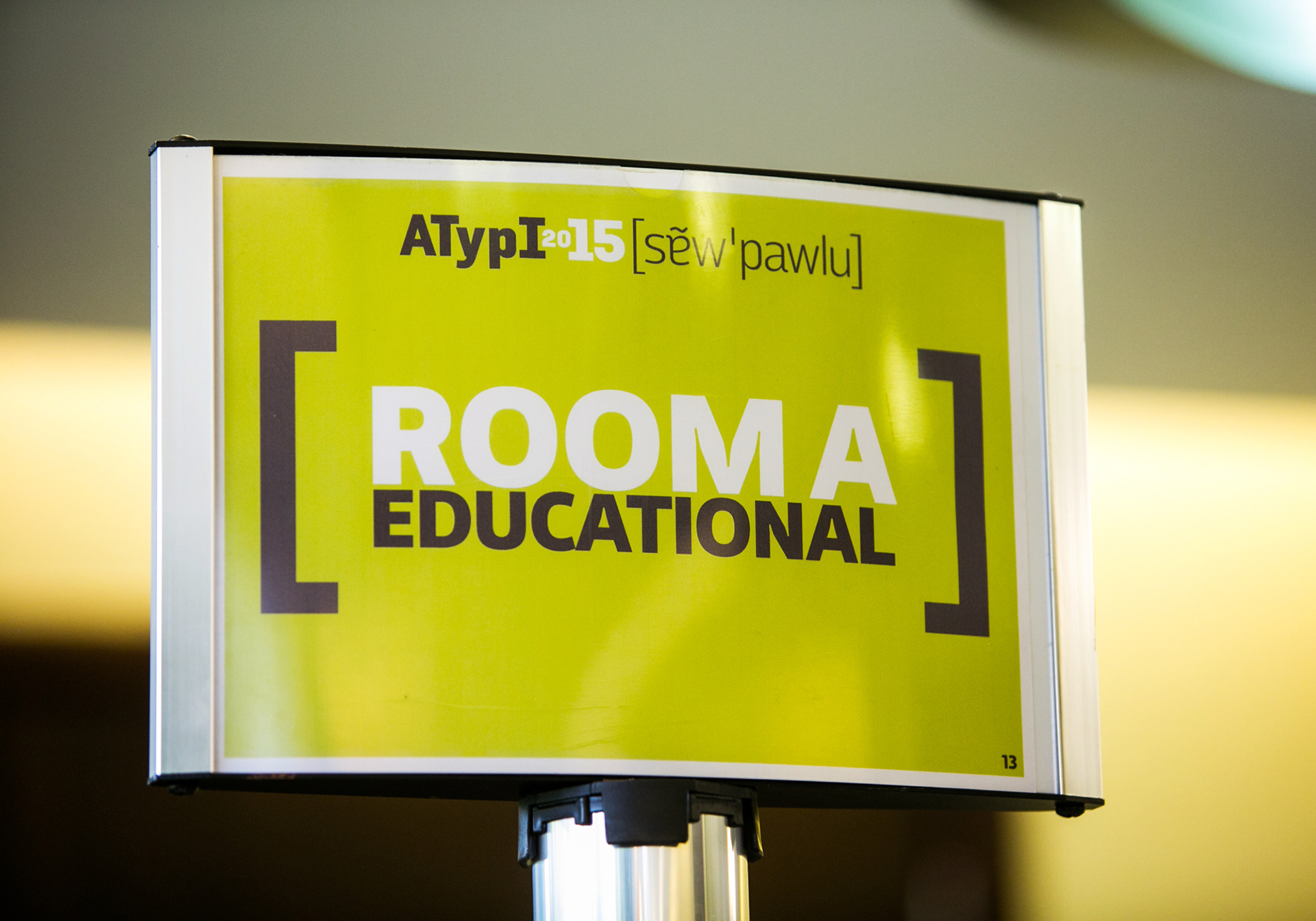
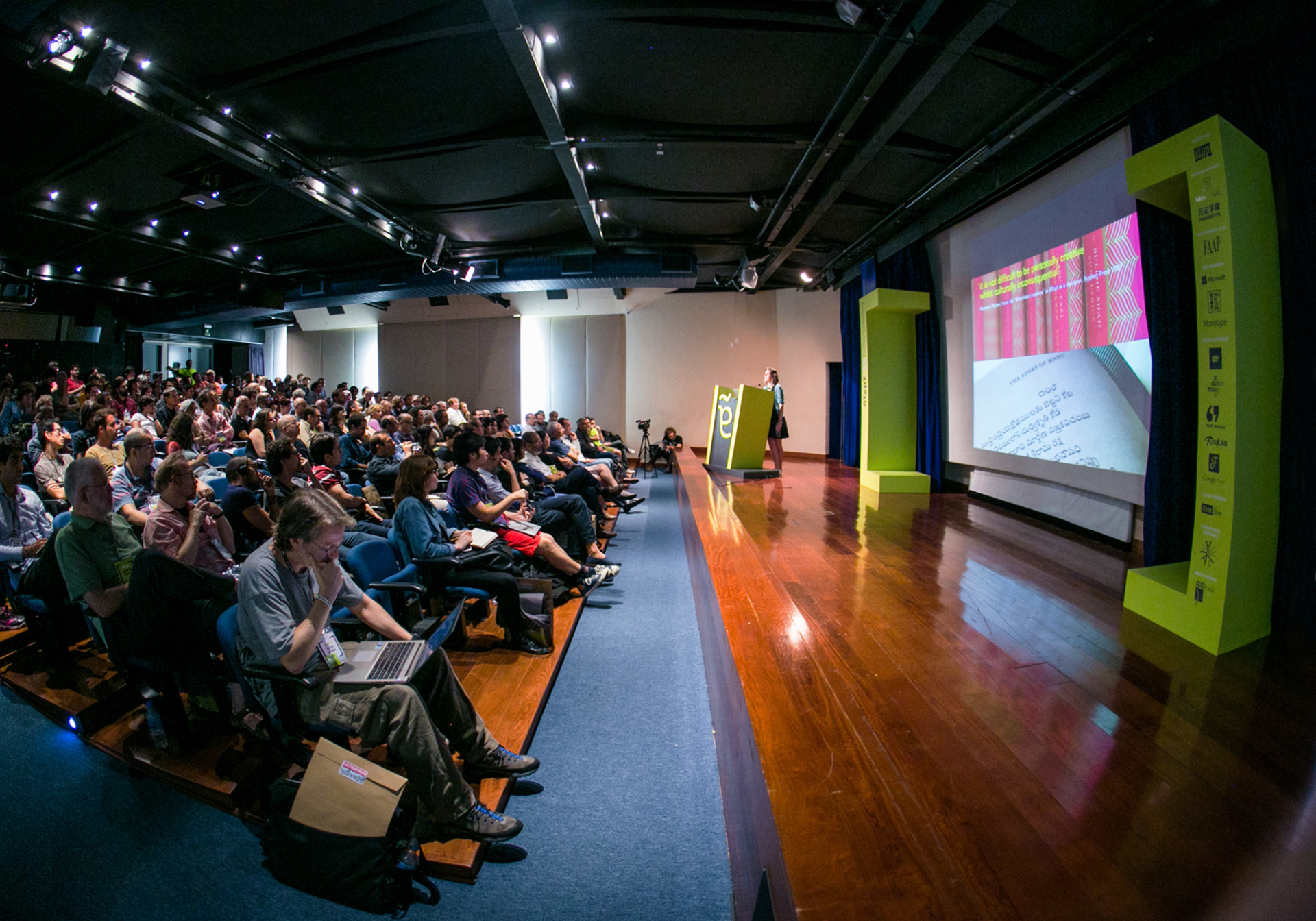
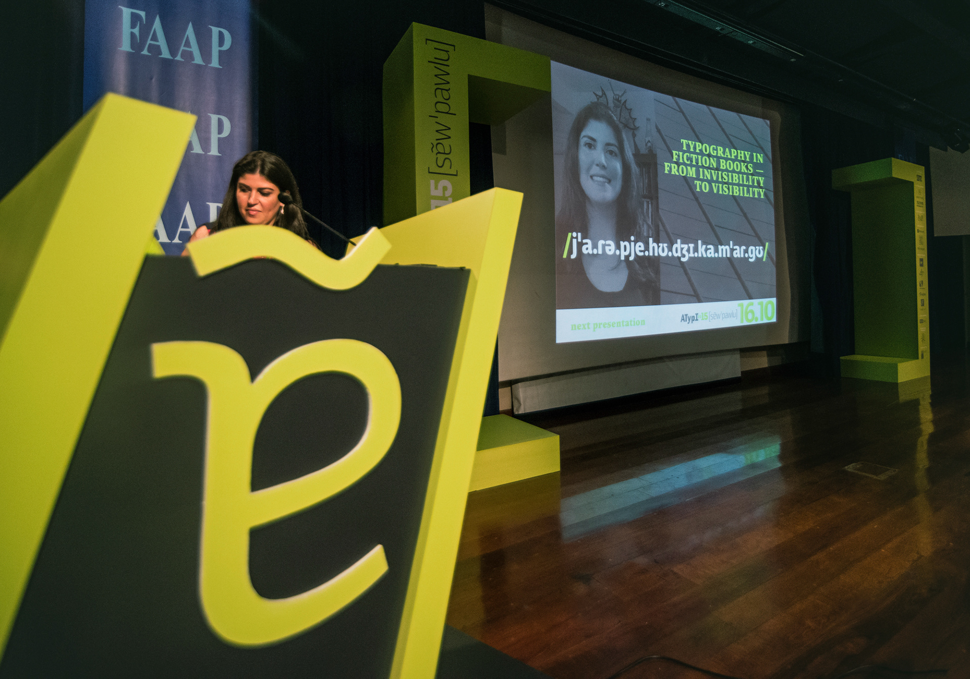
For the conference materials, two typefaces with phonetics glyph coverage were selected: Voces and Brasílica. Brackets and slashes are common glyphs for displaying phonetics content, so they were added as graphic elements of the visual identity, such as the giant brackets on stage.
Some key words in Portuguese were presented in phonetics, providing hints about how to pronounce them. The names of all speakers would also appear on screen in phonetics. Phonetic transcriptions of names are open to interpretation, thus it was a big challenge to make a transliteration of names from all over the world. Nevertheless, It was a pleasure having the chance to explore the usage of phonetics alphabets in the construction of an identity for a type conference!


COLOPHON
Visual identity & booklet design: Crystian Cruz
Client: ATypI’s conference organizing committee (Claudio Rocha, Crystian Cruz, Diego Maldonado, Eben Sorkin, Gerry Leonidas, Henrique Nardi, José Scaglione, Marina Chaccur, Onur Yazicigil, Simon Daniels and Thomas Phinney)
Phonetic transcription: Andrea Zakime
Photos of São Paulo: Flavio Samelo
Promotional video: Visorama Diversões Eletrônicas
Map: Diego Maldonado
Typefaces: Brasílica (by Rafael Dietzsch), Voces (by Ana Megda & Pablo Ugerman), Solido (by Dino dos Santos & Pedro Leal) and Acta Symbols Time (by Dino dos Santos). All typefaces kindly provided by their authors.
Photos of the event: Luke Garcia and Andre Hawk.