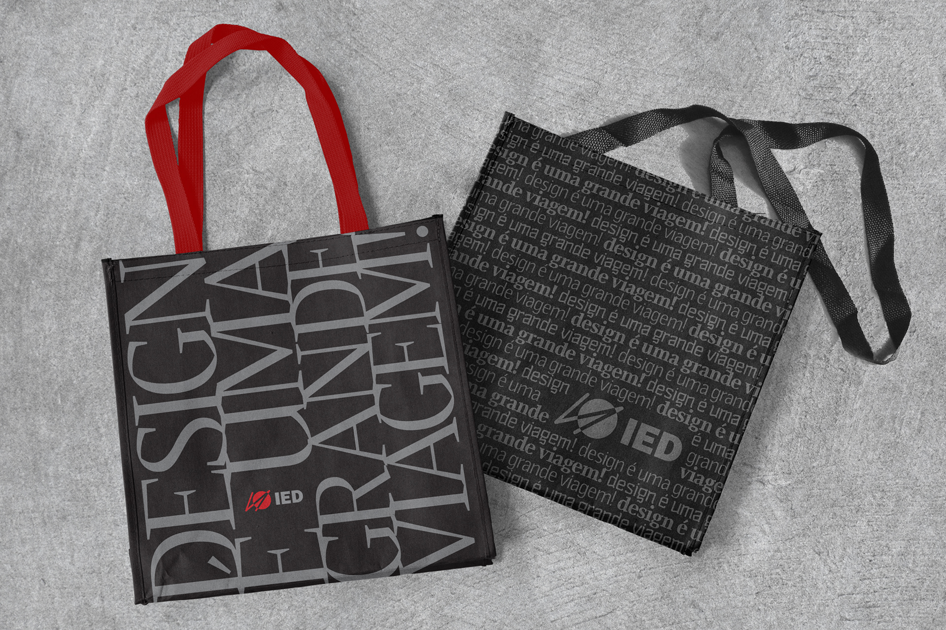
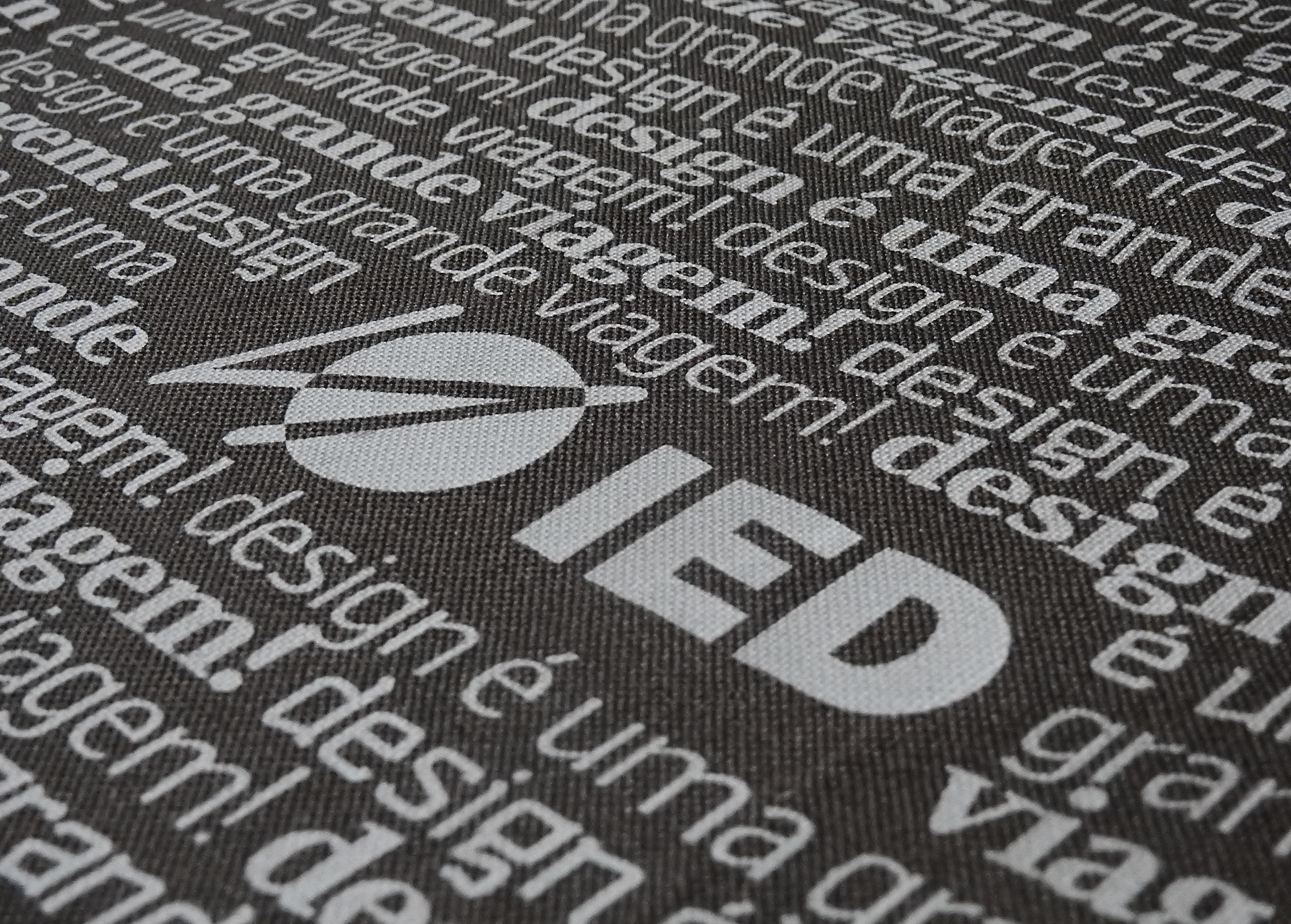
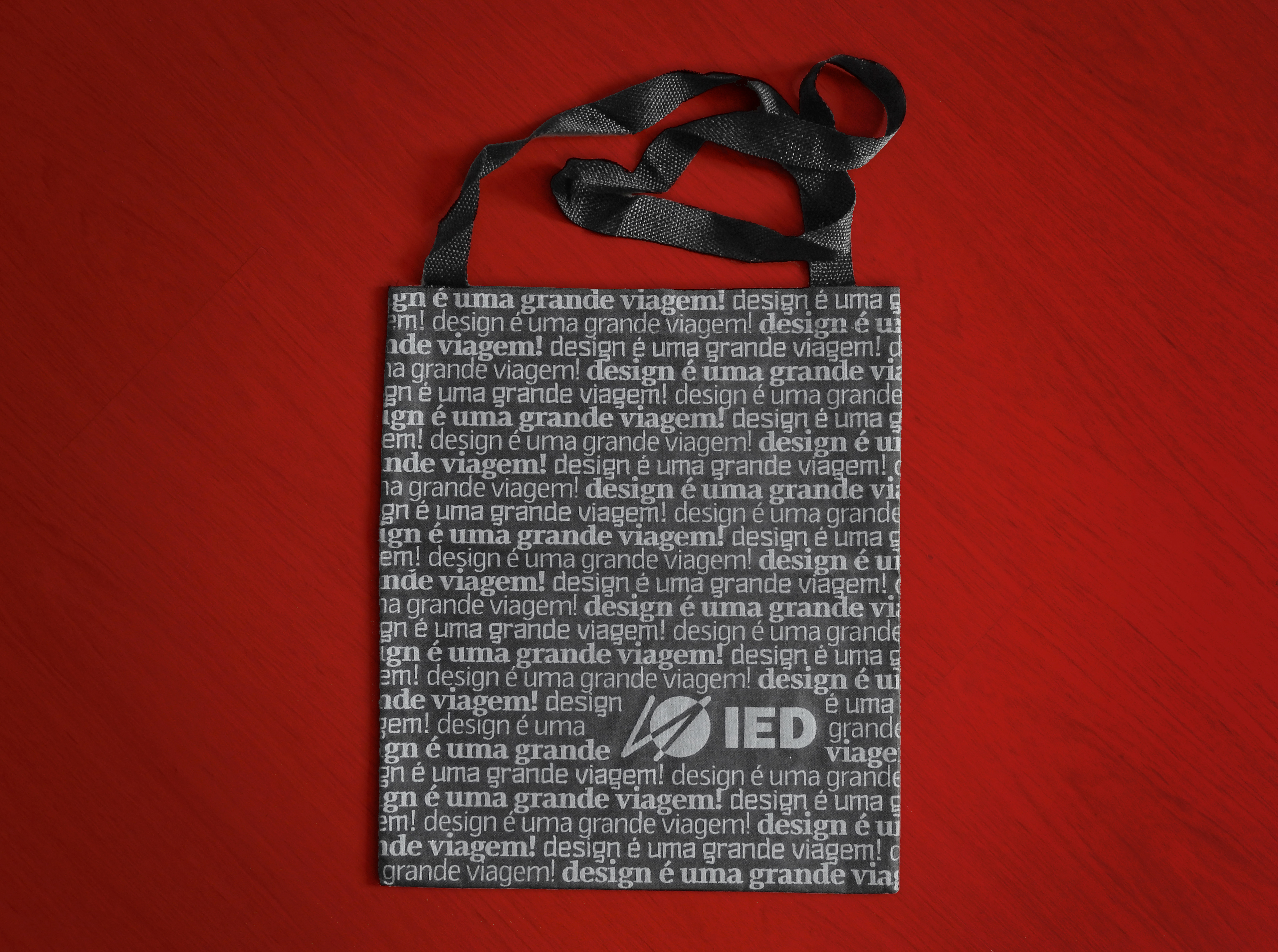
Istituto Europeo di Design (IED São Paulo) asked me to create a tote bag for their winter Open Day in 2012. As a professor of the Typography course at the institution, they proposed me to create the artwork using my own fonts. I hardly use my own fonts on my design work, as I enjoy seeing uniques solutions by other designers. I have the impression that by using it myself, others may feel inclined to use it only in the same style. But this case was different, so... challenge accepted!
The brief implied the use of the copy 'Design é uma grande viagem' ('Design is a big trip', in Portuguese). I've created two artworks. In the end, they were only able to print the second version, that was entirely in one colour. The phrase was repeated as a pattern in three of my fonts (Smoking, Cruz Sans and Quartzo). But I love the other one as well, with my typeface Quartzo typeset in huge uppercase letters. It is undoubtedly the most fun type specimen I've ever made! And it was pleasing to see people walking around the building carrying my fonts. Which one is your favourite?
TYPEFACES FEATURED: