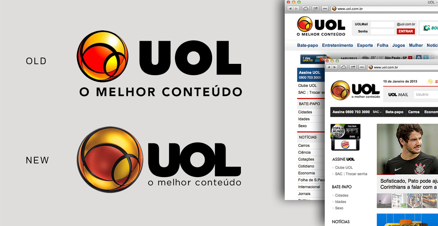
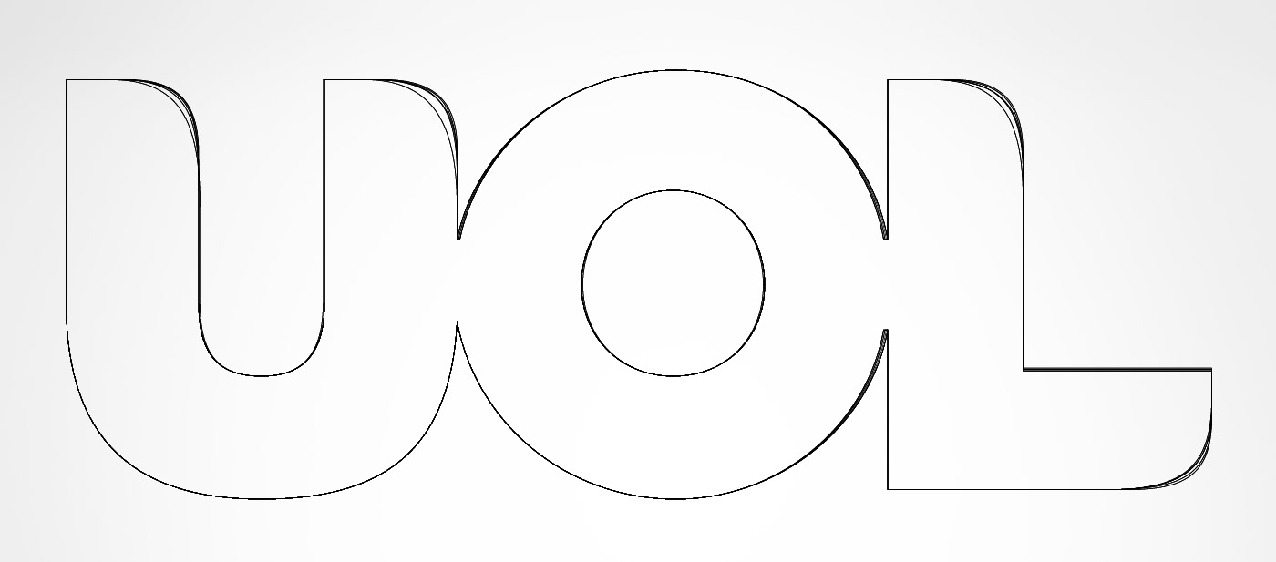
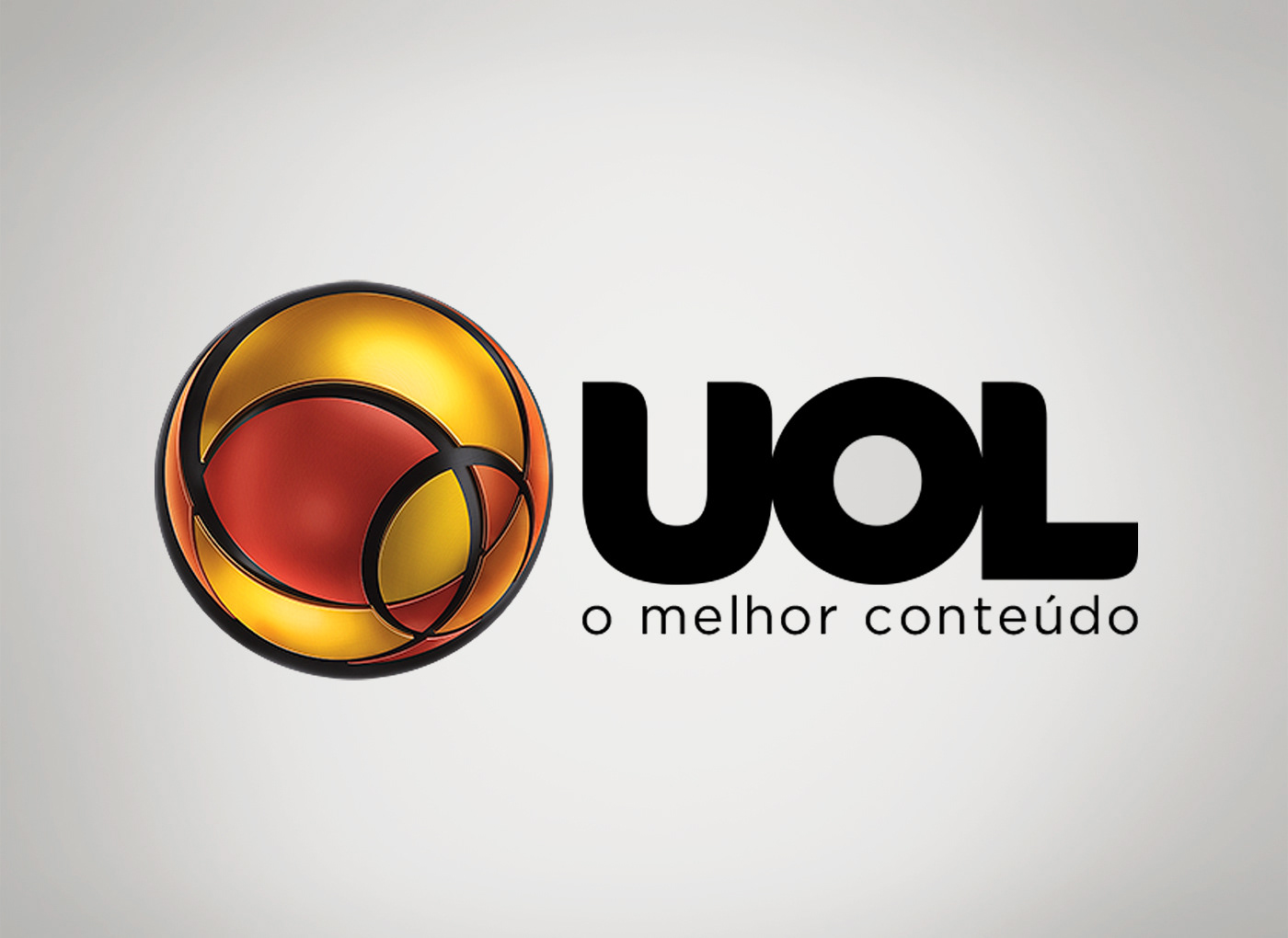
During the period I was working as Head of Typography at Africa Advertising, redesigning this logo was one of the projects I was involved. UOL is the the largest site in Latin America, and the most traditional one in Brazil, so it was a challenge to change a brand that was seen daily by millions of Brazilians.
The design team was responsible for managing the project, and I was asked to create some versions for the lettering (UOL), while they were focused in the symbol and the overall aesthetics of the new brand identity. At the end, one of the designs I have proposed for the lettering was selected by the client. The rounded corners were intended to make it more related to the symbol, and the connected letters came from the idea to show that everybody are somehow connected to the world via the website.
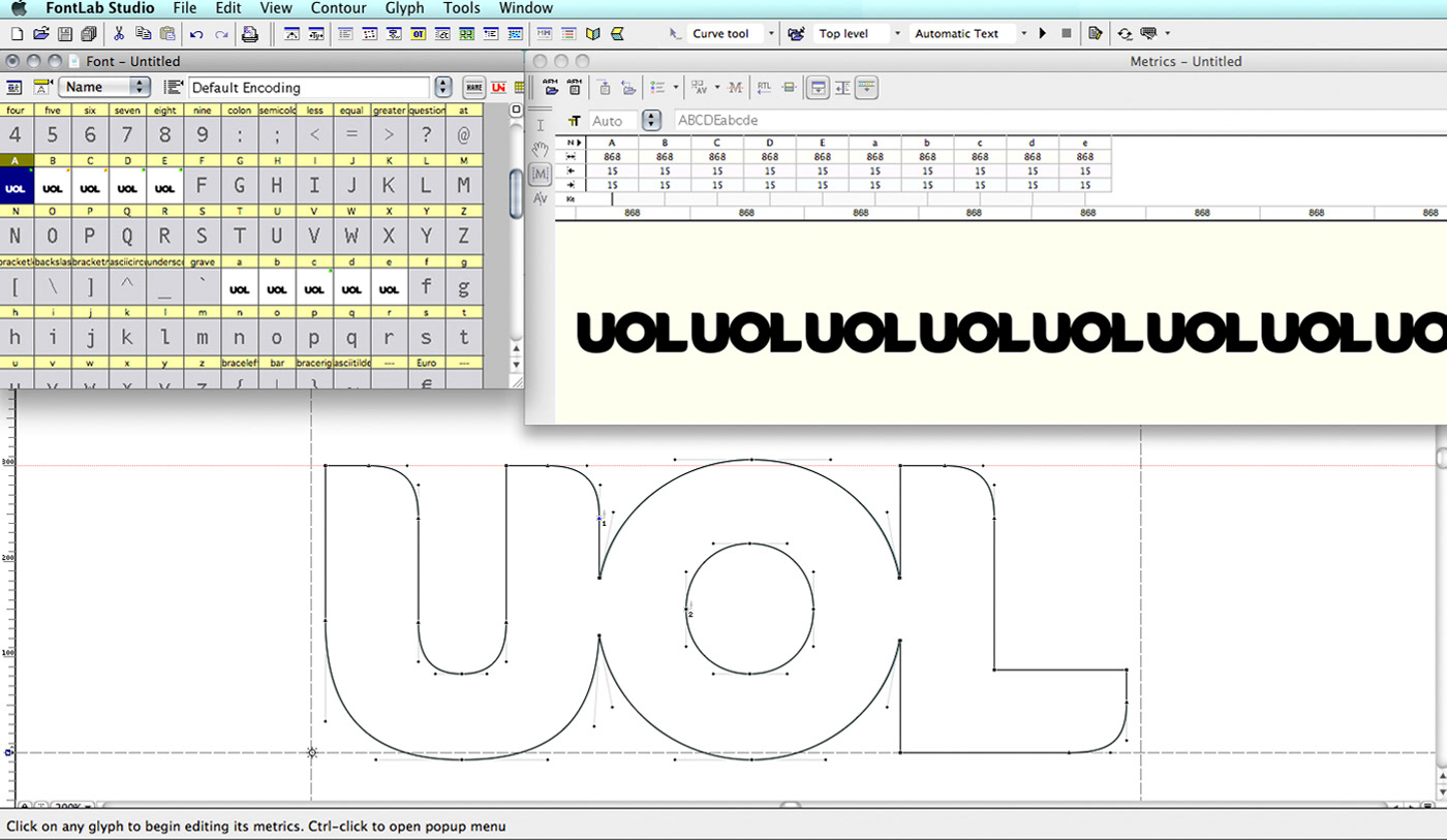
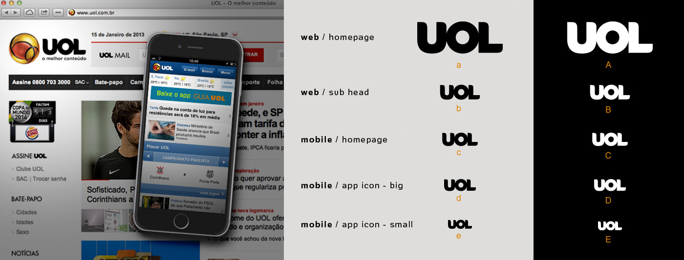
In order to overcome technical issues of rendering the logo properly when displayed in different sizes, it was created five different optical sizes, with the collaboration of the type designer Marina Chaccur. Each design was intended to be used at specific sizes and applications, preserving the same visual perception across all usages. They were inserted in a font file, so they could be installed on the computer and easily be used as a typeface.