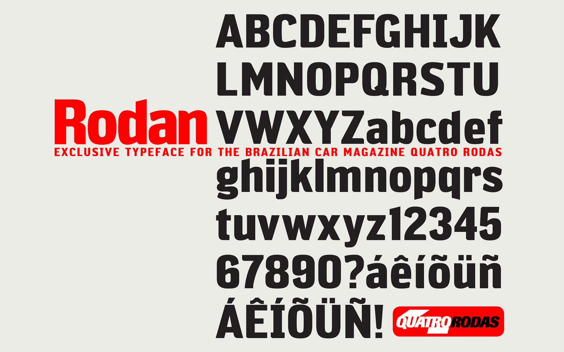
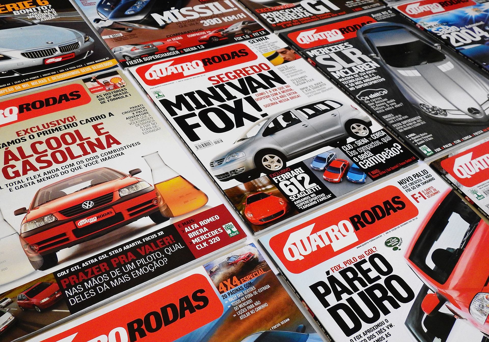
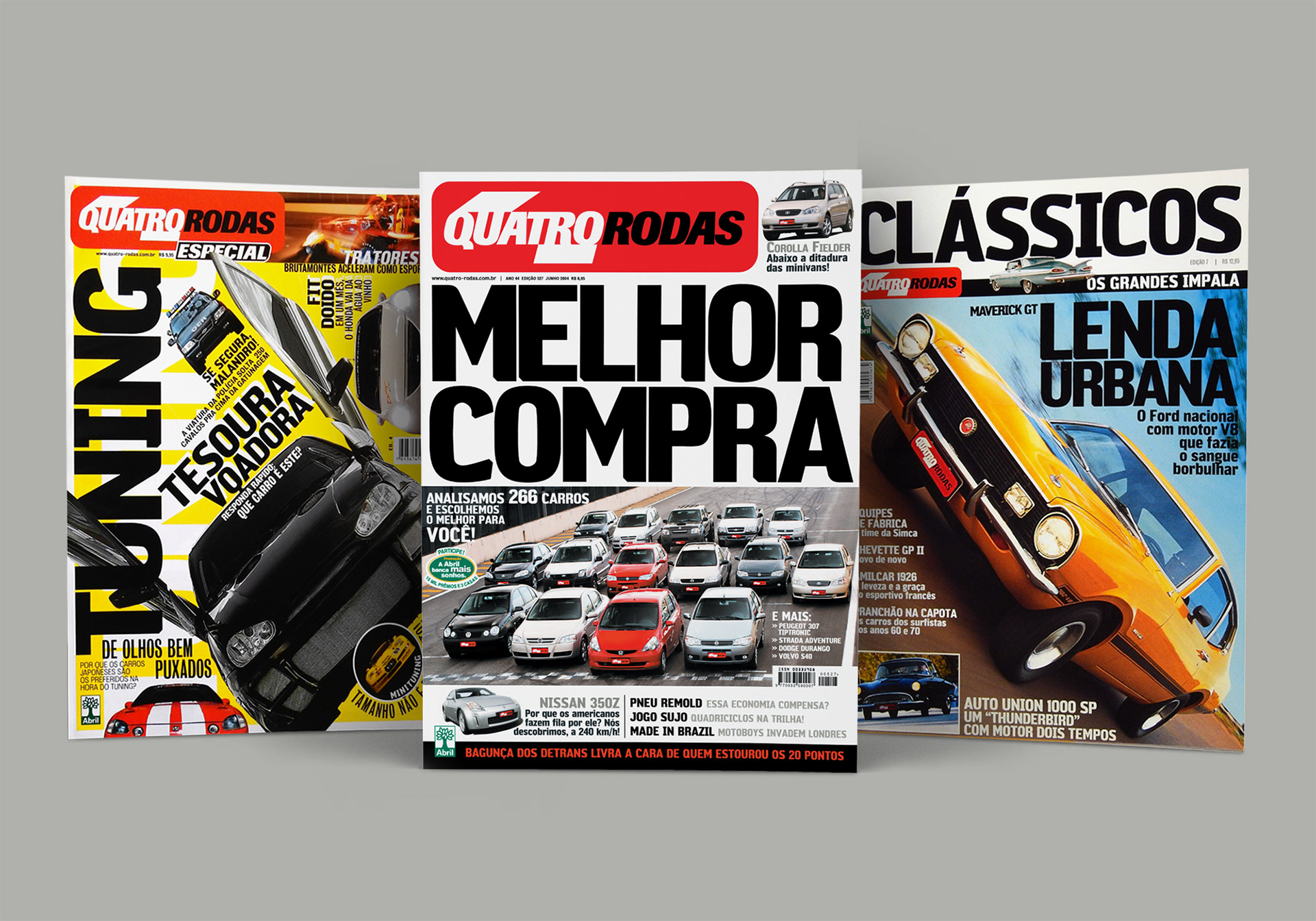
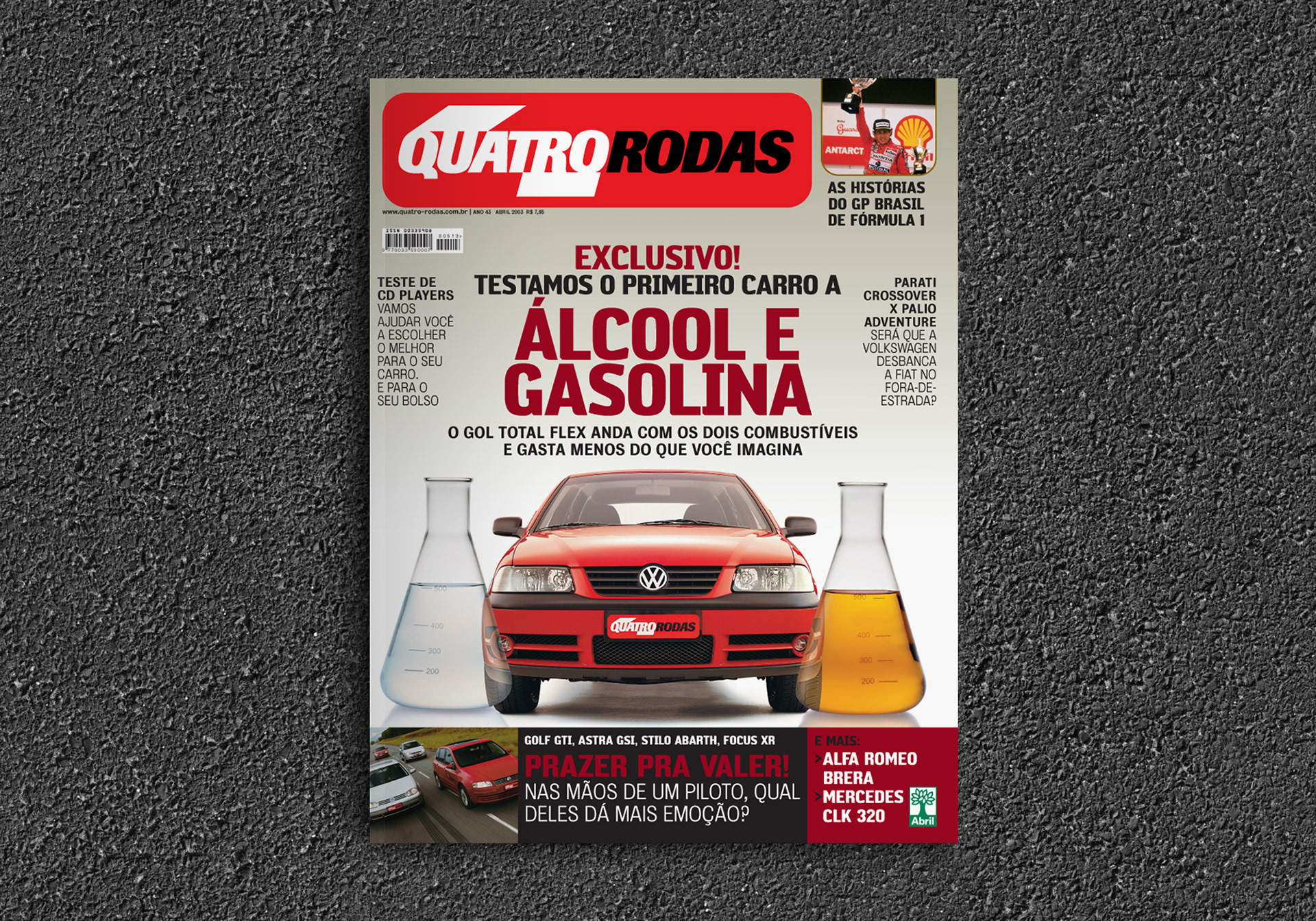
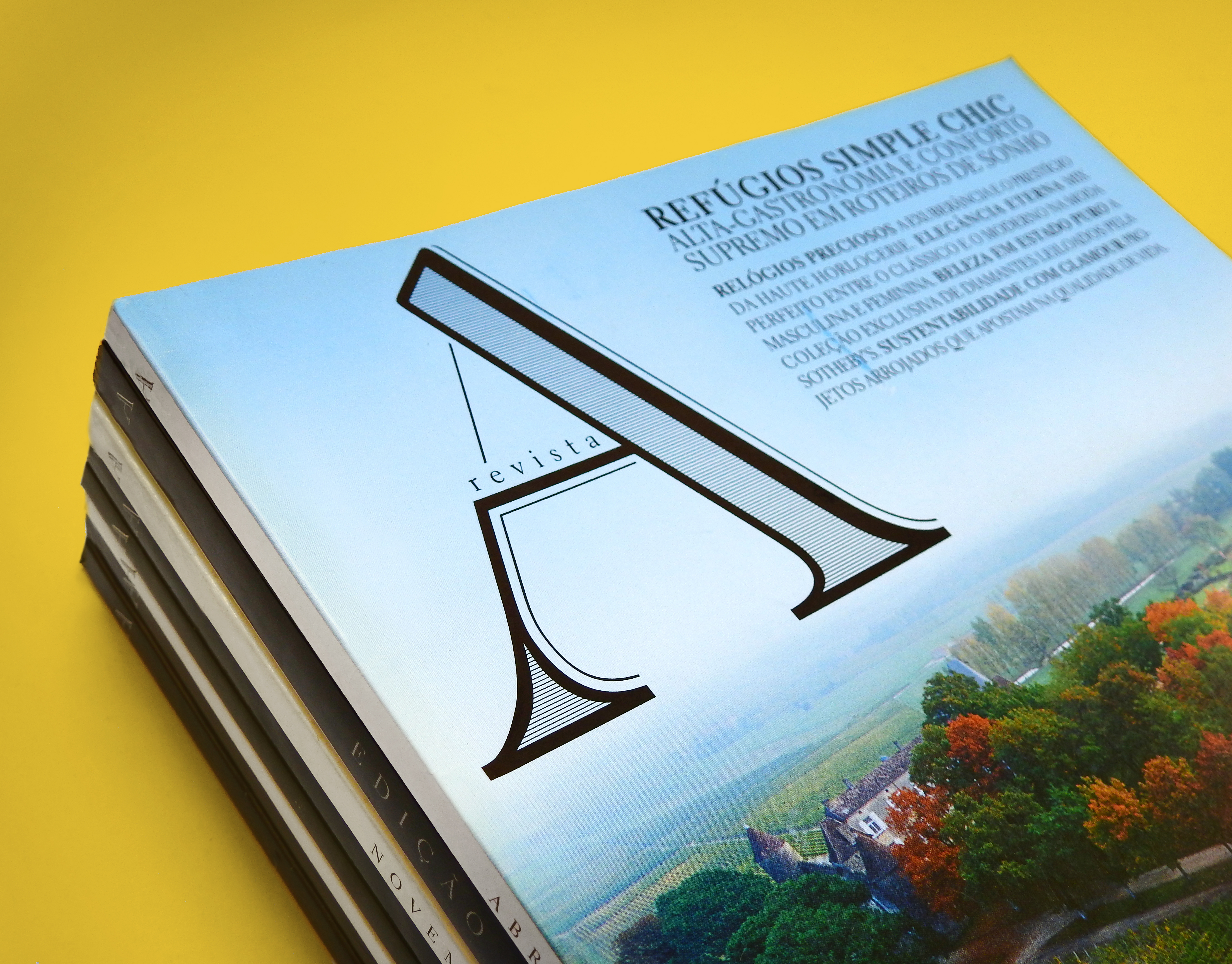
In 2003, Quatro Rodas magazine had a major redesign when the new art director Saulo Ribas came in. During the process, he commissioned me to create a exclusive typography for the new design, with the goal to increase the reader's identification with the magazine. The new typeface should carry concepts such as technology, tradition and masculinity. I had worked as a designer of that publication two years prior to this, and that was valuable for understanding the needs of the new project.
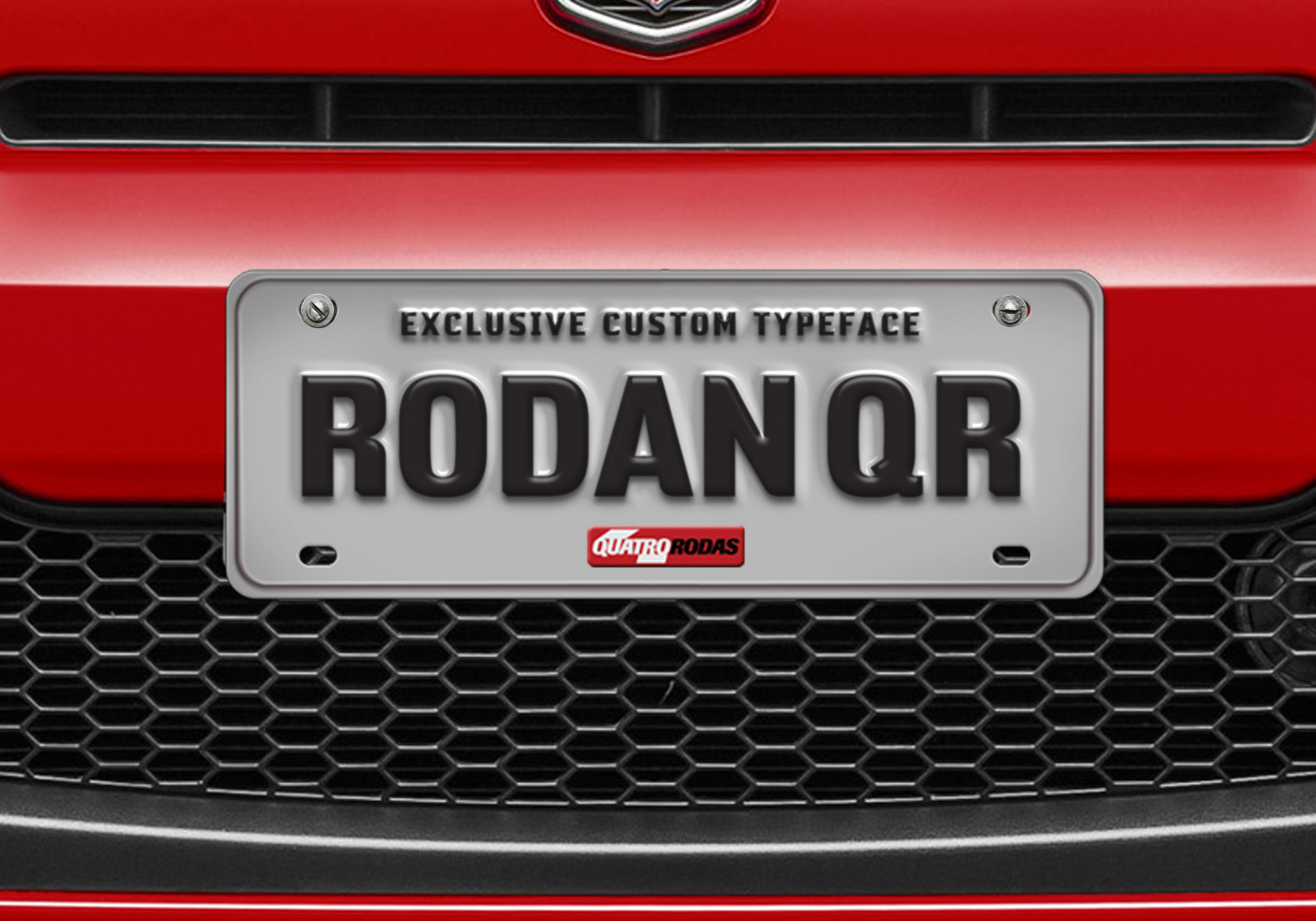
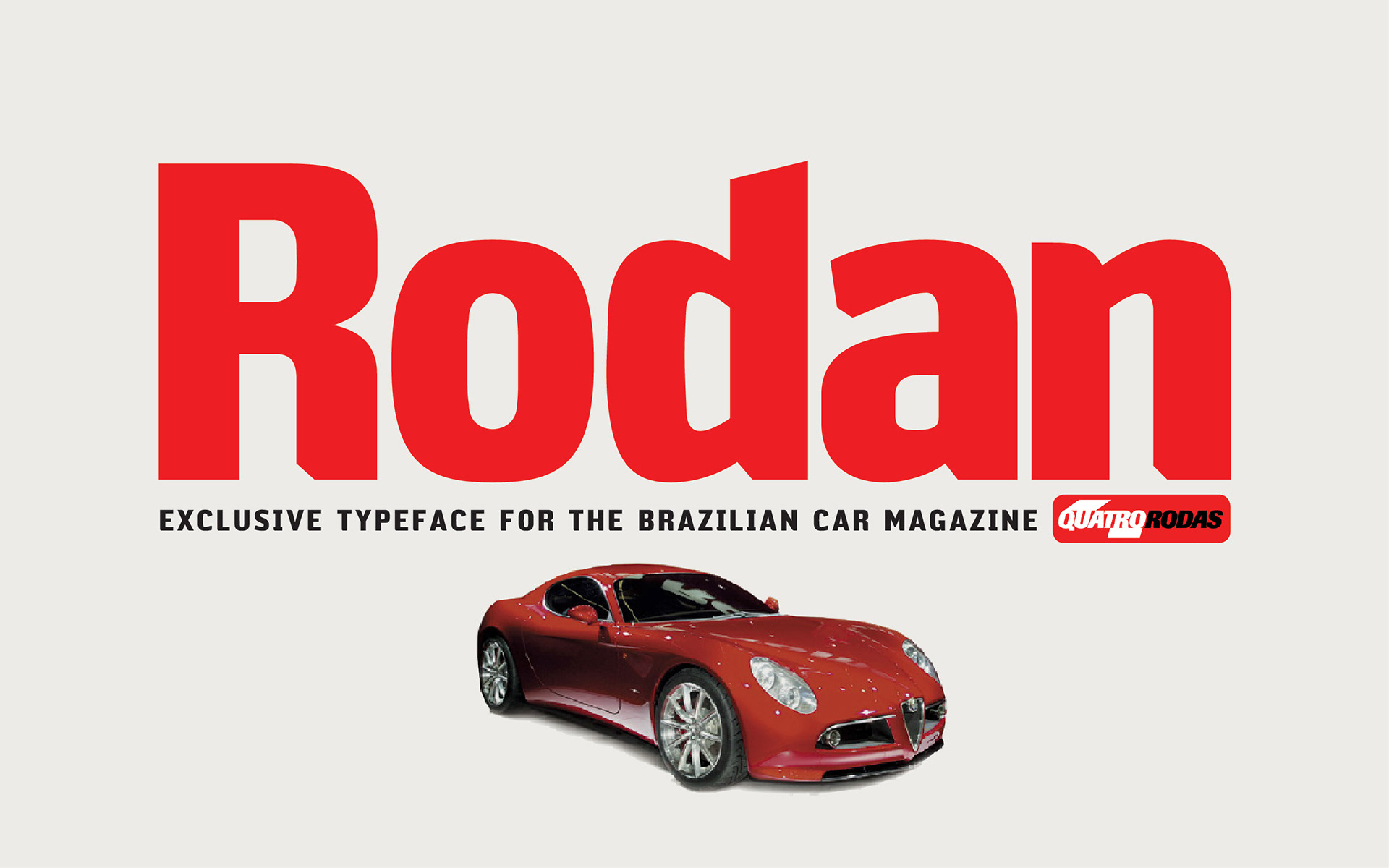
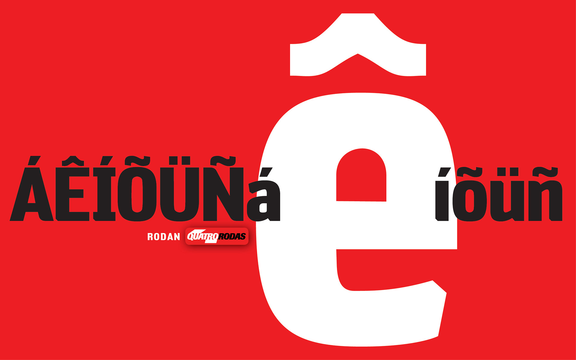
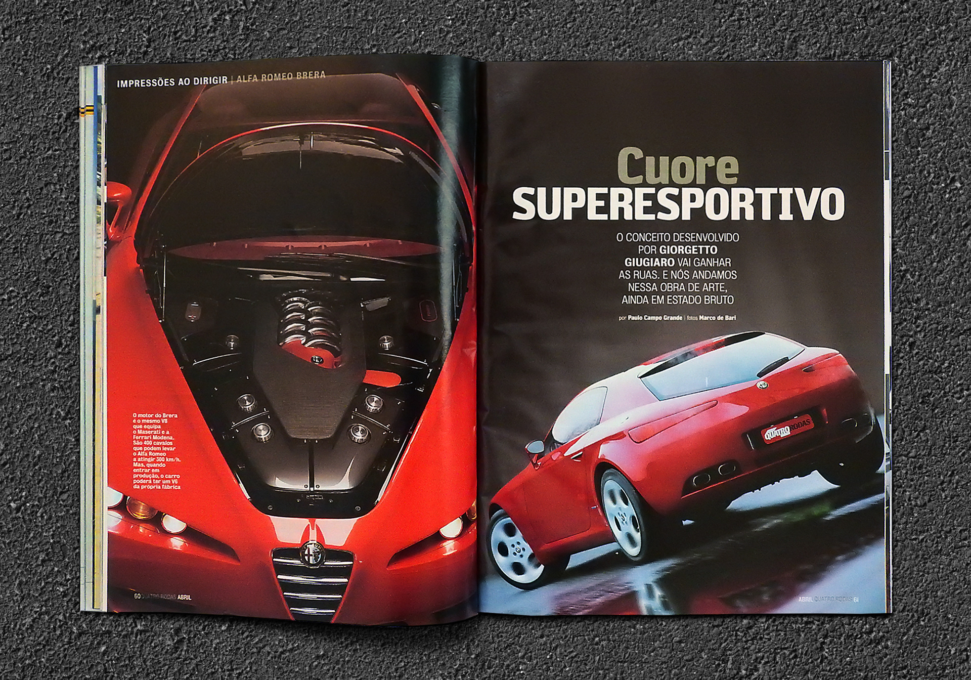
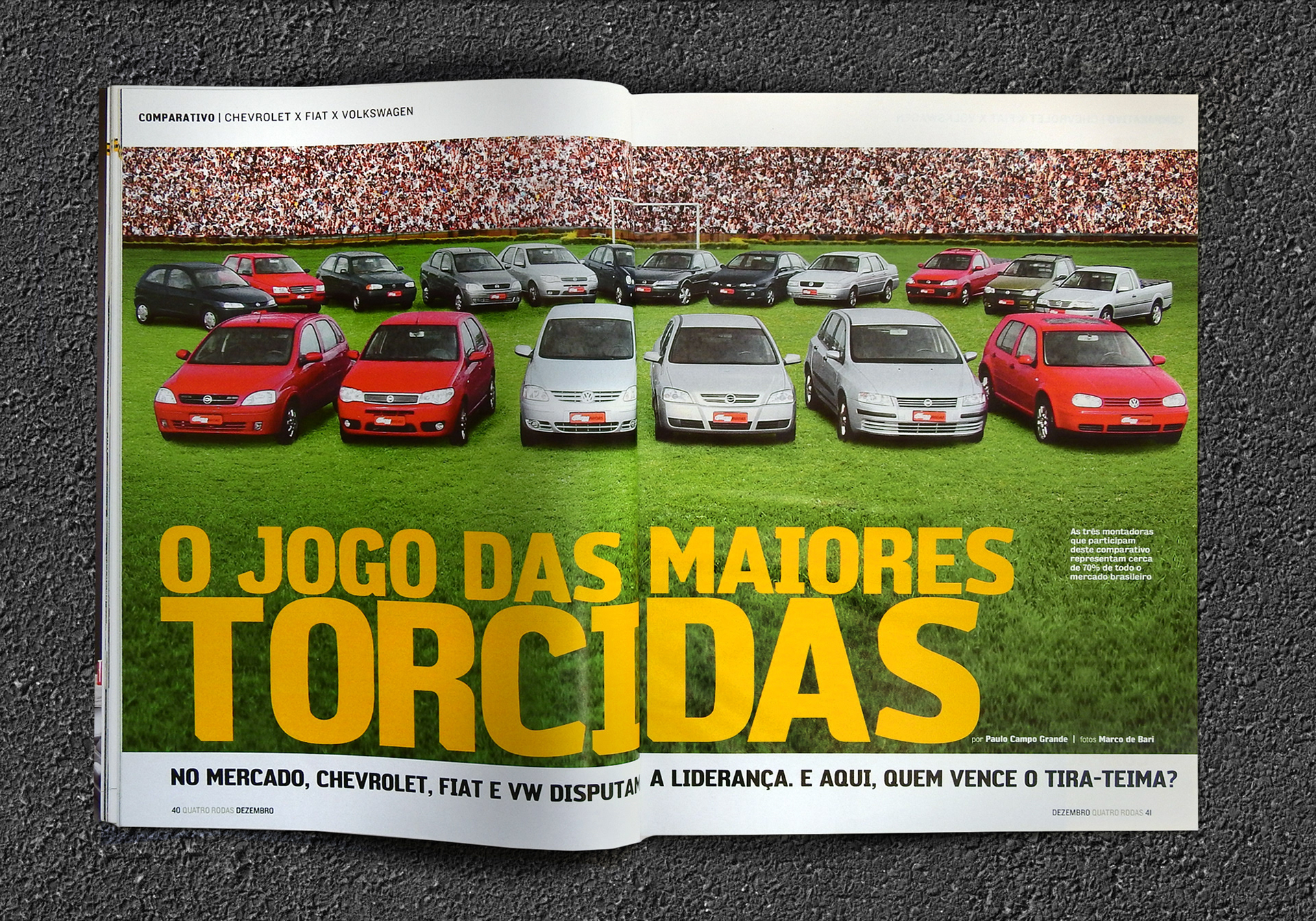
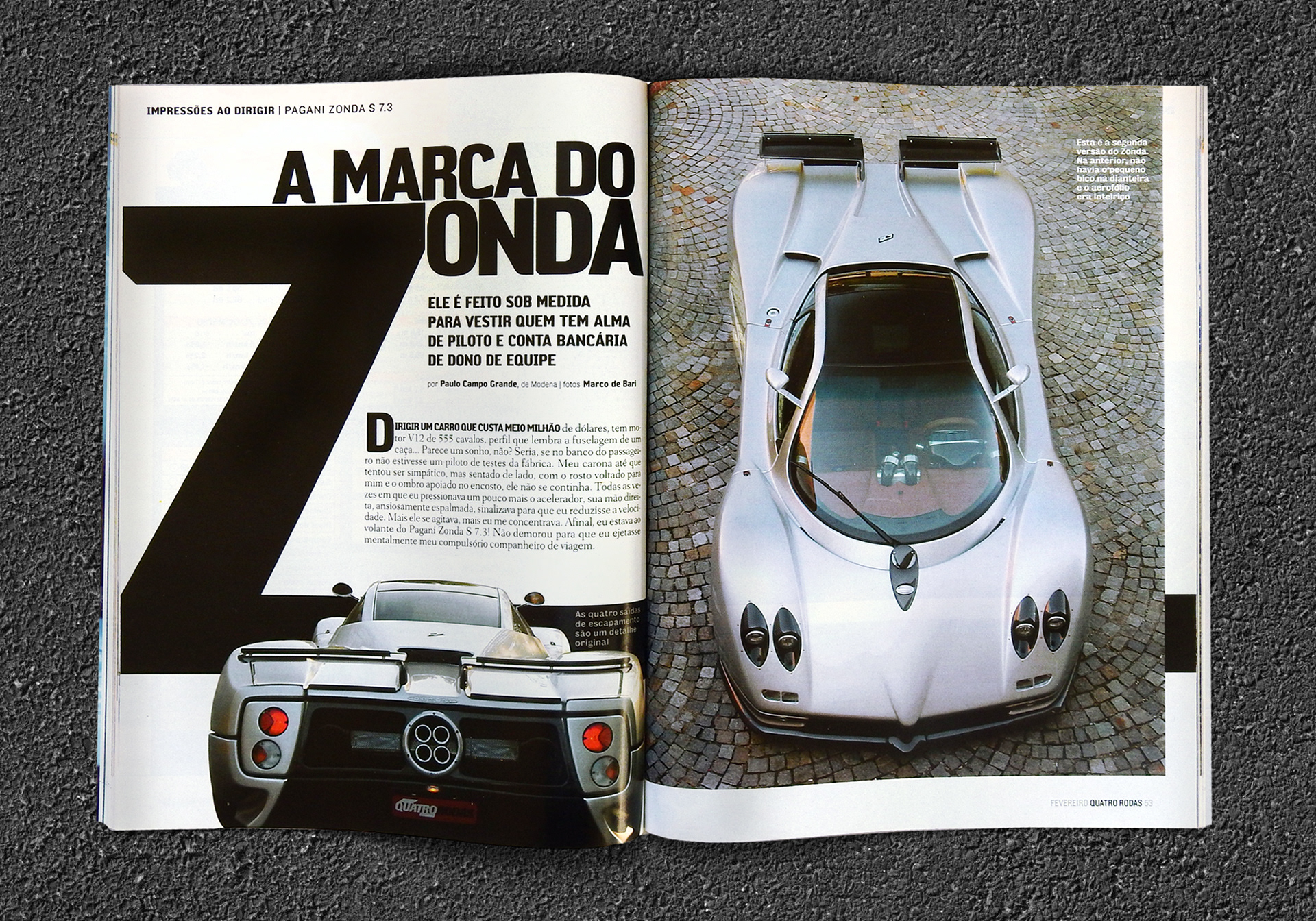
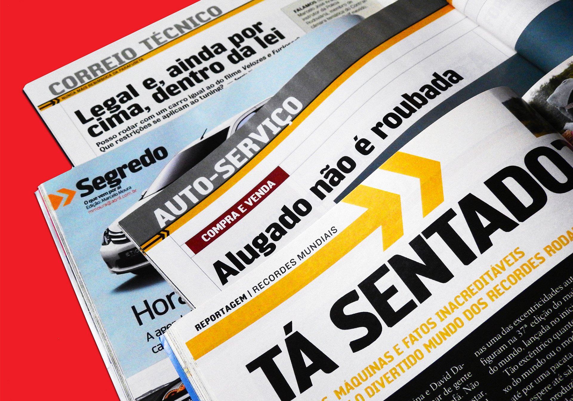
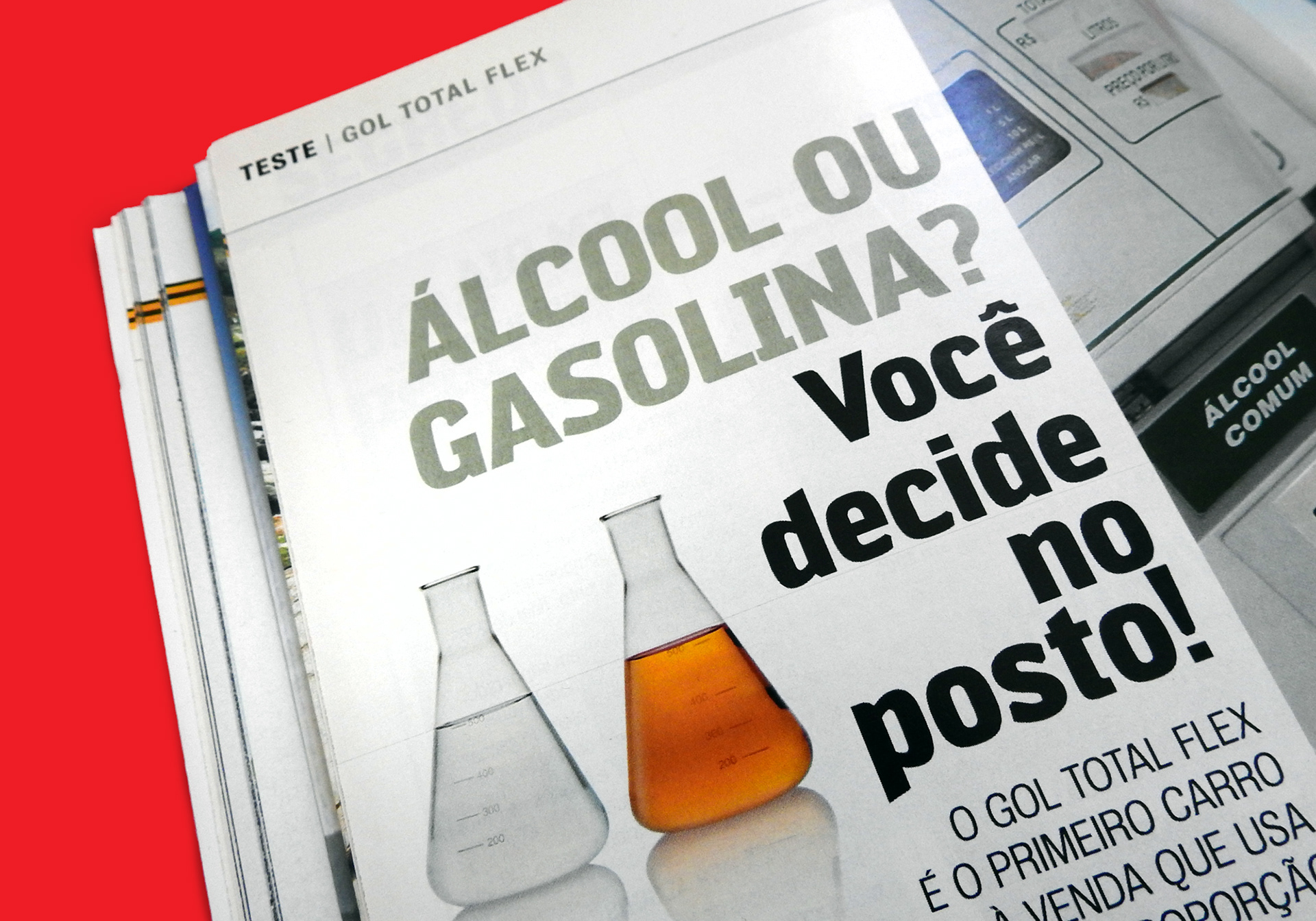
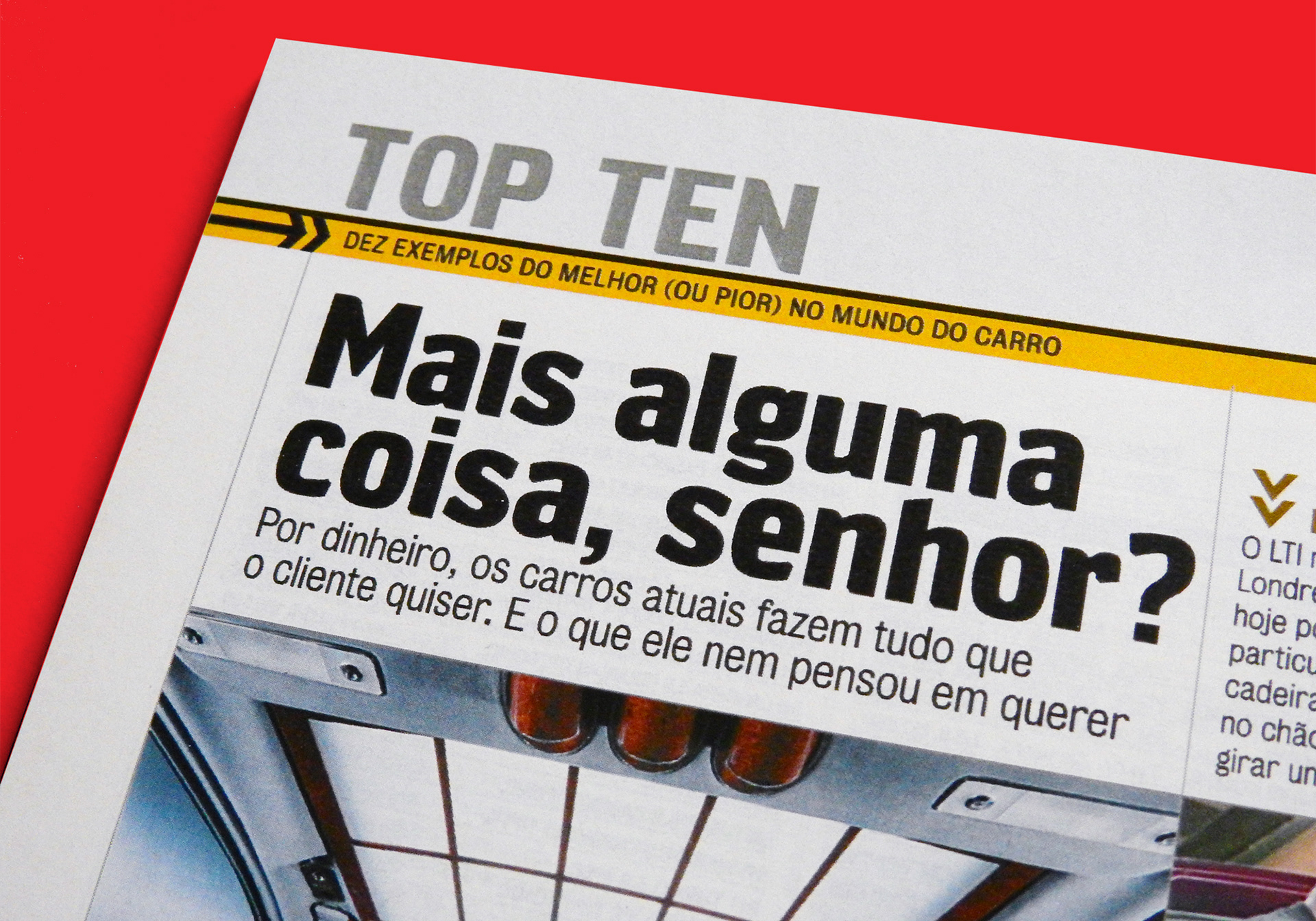
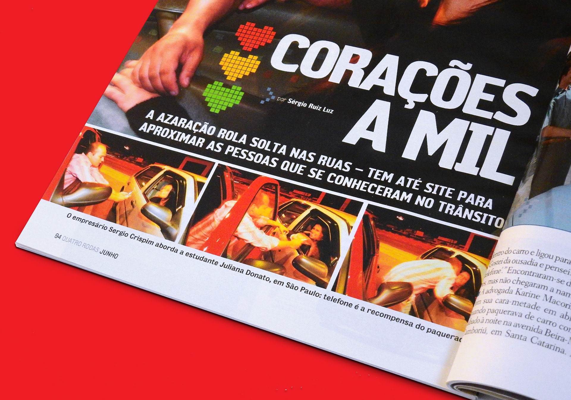
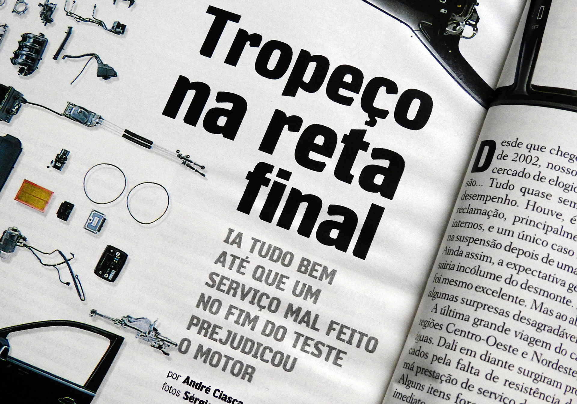
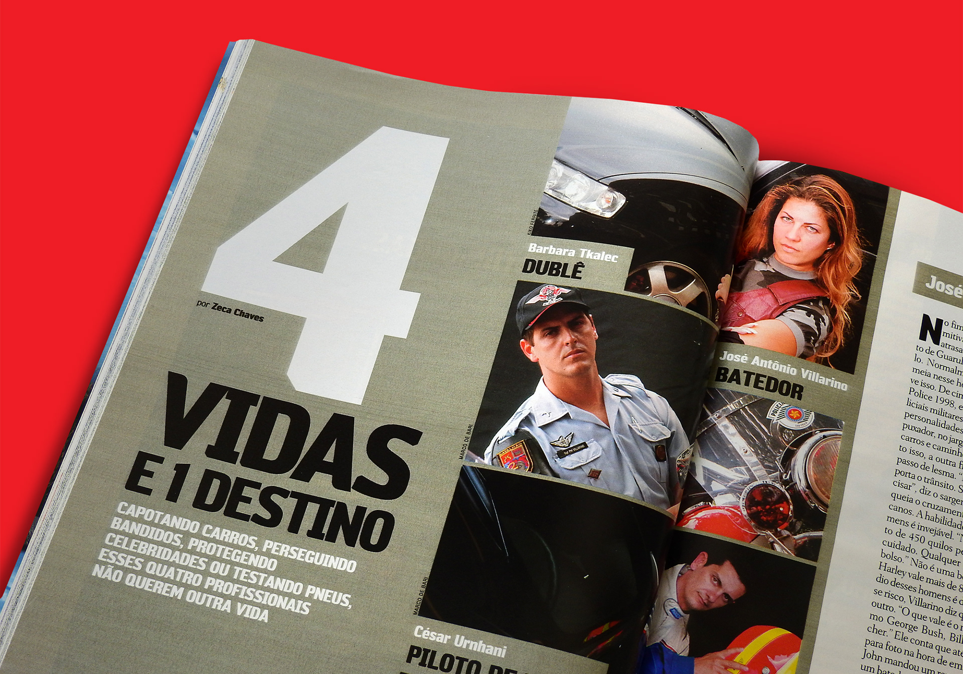
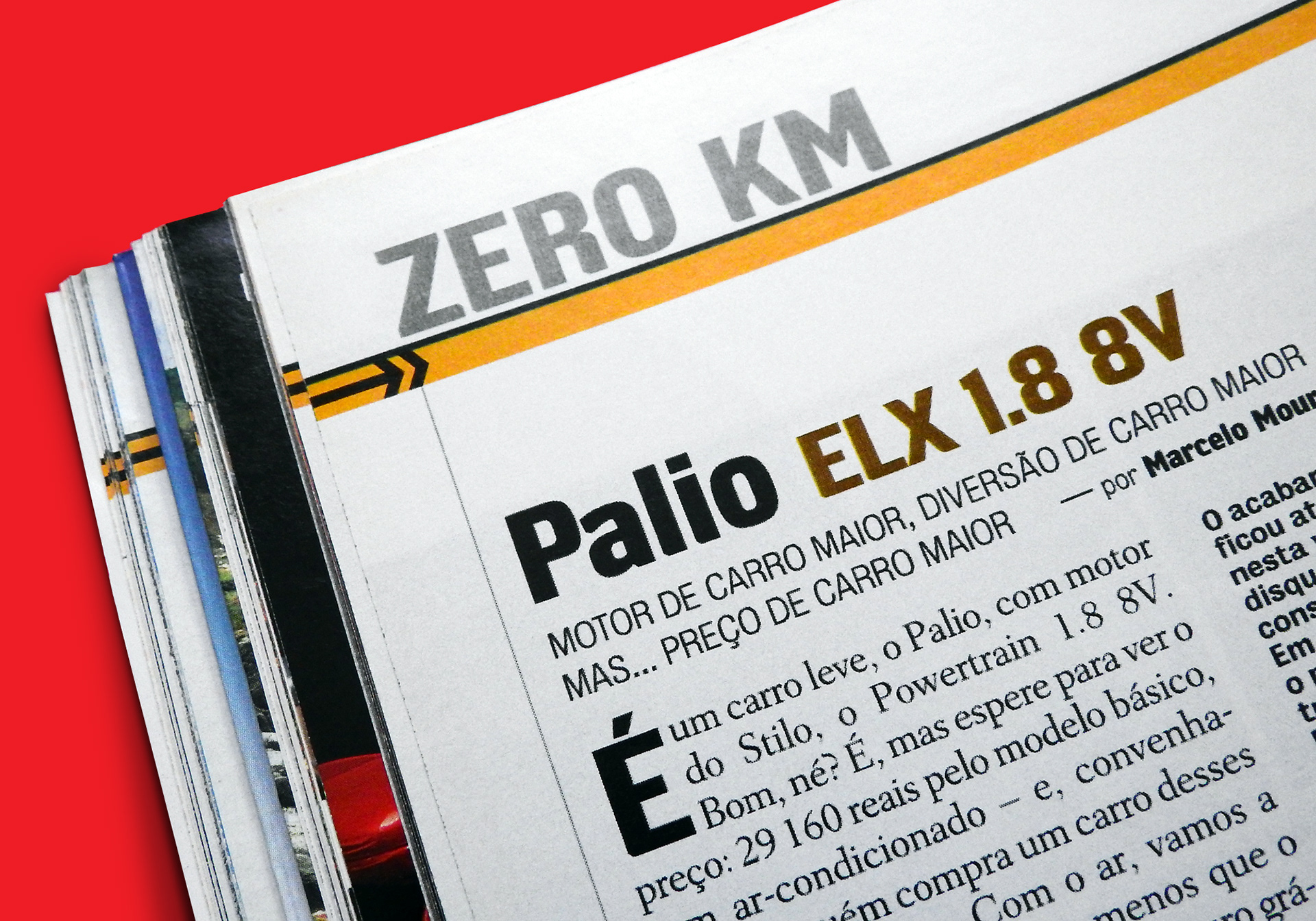
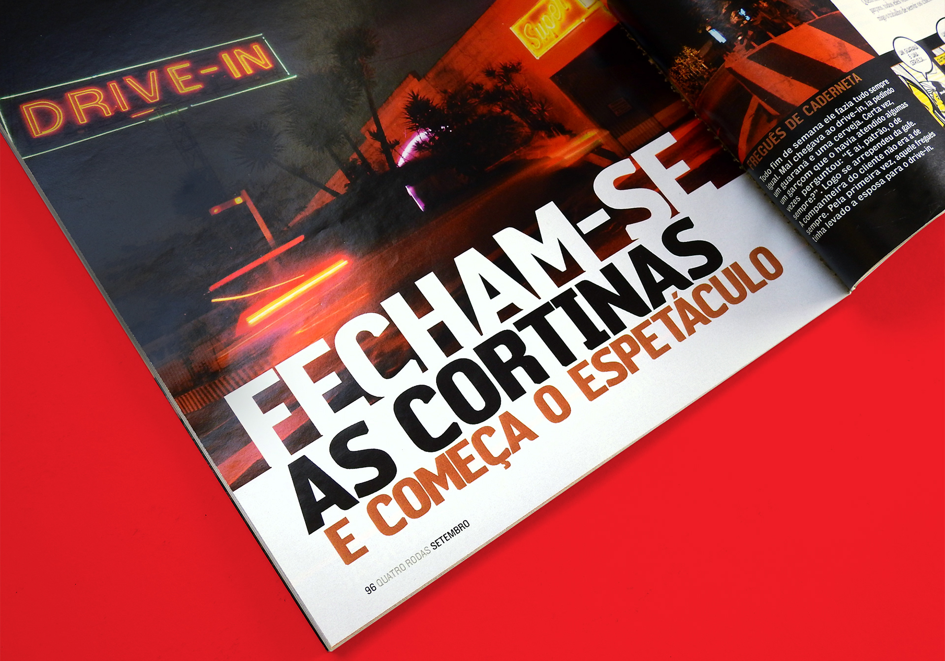
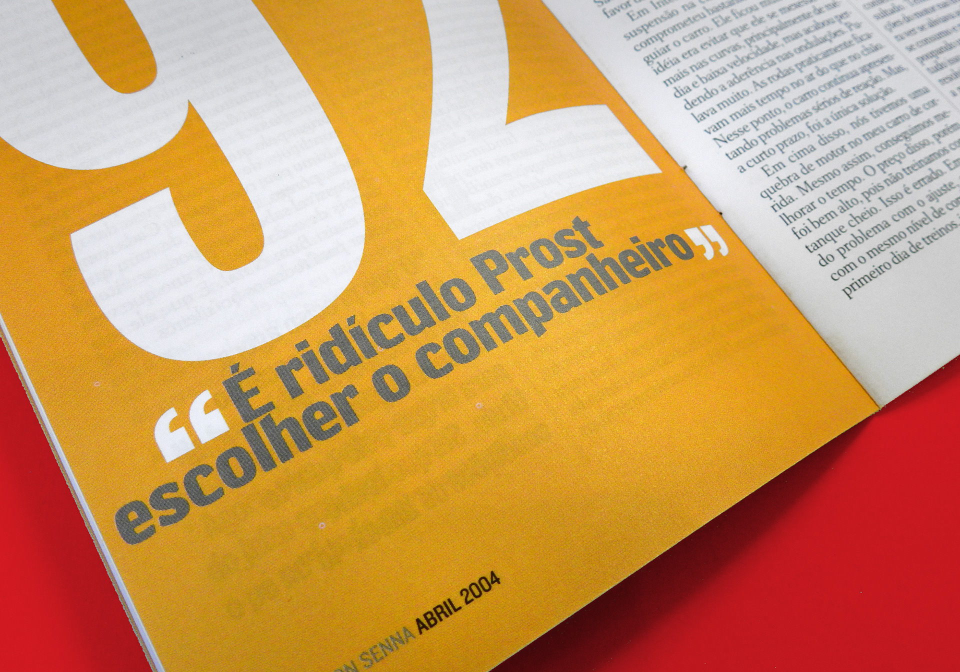
The client knew in advance some basic parameters we would like to have on the font, and that was essential for the tight schedule that was presented to me. The font was intended for headlines, decks and standfirsts. Thus, I had to chance to explore a great level of details on the letterforms, which were inspired by the design of cars of that period. Rodan was designed directly on the black weight, so it has the advantage to look 'natural' at this weight, instead of looking like a derived design from a regular or bold version.
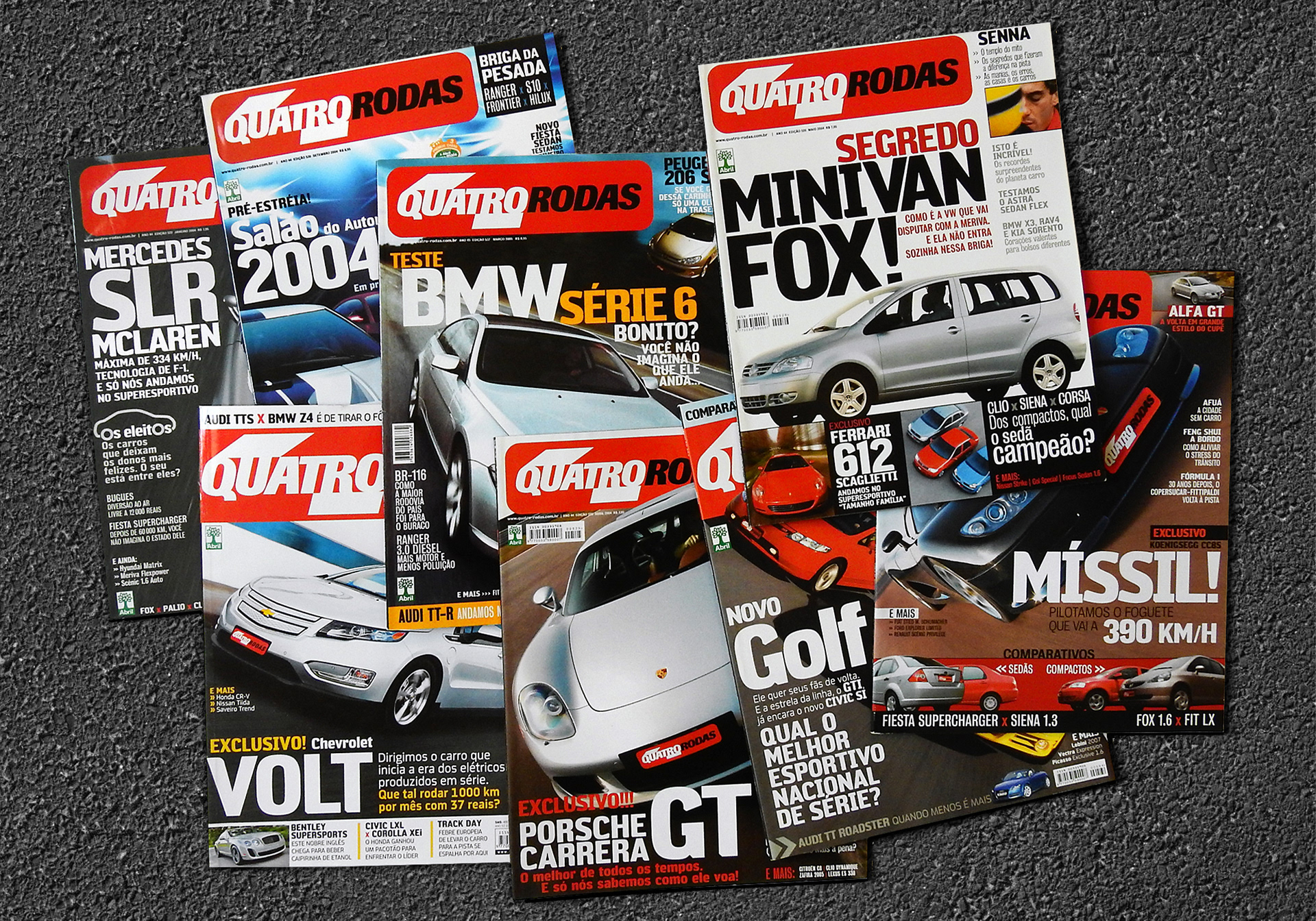
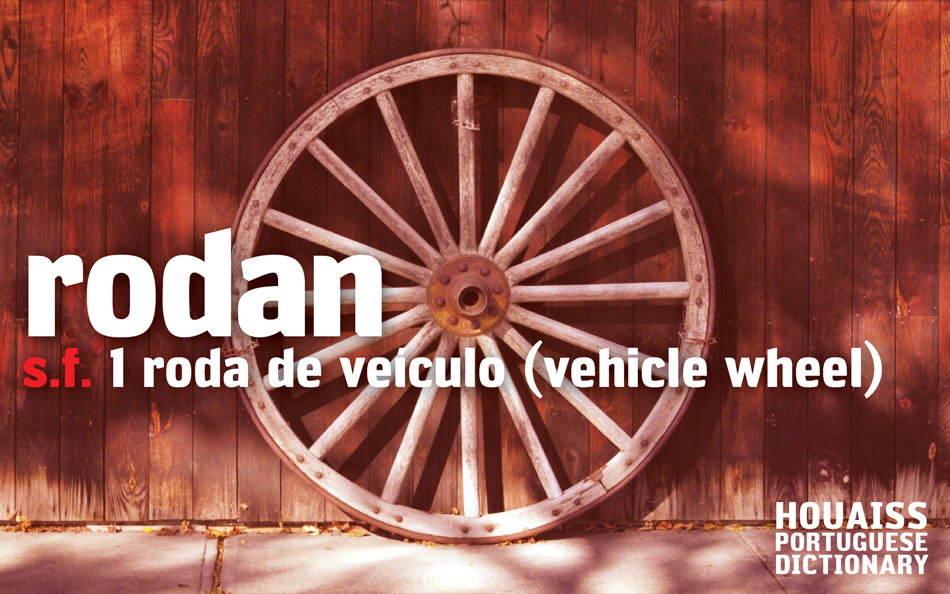
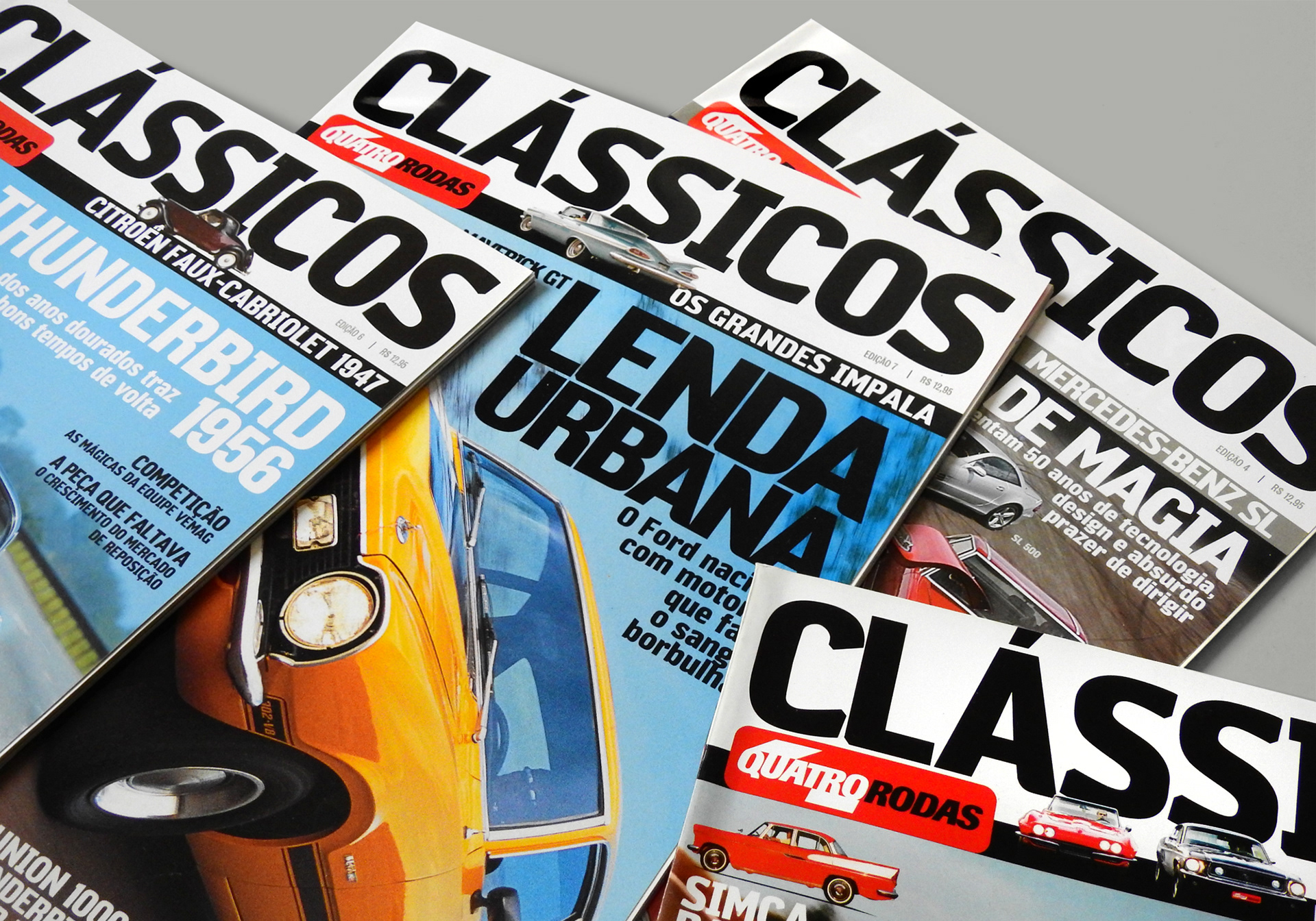
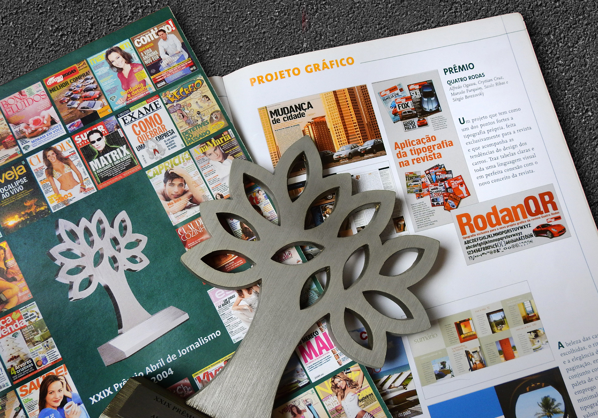
The name Rodan means vehicle wheel in Portuguese, mostly related to that big wheels presented on wagons. The typeface was the official display typeface of the magazine for 13 years, helping to considerably increase the brand awareness of the publication among readers. During this period, the magazine was redesigned twice, and it was interesting to see the typeface attending different demands over the years.
The magazine won the prize Redesign of the Year at 29º Prêmio Abril de Jornalismo, with a remark to the exclusive typeface as the strong characteristic of the new project. It was also featured at the exhibitions TypeCon Gallery 2003 and Bienal Letras Latinas 2004.