At the time of project design, the WebFont technology started to become popular across the internet, but they used only retail fonts and there was no record in the world of corporate typefaces designed for exclusive use on the Internet. As the largest site in Latin America, UOL felt the need to create a unique WebFont in order to enhance the identity of the portal. The new typography would be drawn parallel to the design of the project site and the briefing was to create a design that has a good balance between personality and readability by the immense amount of site users. The biggest challenges would be overcome some technical limitations of the recently launched WebFont technology, such as an automatic replacement for system standard fonts when the user has very old versions of browsers, as well as optimize the text rendering for all browsers and operating systems.
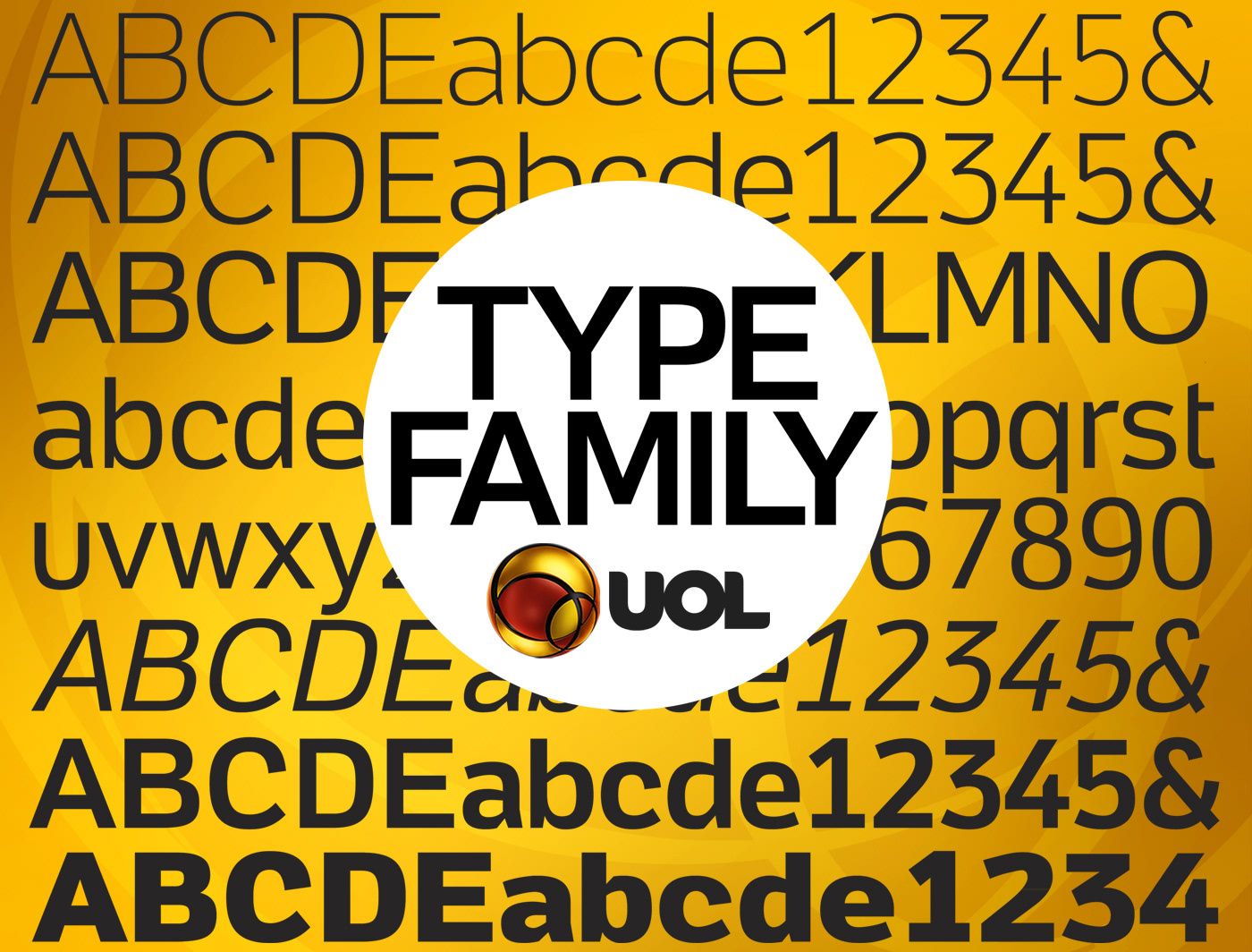
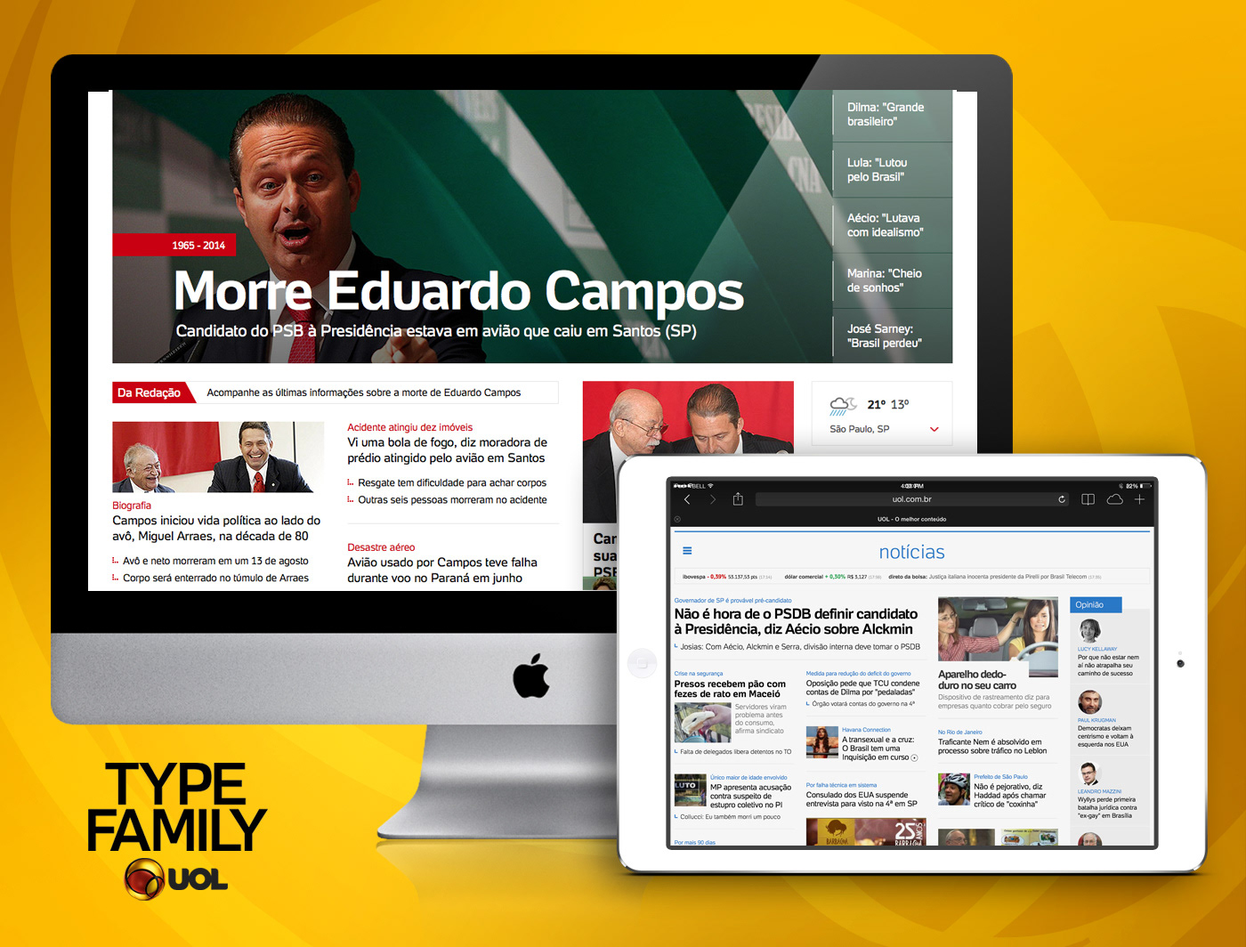
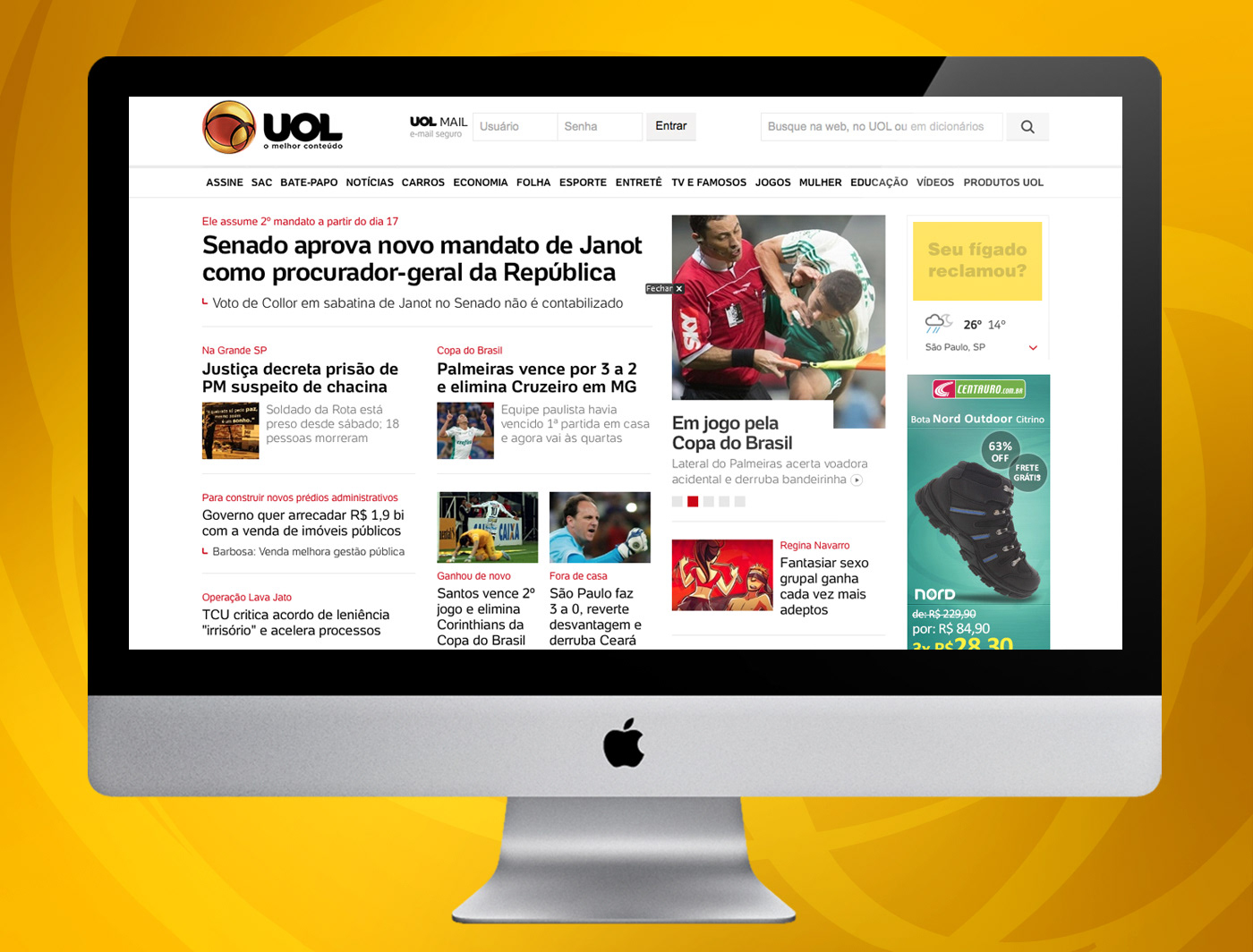
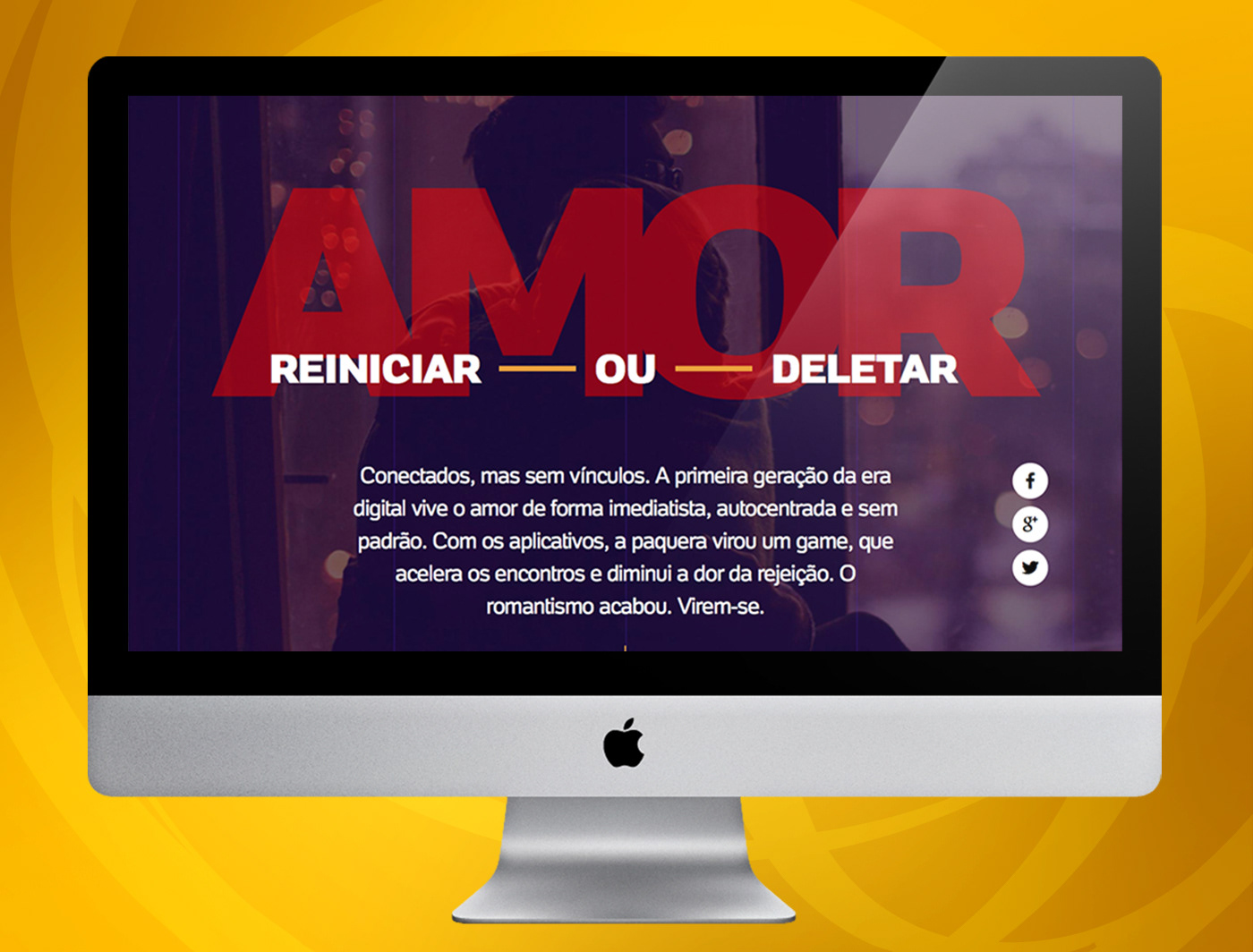
A type family containing nine variations was created. The briefing provided initially fonts for display use, but during the development UOL team identified that typography also looks good on the body text, and in the end adopted the new typography for the entire site content. To solve the technological problem, it used a metric compatible with Arial typeface, which was the source used in the old site design. Thus, during the implementation phase of the new graphic design, the two fonts could coexist without causing many problems in viewing content, and not compromise navigation in older browsers. A year after the start of implementation, the new typeface was applied in 100% of portal texts and also in the offline parts such as corporate identity and advertising. This fostered an exclusive communication line and standardize all communication of UOL, and differentiate from other portals.
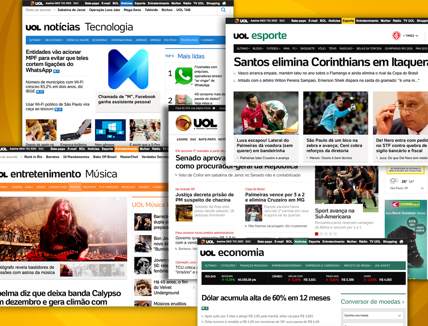
See the type family in action at www.uol.com.br
Creative director: Crystian Cruz
Type designers: Crystian Cruz & Marina Chaccur