Description:
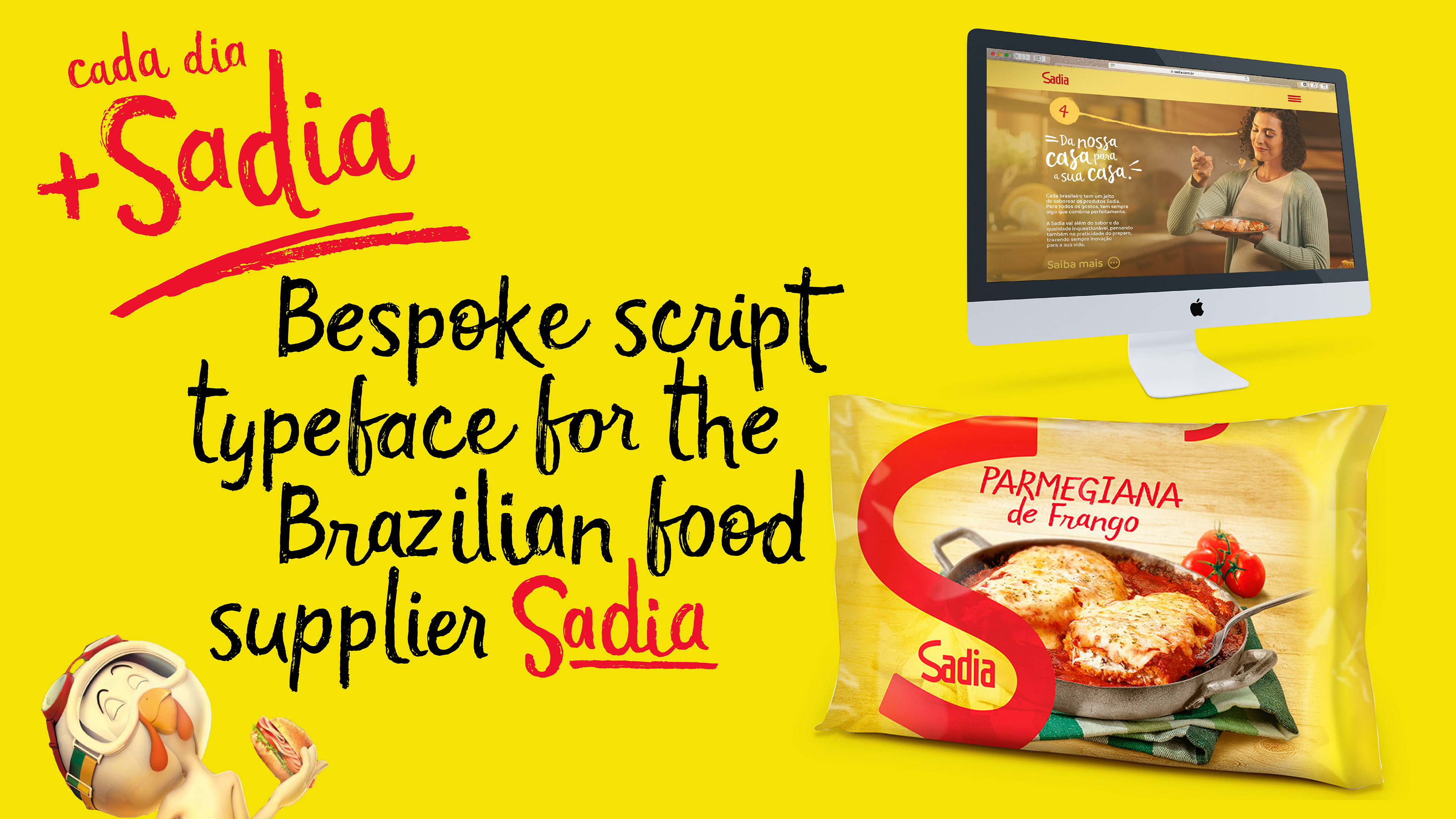
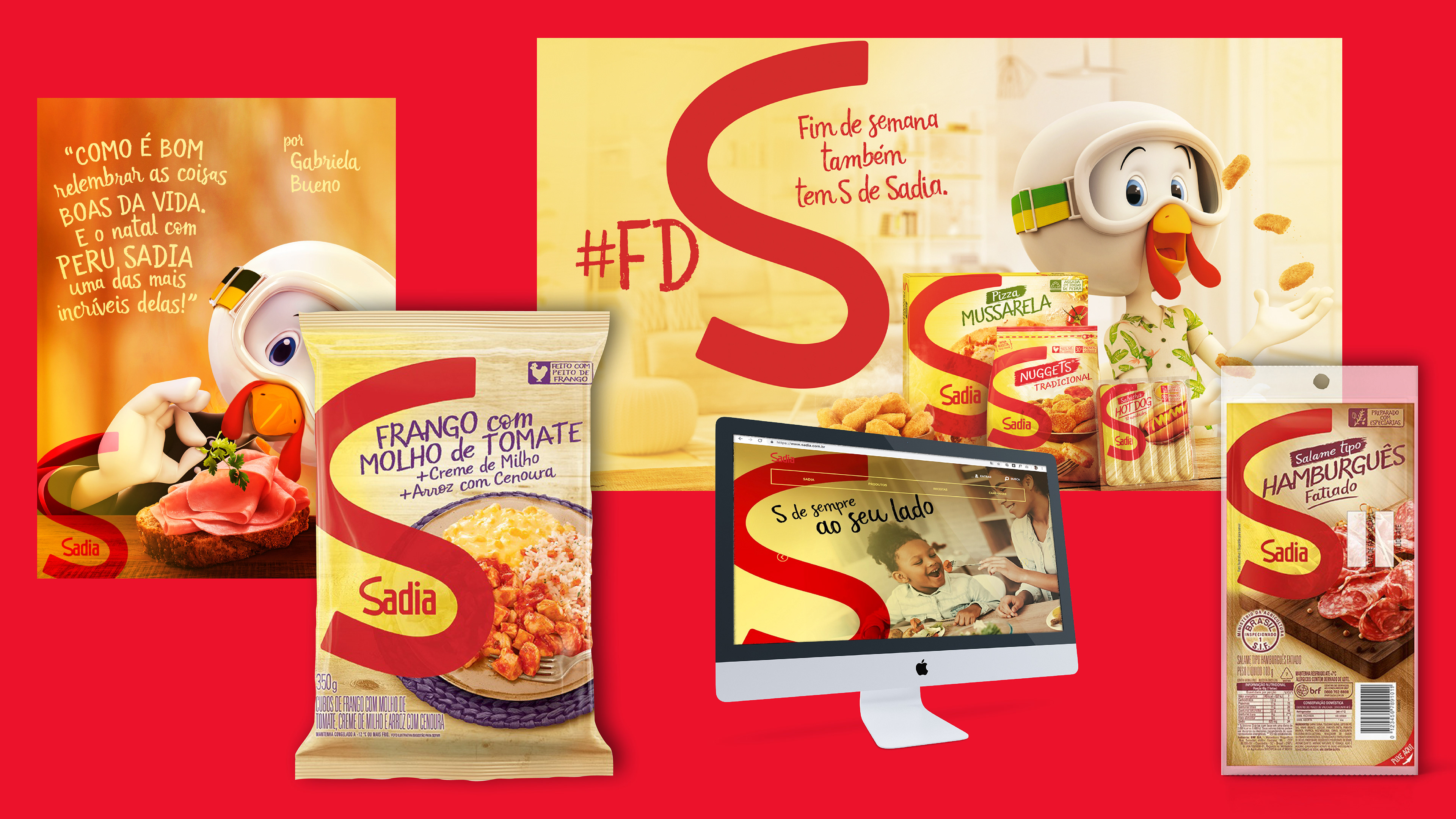
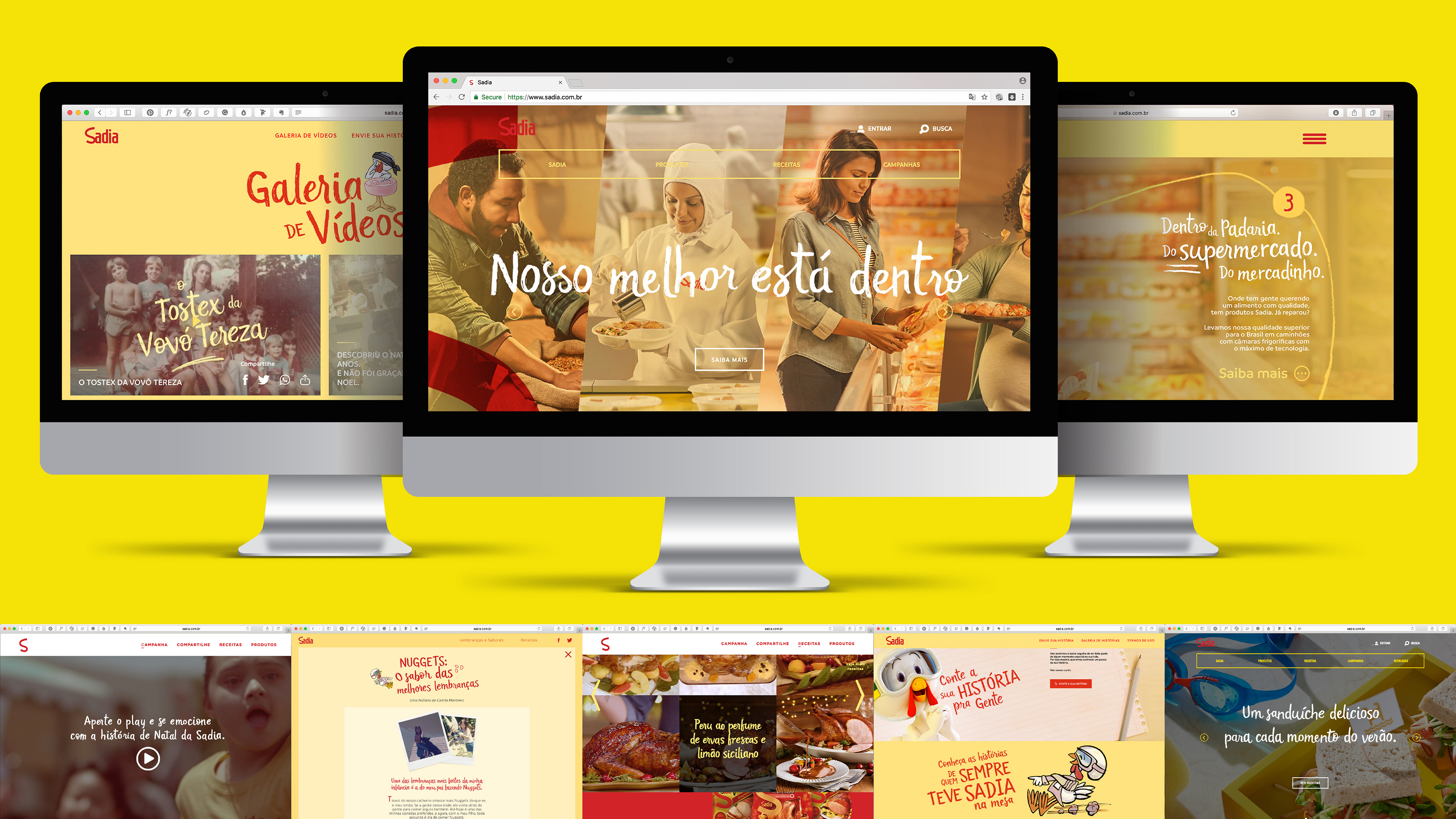
A market as competitive as the food sector in Brazil demands visual communication with differential, to stand out in points of sale and contribute to the loyalty of the public. Sadia is one of the most traditional suppliers of refrigerated products in Brazil. In the campaign launched in 2017 by F/Nazca and Team Creatif, which included not only new advertising but a more standardized language for all packaging, a need arose for creating a bespoke to represent the new branding. “Cada Dia + Sadia” is a script typography created exclusively for Sadia, and its construction was marked by the unusual exploitation of Opentype technology to meet the demands of the briefing.
Objectives:
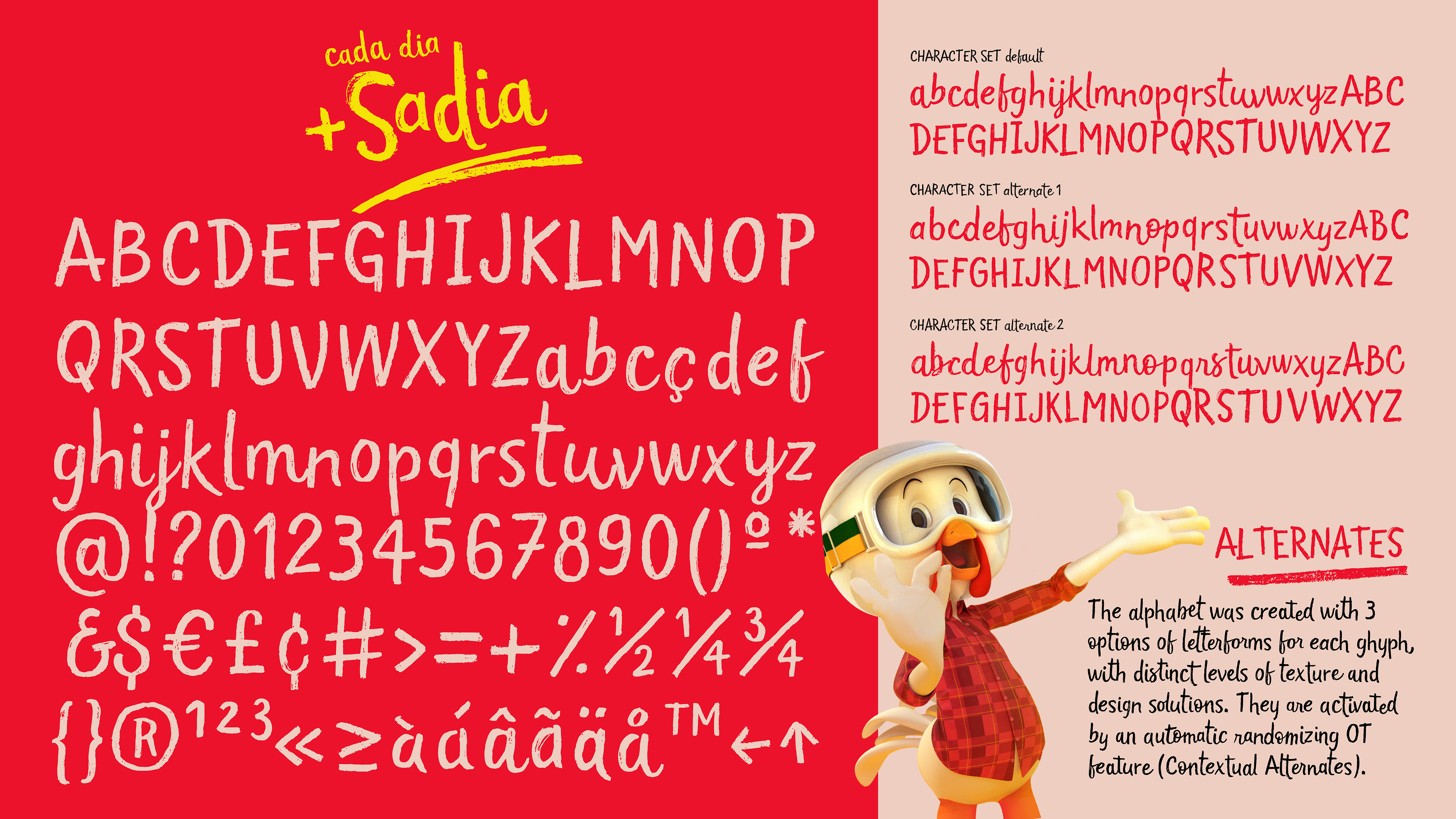
The new font should meet the demand for informality and casualty that was at the heart of the new positioning while maintaining an aesthetic standard consistent with a leading brand. Within this context, it was essential to create a font with hand-drawn features, such as the texture of brush strokes and paint flaws. Alternate glyphs were inserted to avoid the mechanical feel in the composition of titles and product names. The biggest challenge would be to create a font that works well as a display font (advertising campaigns and point of sale displays) and also as a text font (packaging).
Results:
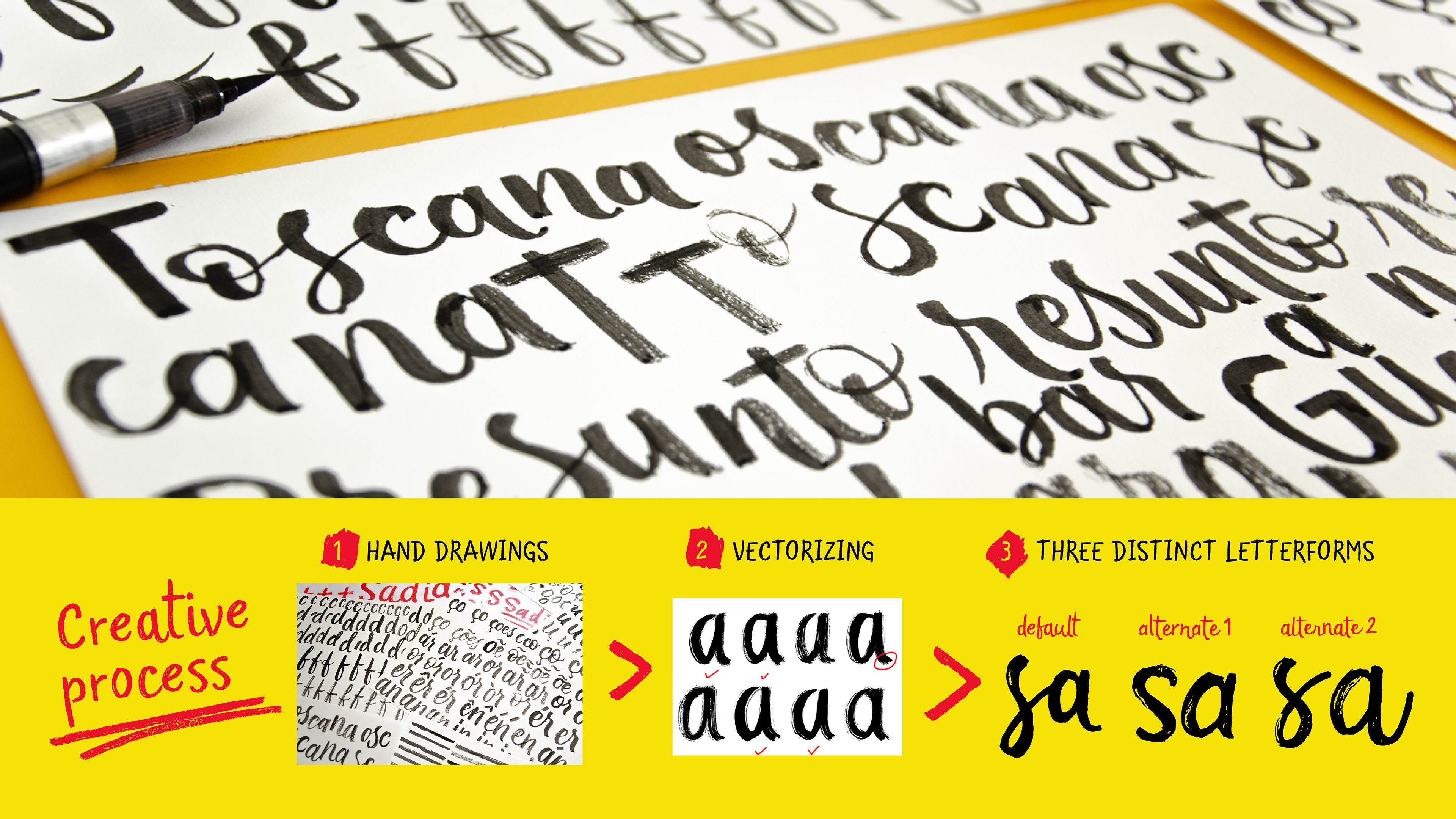
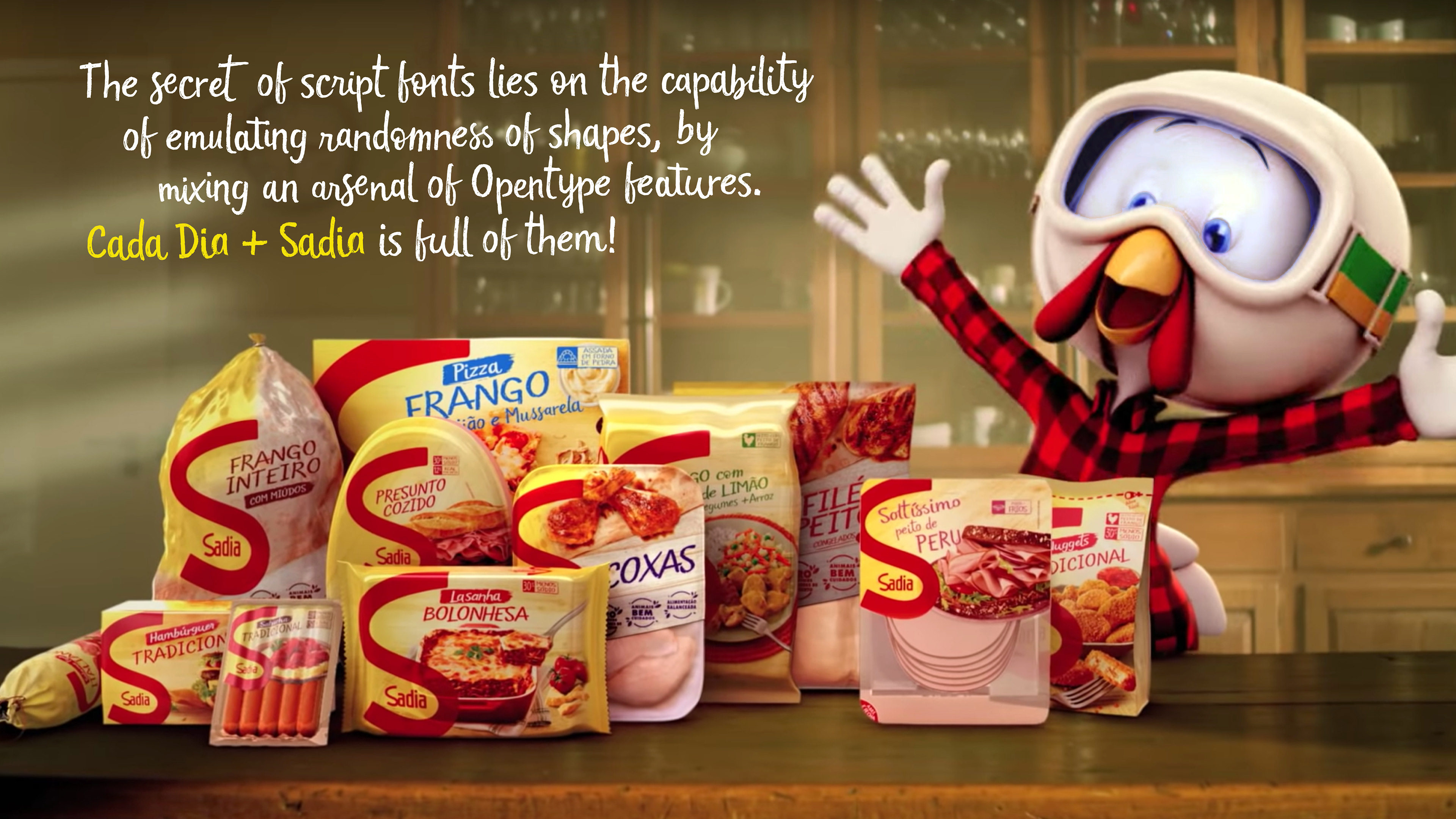
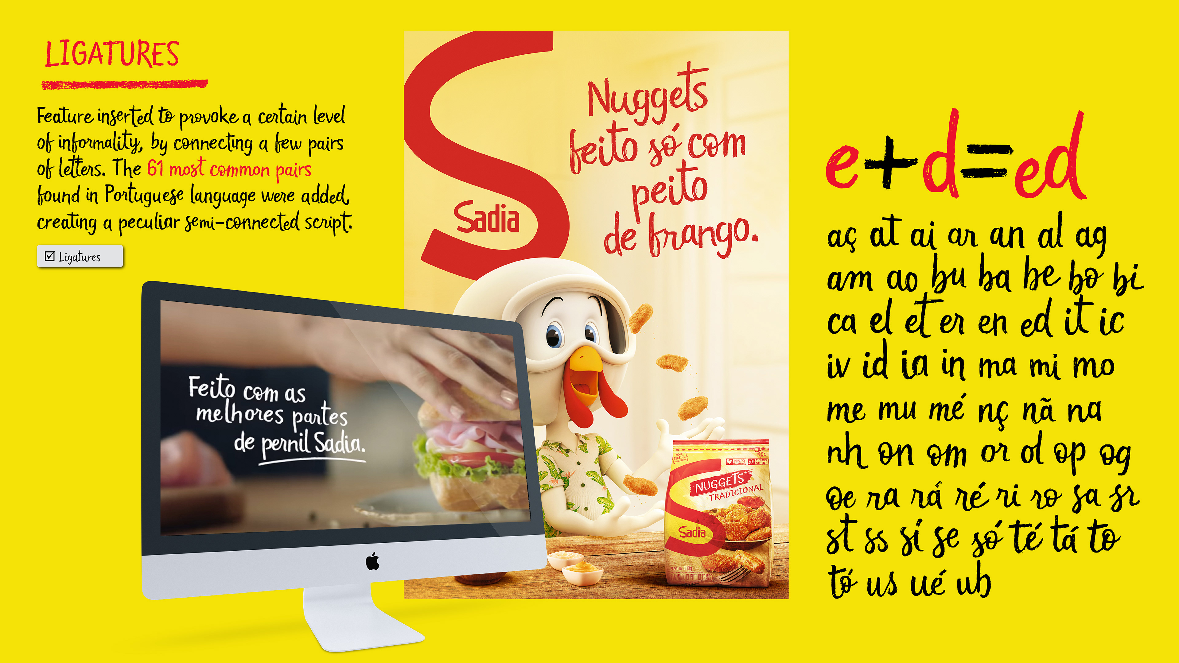
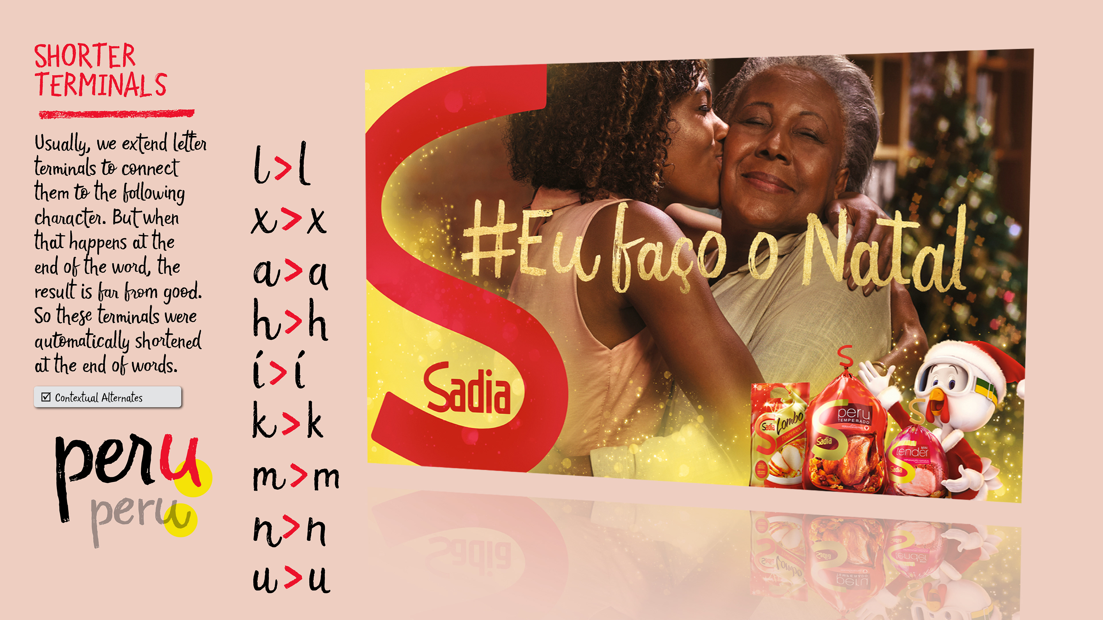
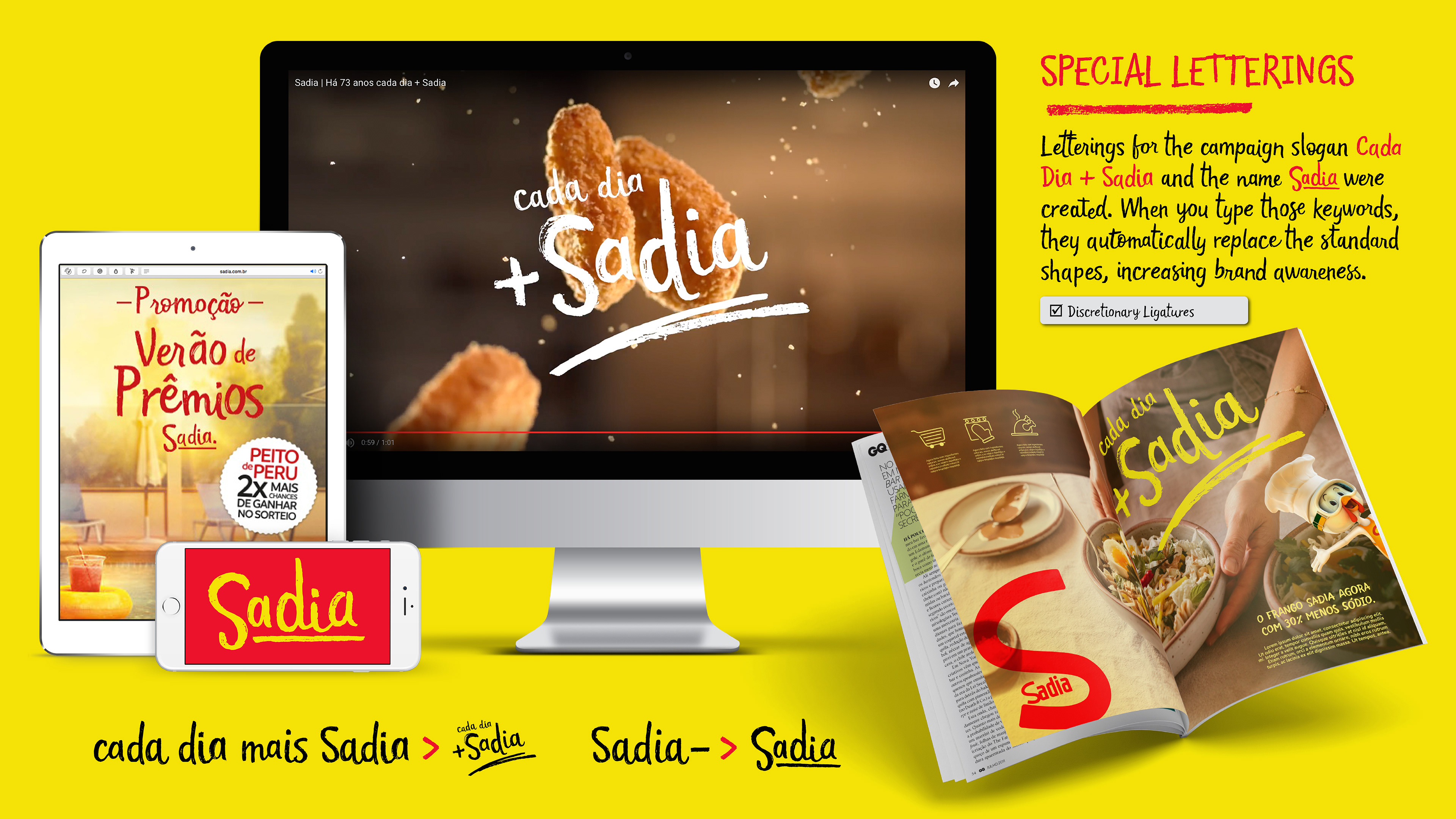
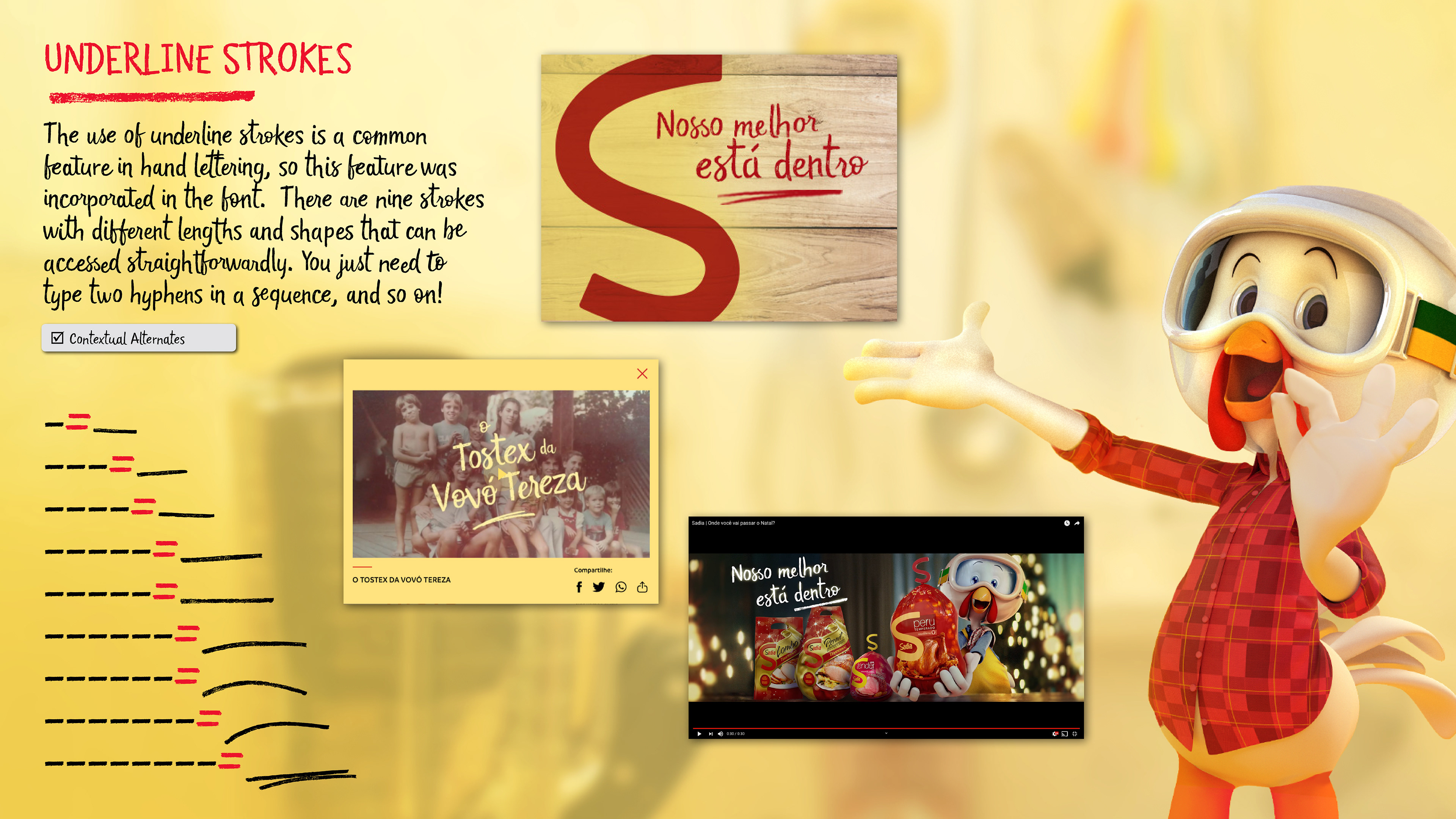
There were two essential steps in the design process: paper drawing and scanning of all glyphs for later vectorization, and OpenType programming that ensured the natural and casual look of writing. From the scanned images, three versions of each glyph were chosen to create the vector trace. These design variations were programmed to produce certain randomization in glyph choice (contextual alternates), preventing repeated glyph designs when the same letter appears more than once in the same word. Furthermore, 61 most common Portuguese letter pairs were added as ligatures, creating a peculiar semi-connected script style. Some custom OpenType features have been included, such as shorter endings when the letter occurs at the end of words, in addition to advertising letterings and a series of 9 underline strokes that can be activated by repeatedly typing the hyphen.
------
TEAM:
Creative Director: Crystian Cruz
Typeface Design: Crystian Cruz & Lucas Gini
Clients: Team Creatif + F/Nazca
------
AWARDS:
Project selected for the 13th Brazilian Biennial of Graphic Design
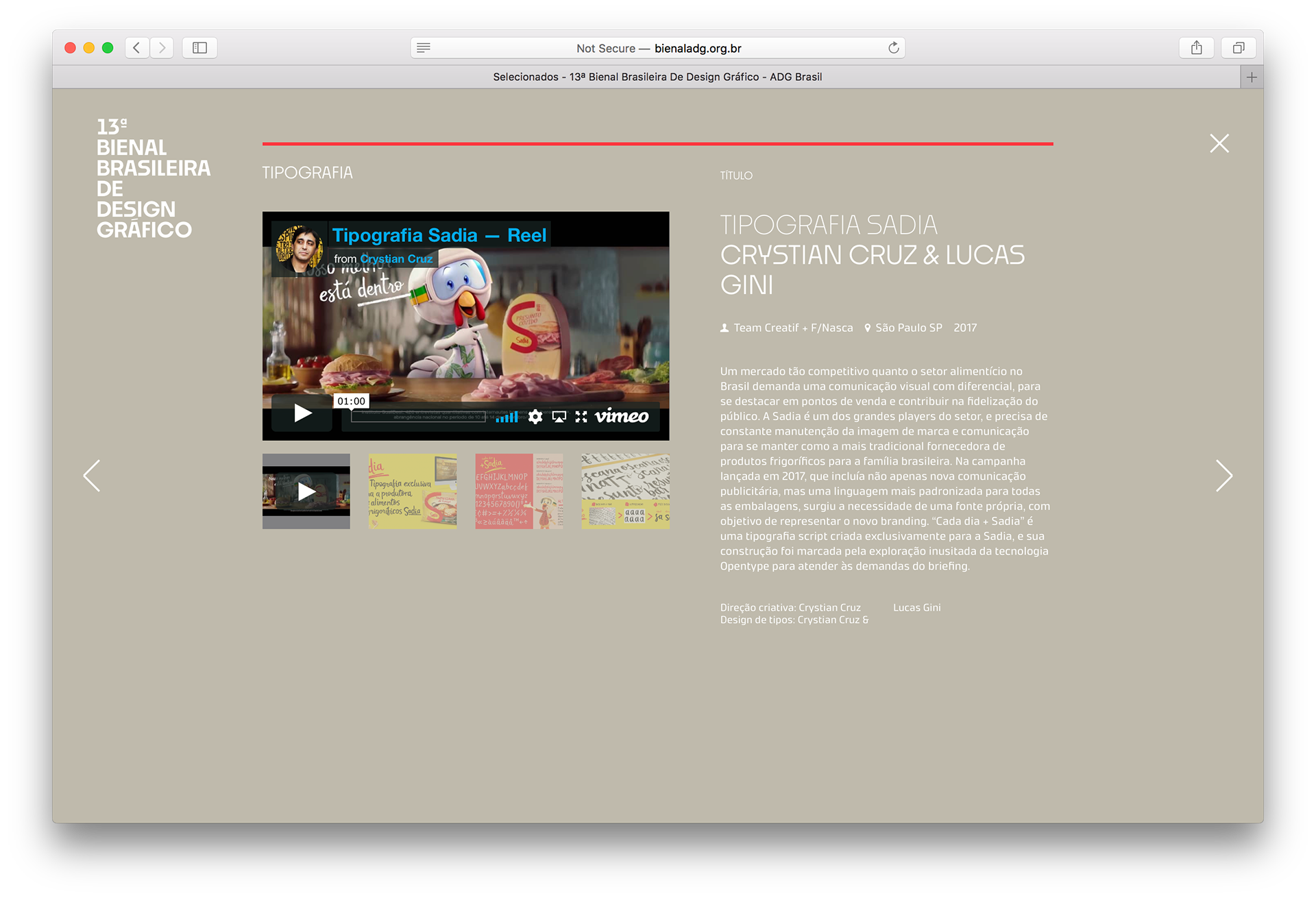
Reel - typeface Sadia in use on TV and web
------------