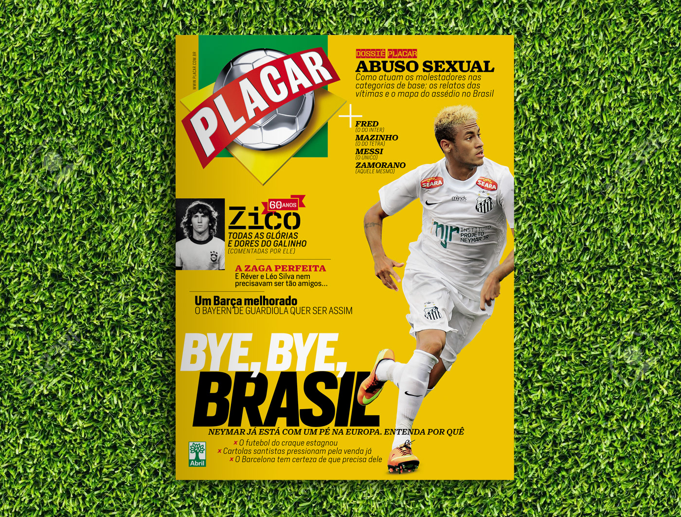
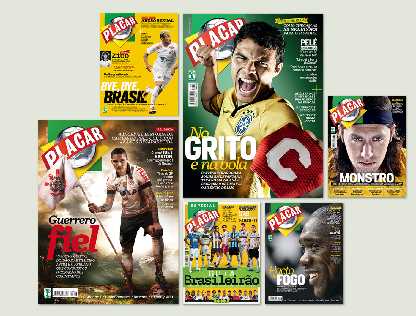
One of the most traditional magazines in Brazil, Placar was keeping the same visuals for the last 7 years. The redesign was the result of a profound reflection on the history of the magazine and its role today in sports journalism, supported by new pillars to seek greater appreciation of the use of images and the magazine historical archive.
Unlike other publications, Placar has no competition in football magazines segment. But increasingly competes with TV, websites and social networks. Within this context, the challenge was to maintain and expand the relevance of the magazine among the consuming public of football. To meet this demand, it was found that the project needed to be more dynamic and avant-garde.
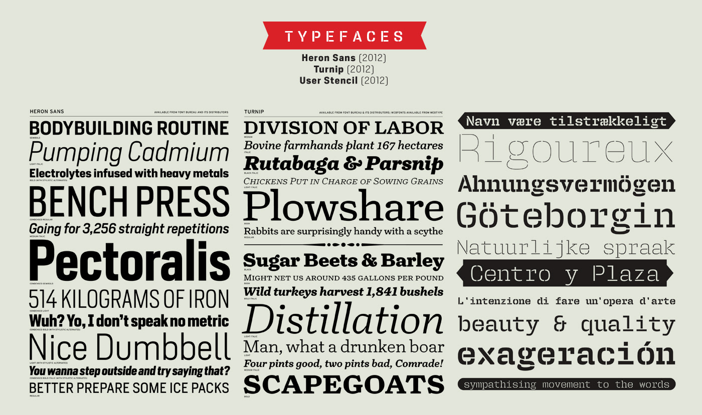
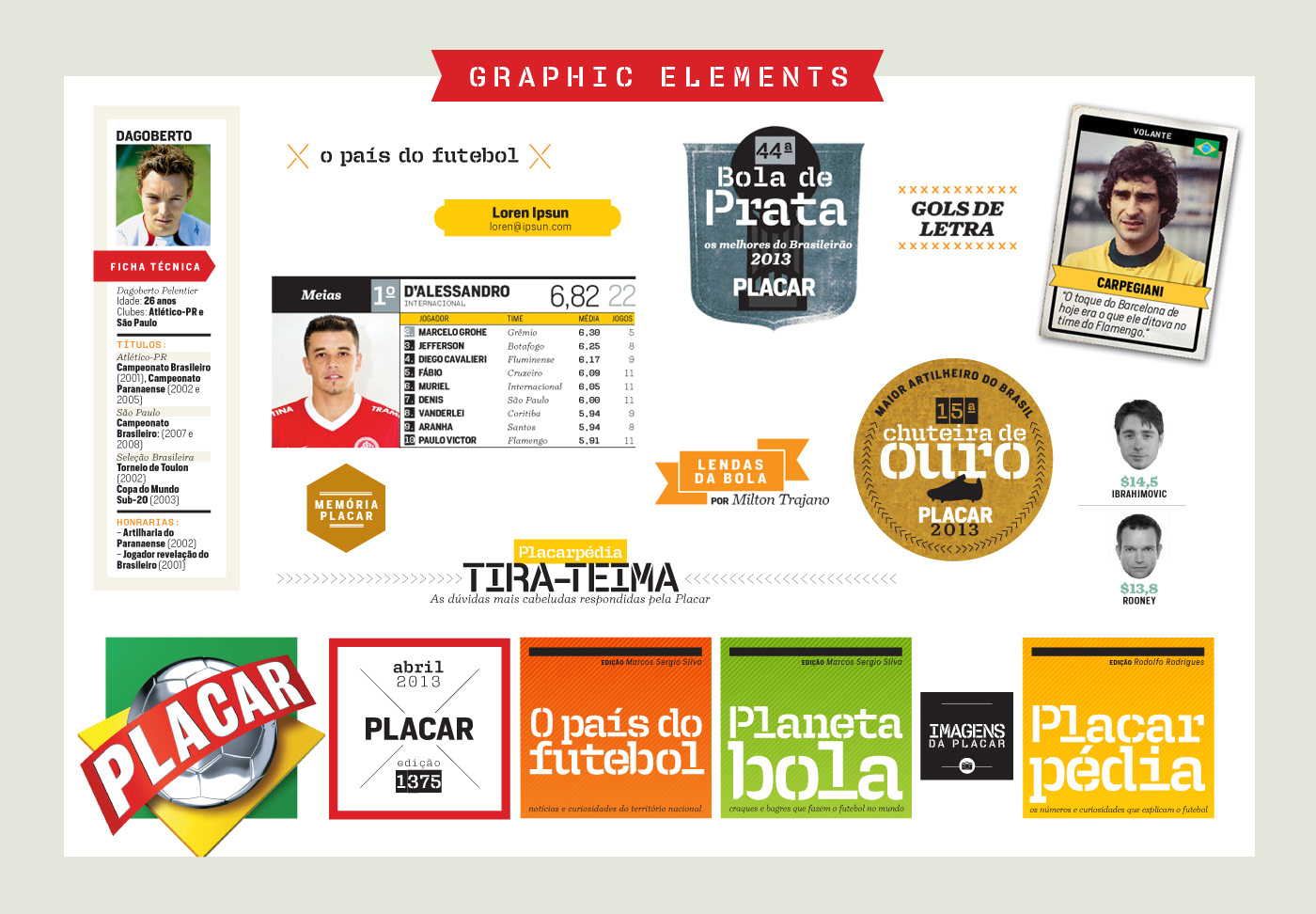
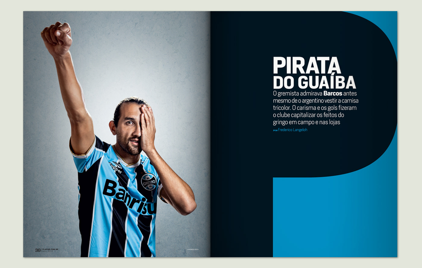
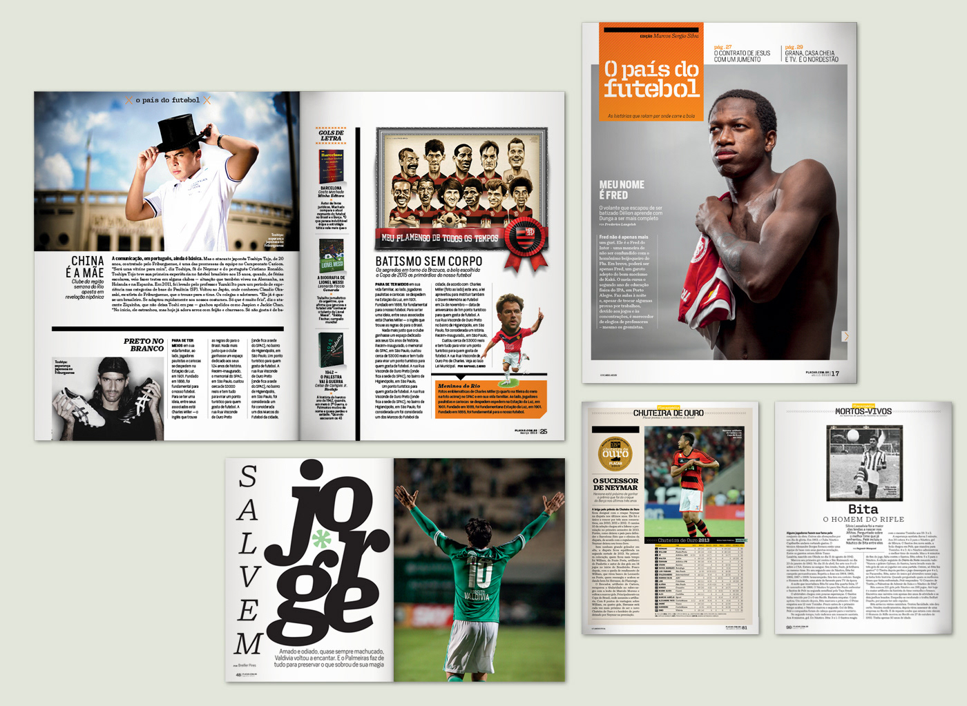
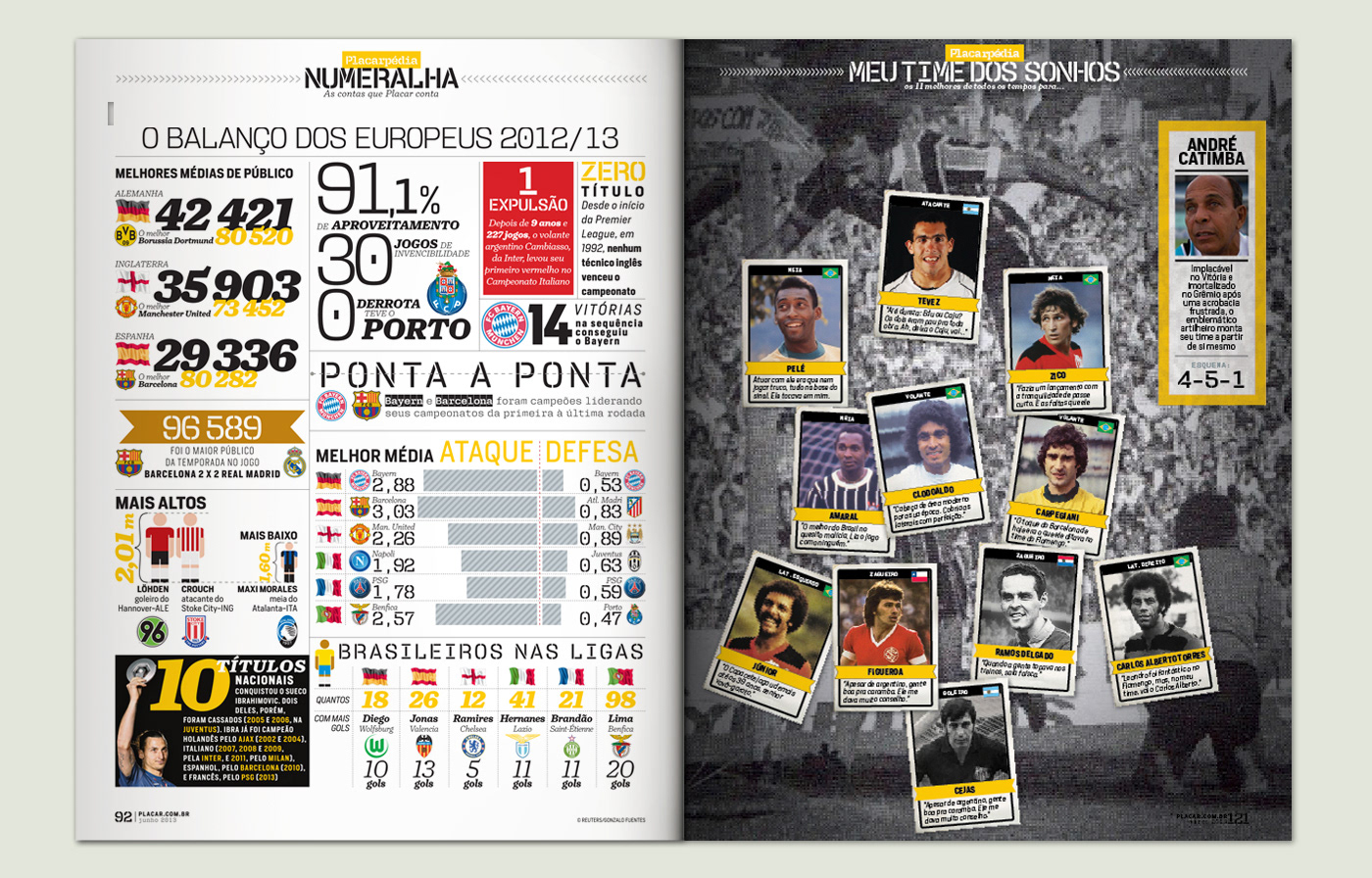
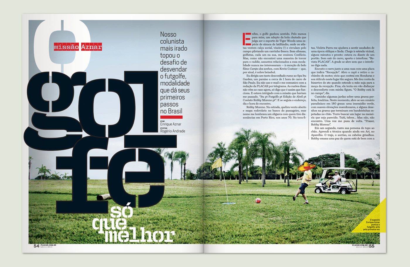
The path taken was the retro design, since the project sought a greater appreciation of the historical collection. To give an air of exclusivity, it was only used recently released typefaces, and it was adopted a new guideline for the photo production. The grid was increased from 3 to 12 columns and the spacing was decreased dramatically, which provided more dynamism to the text area and allowed the use of larger images. Sections won a single-page opener, and this has become a prime space for the use of photographs and illustrations.