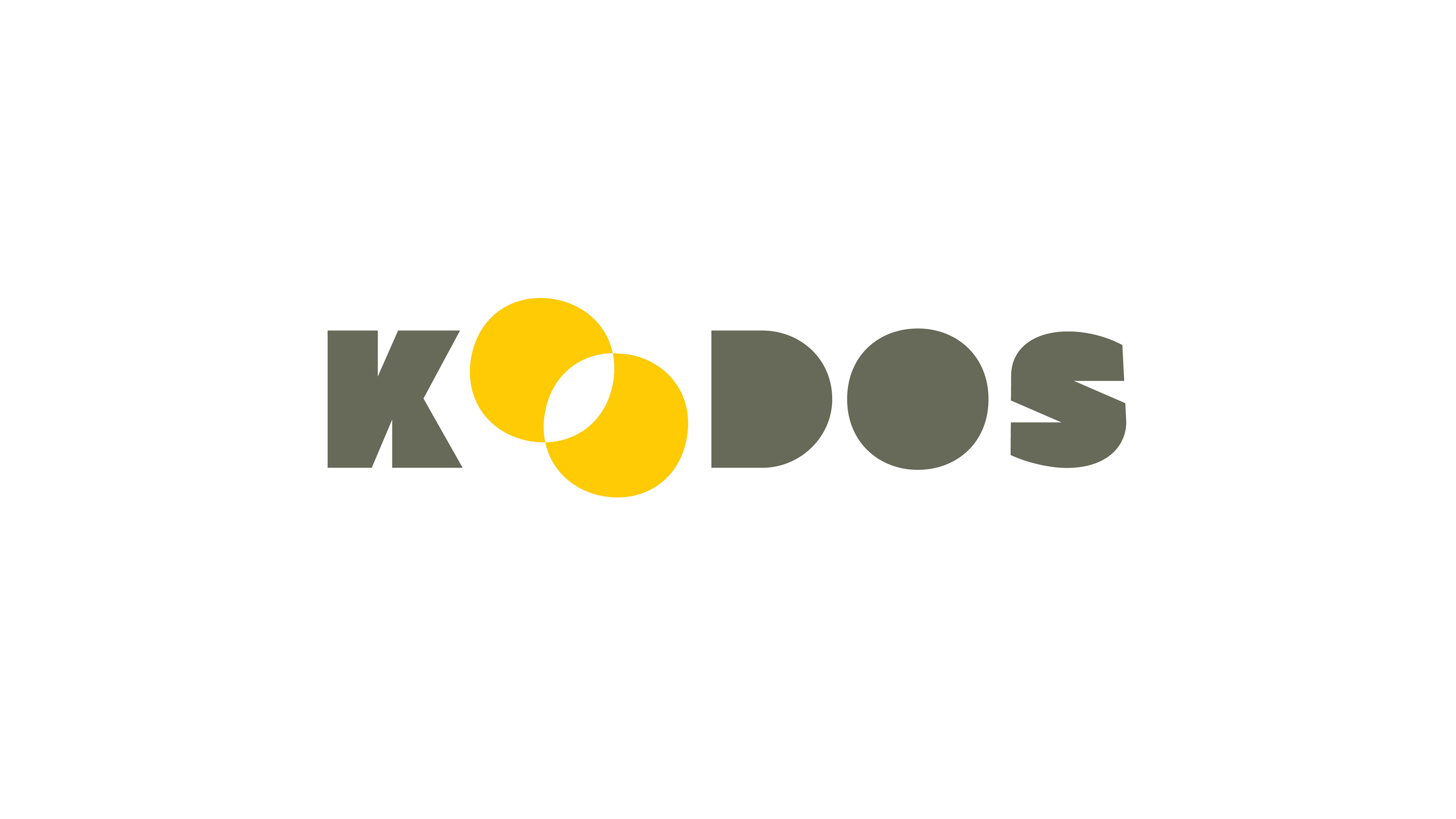
Brand identity for Koodos, a full-service Australian marketing & advertising agency. The design approach revolves around the central theme of achieving marketing goals through collaboration and problem-solving—an ethos embodied in the elegant simplicity of the Venn diagram.
Koodos stands at the intersection of collaboration and problem-solving, symbolising the commitment to being the catalyst for their client's success. The Venn diagram becomes the visual metaphor for the role in bringing together diverse ideas and solutions, seamlessly aligning with their client's marketing objectives.

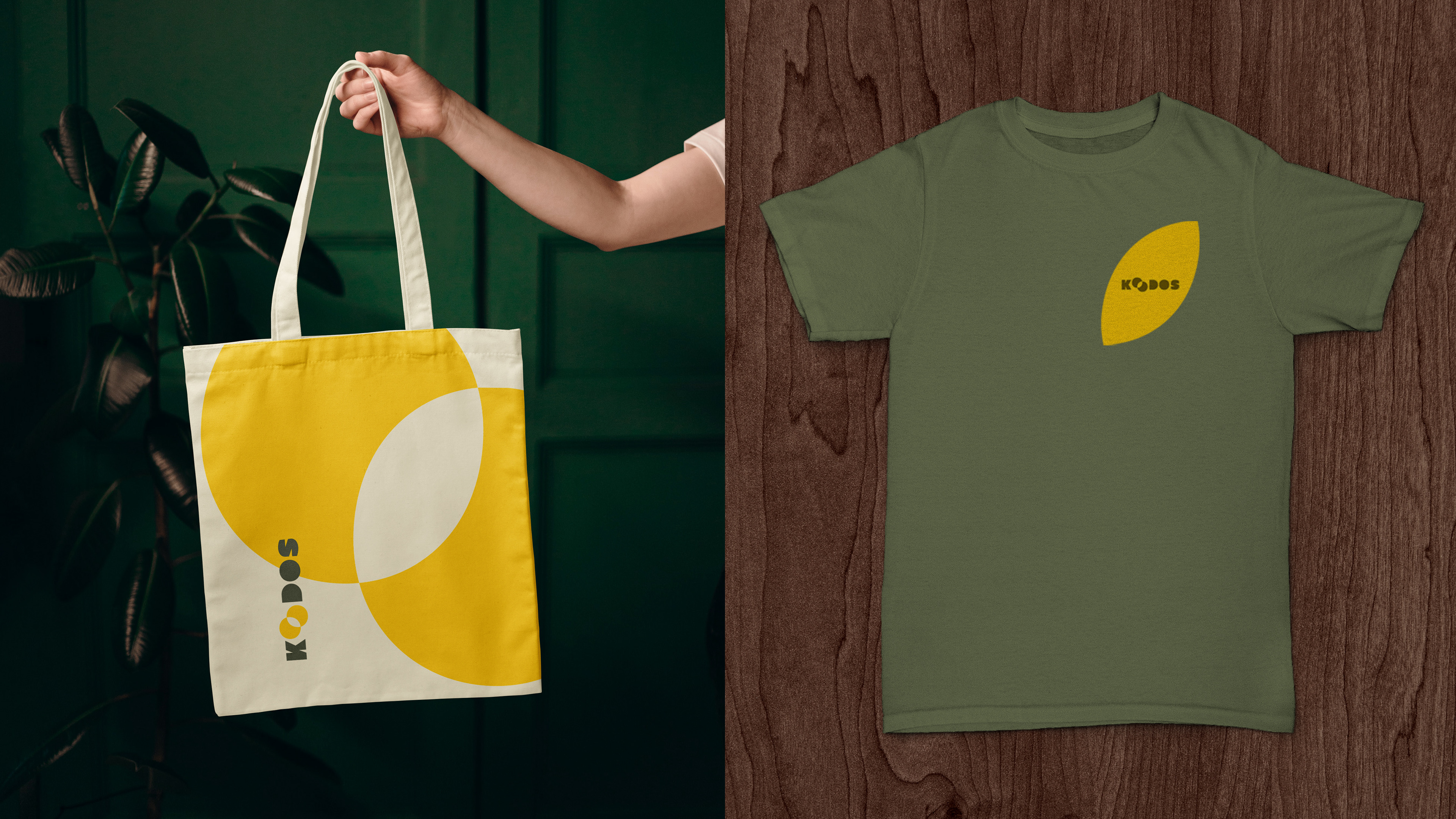
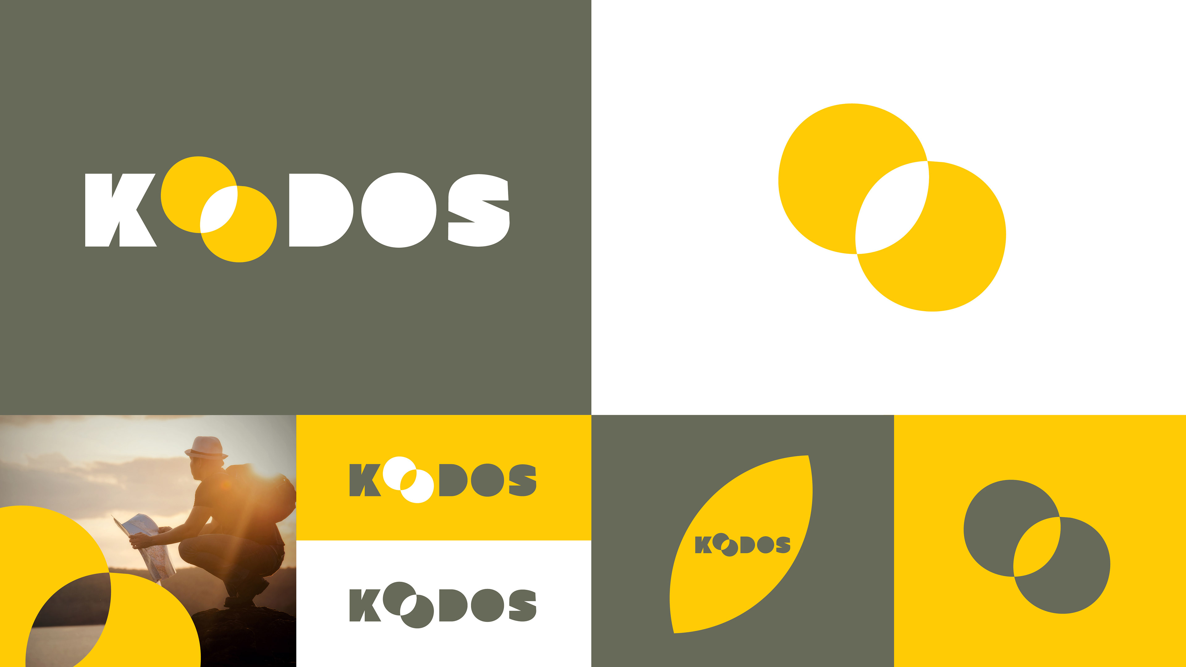
The carefully curated color scheme reflects the versatility and impact of Koodos. Vibrant golden yellow exudes energy and attention-grabbing vibrancy, while olive green offers a touch of sophistication and neutrality. This intentional duality allows for a strategic choice with each piece—whether to command attention or to convey a message with understated elegance.