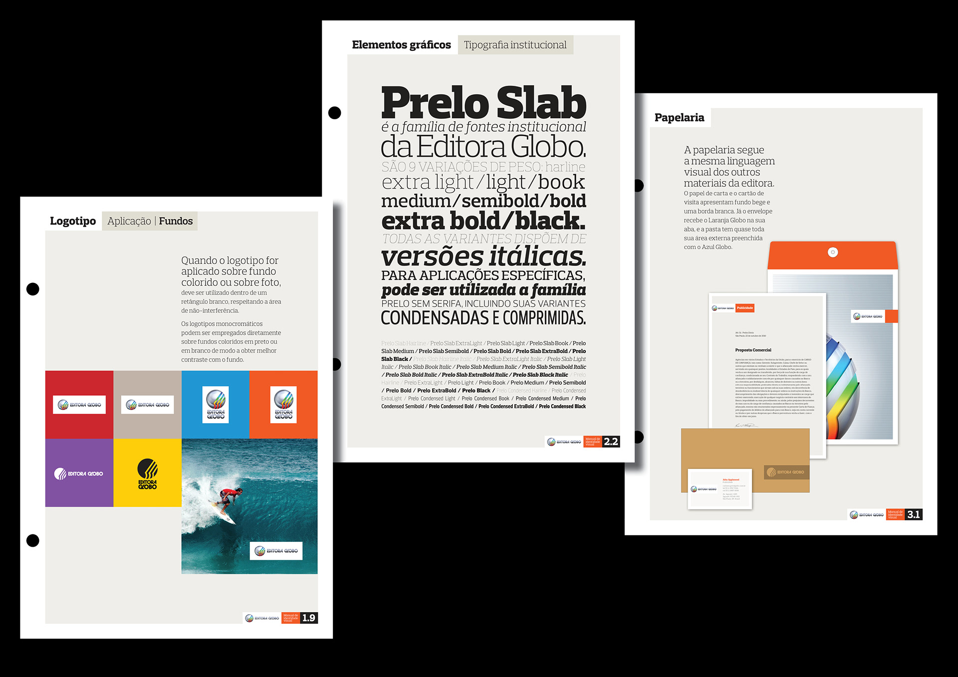
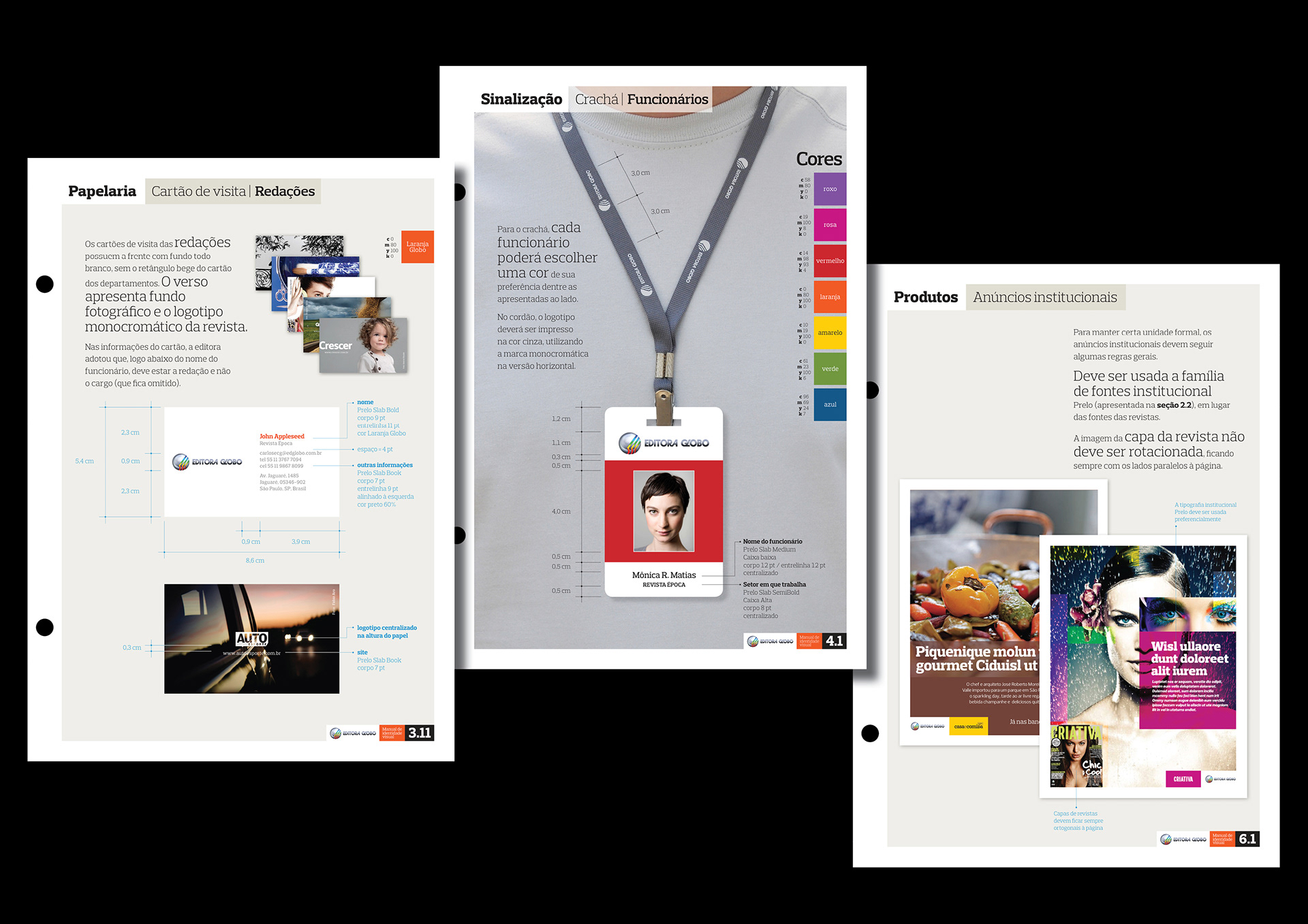
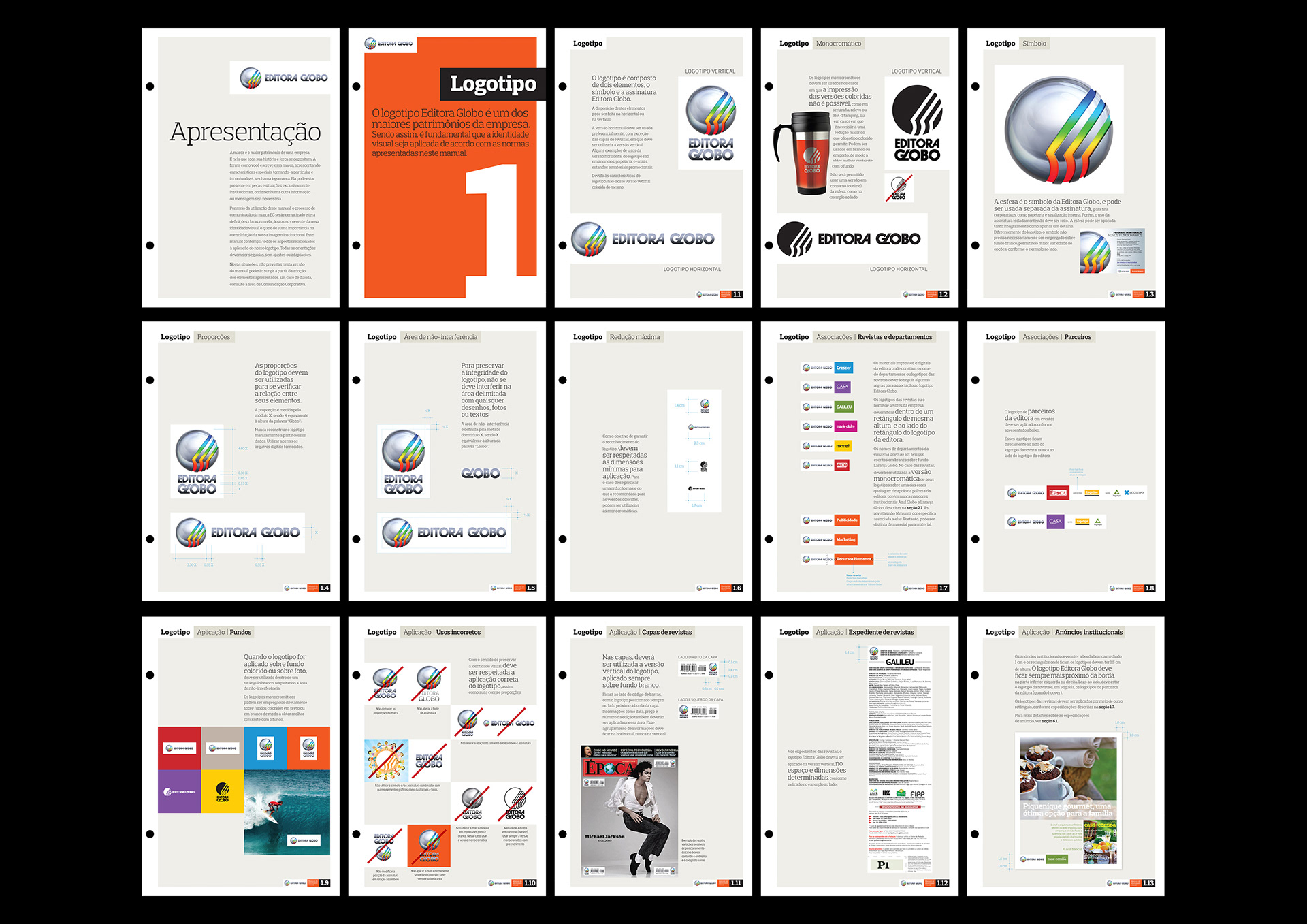
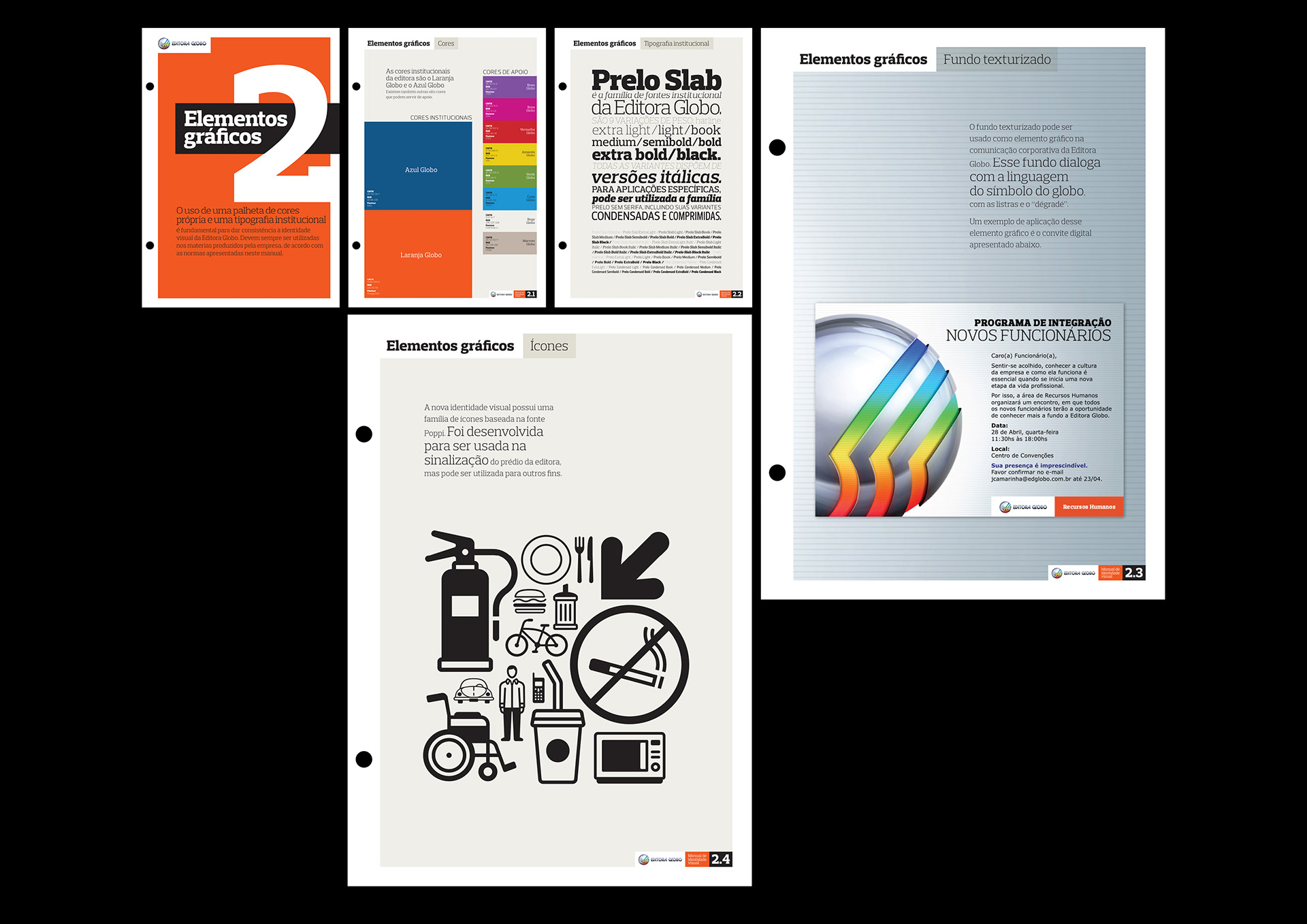
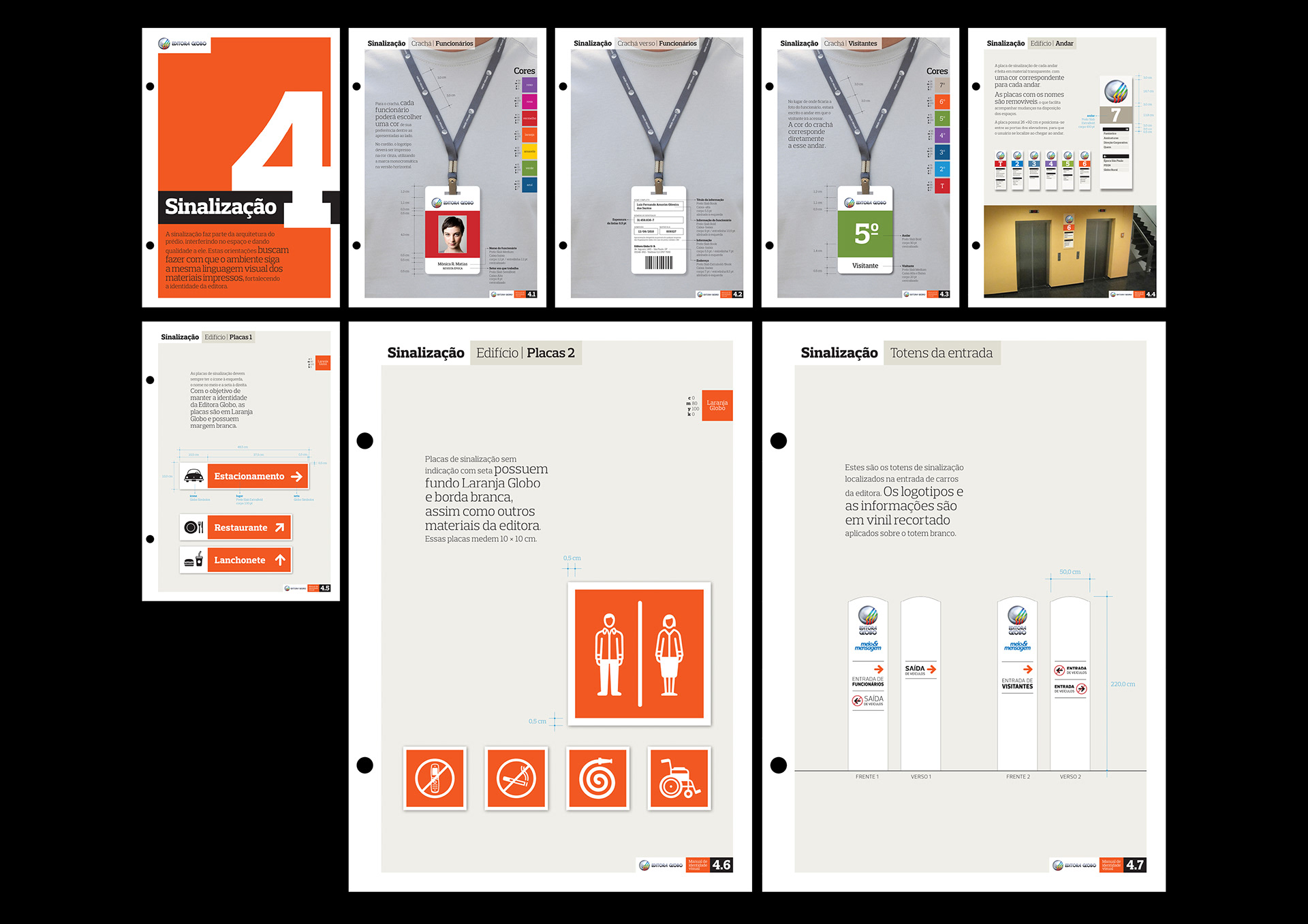
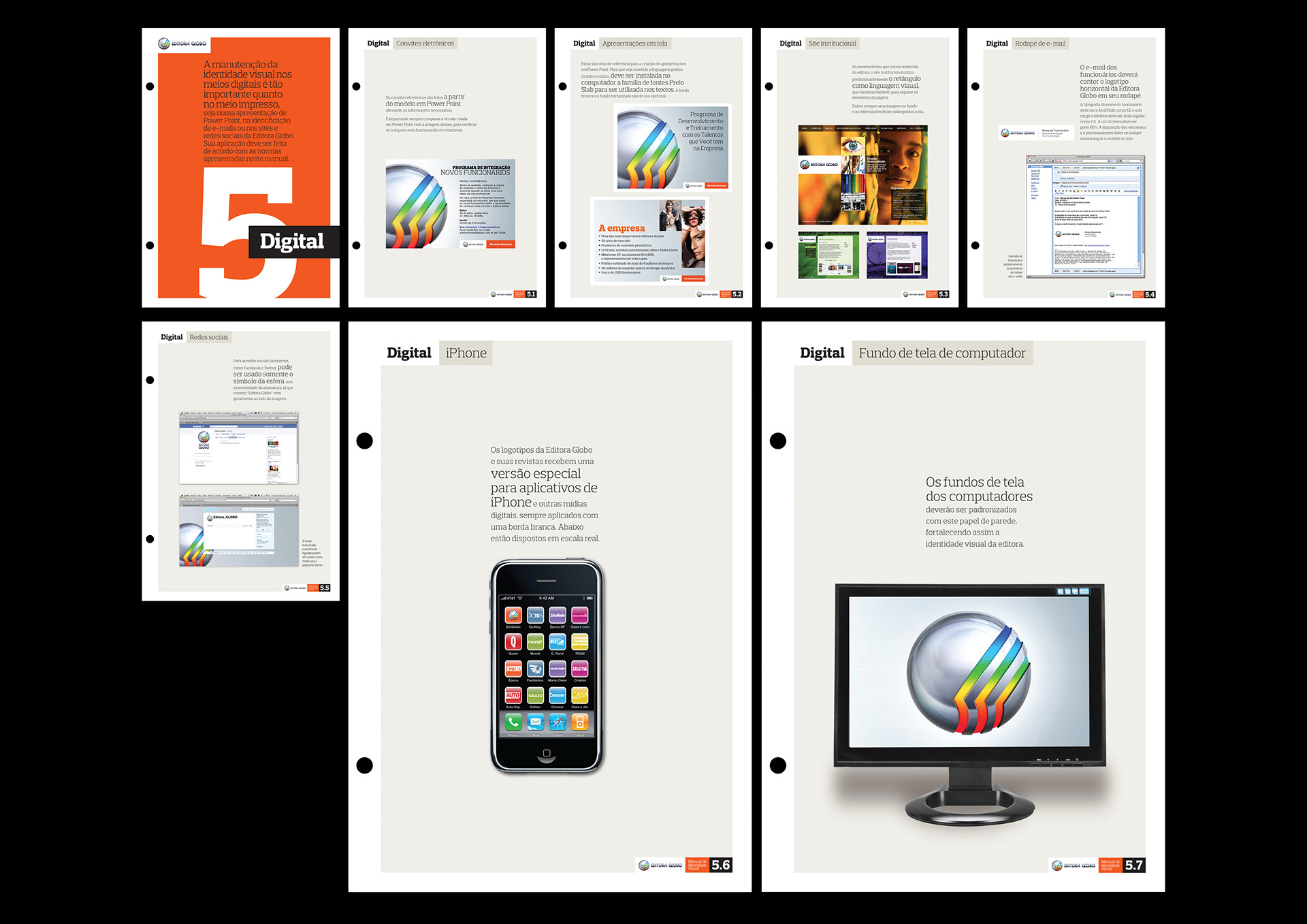
In 2010, Editora Globo’s logo was redesigned by their design team. I was hired to create the stationary and signage, and later on create the brandbook. The process included a standardization of all design pieces that previously did not have the same graphic language. The piece was produced in separate sheets, in order to make it easier to add new content later. In some cases, people would have a digital version that could be printed by then, therefore it was left a good margin, in order not no have content cropped by accident.