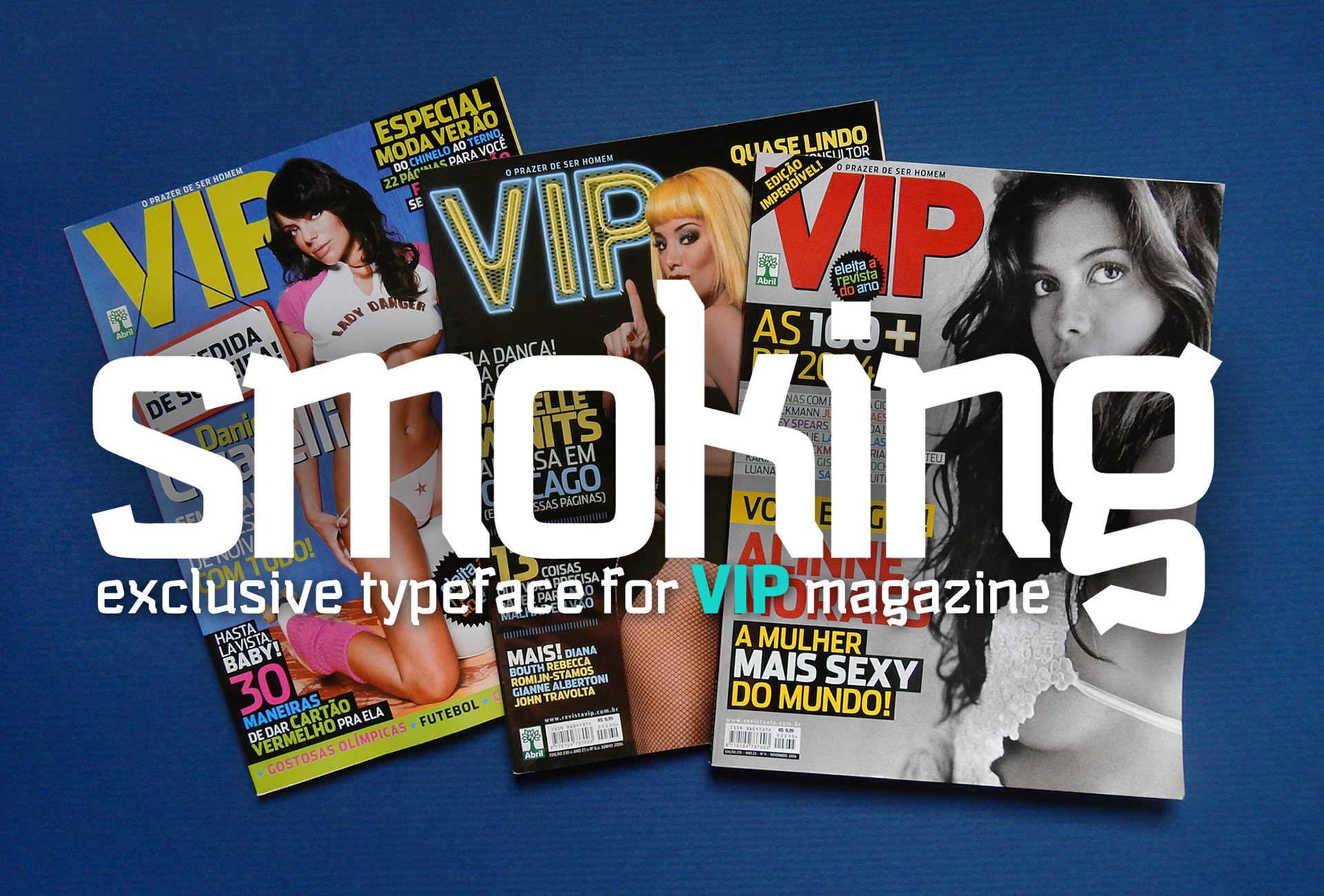
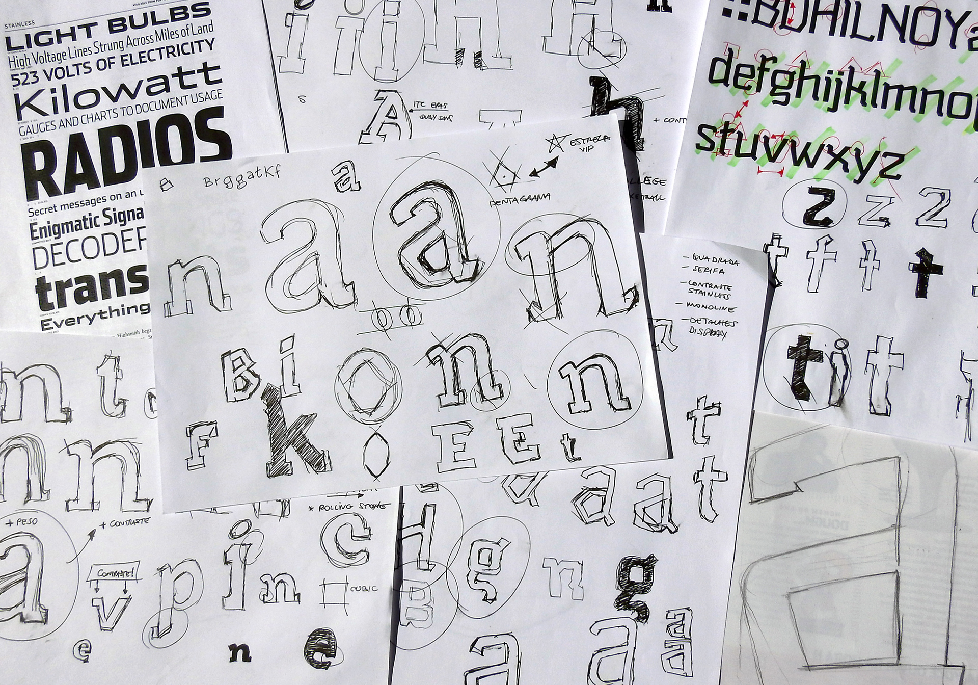
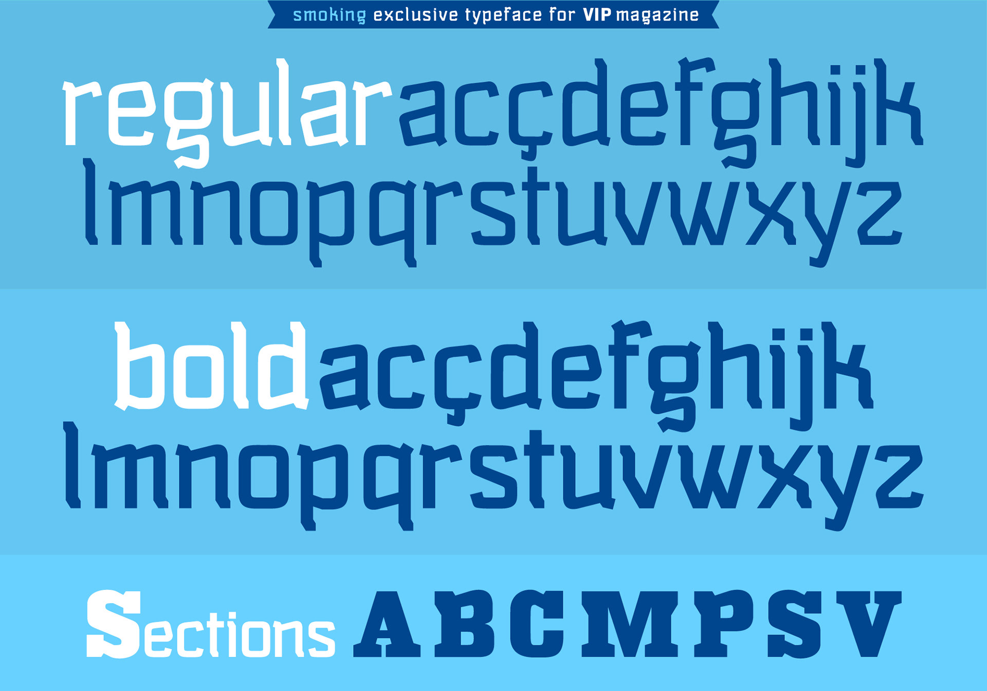
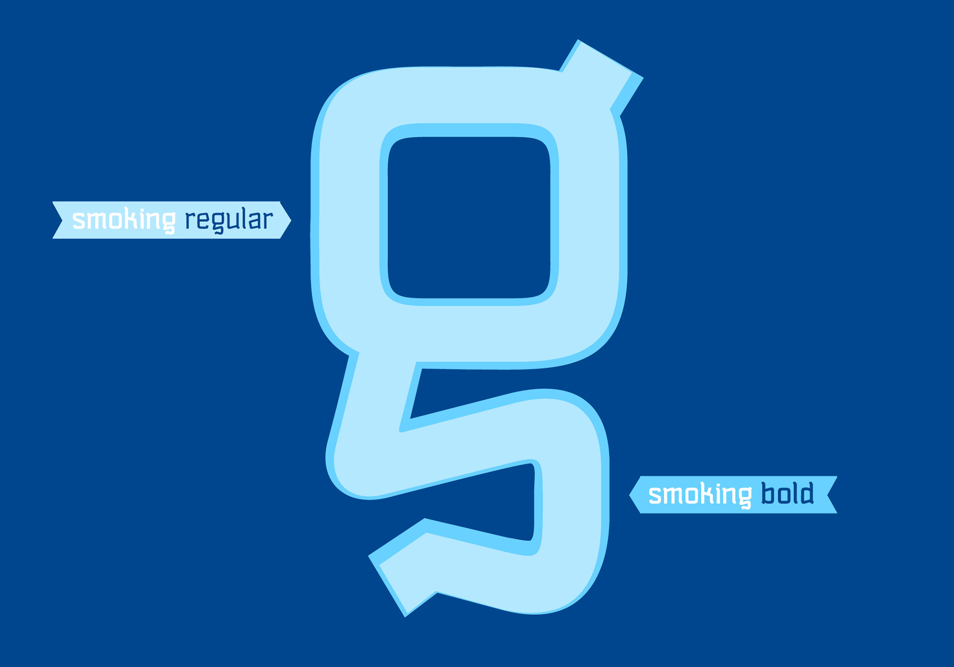
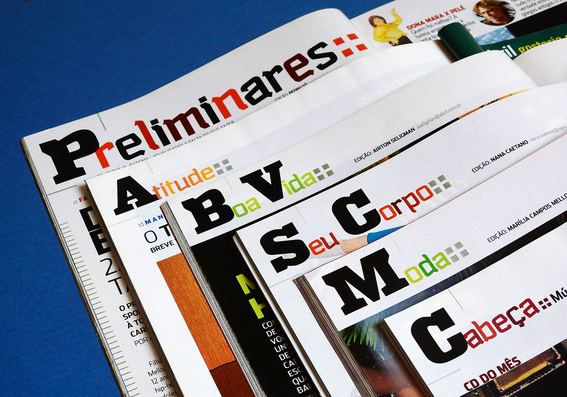
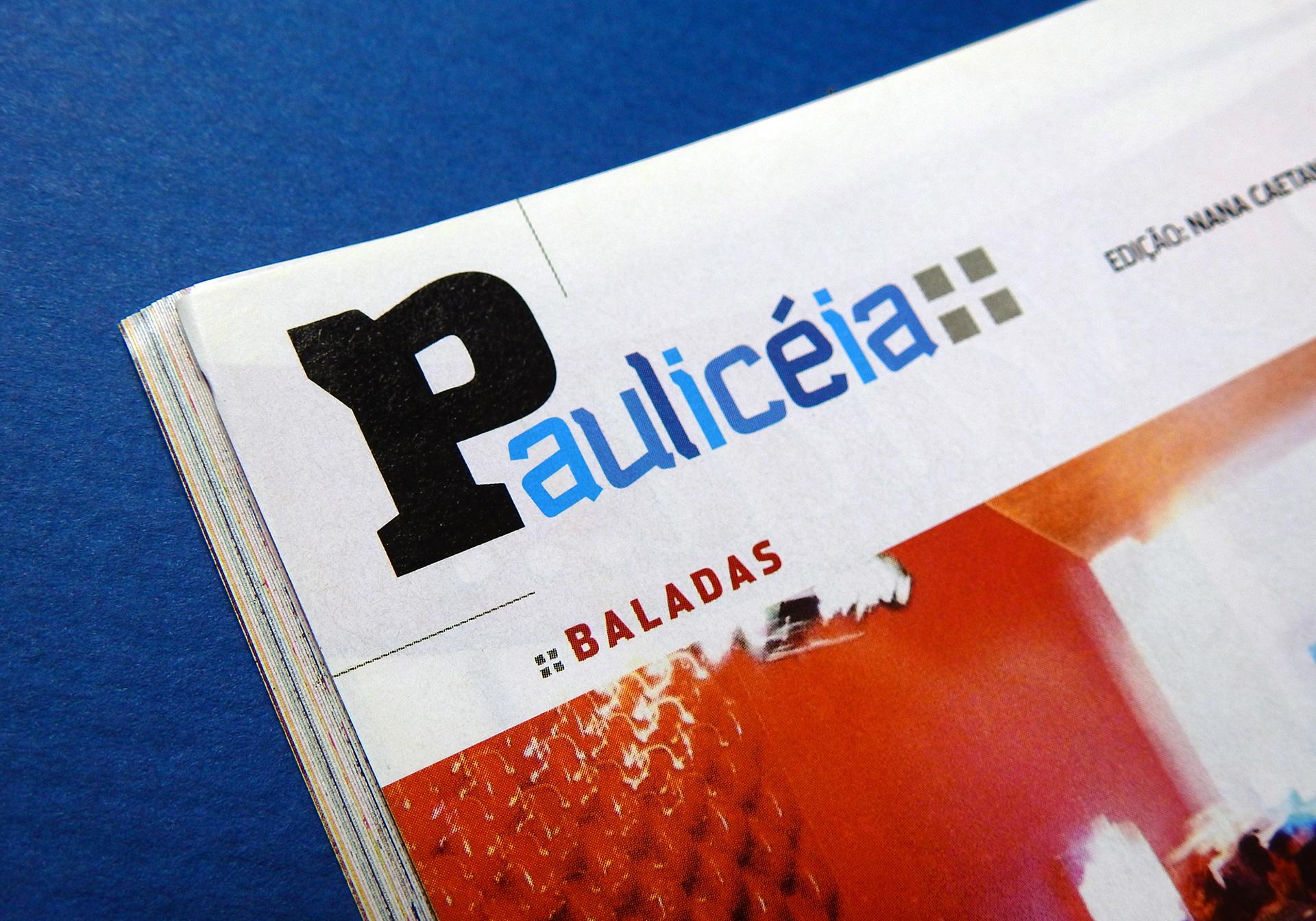
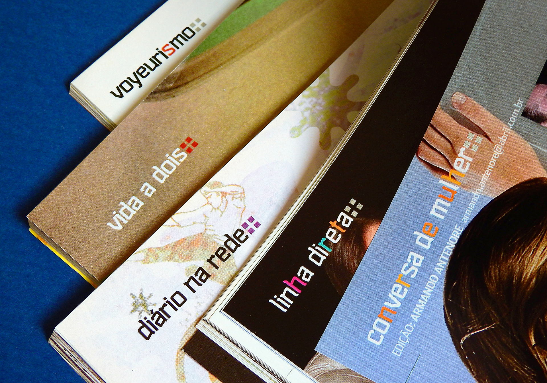
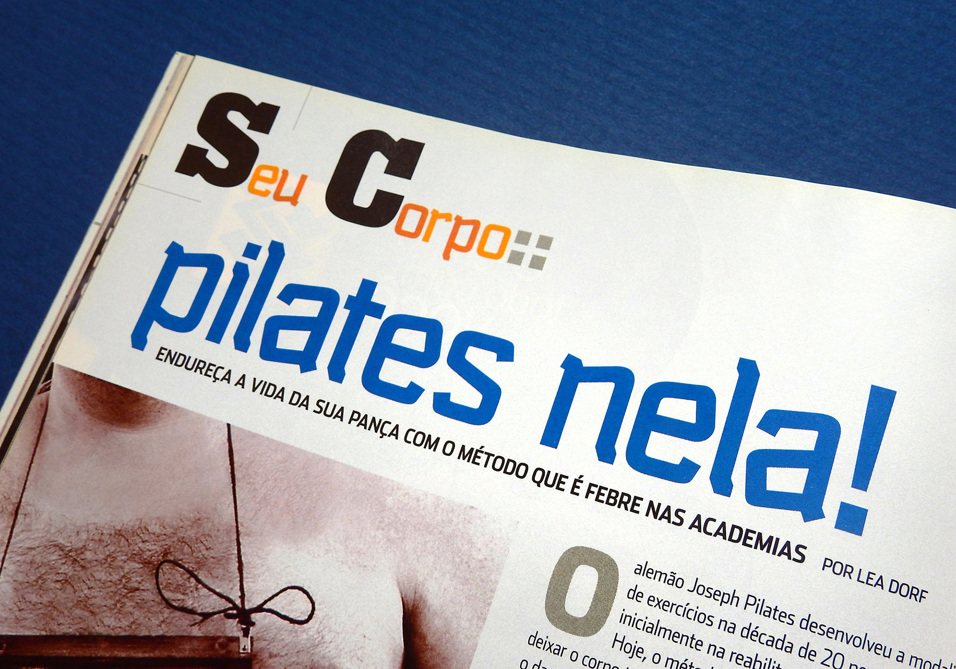
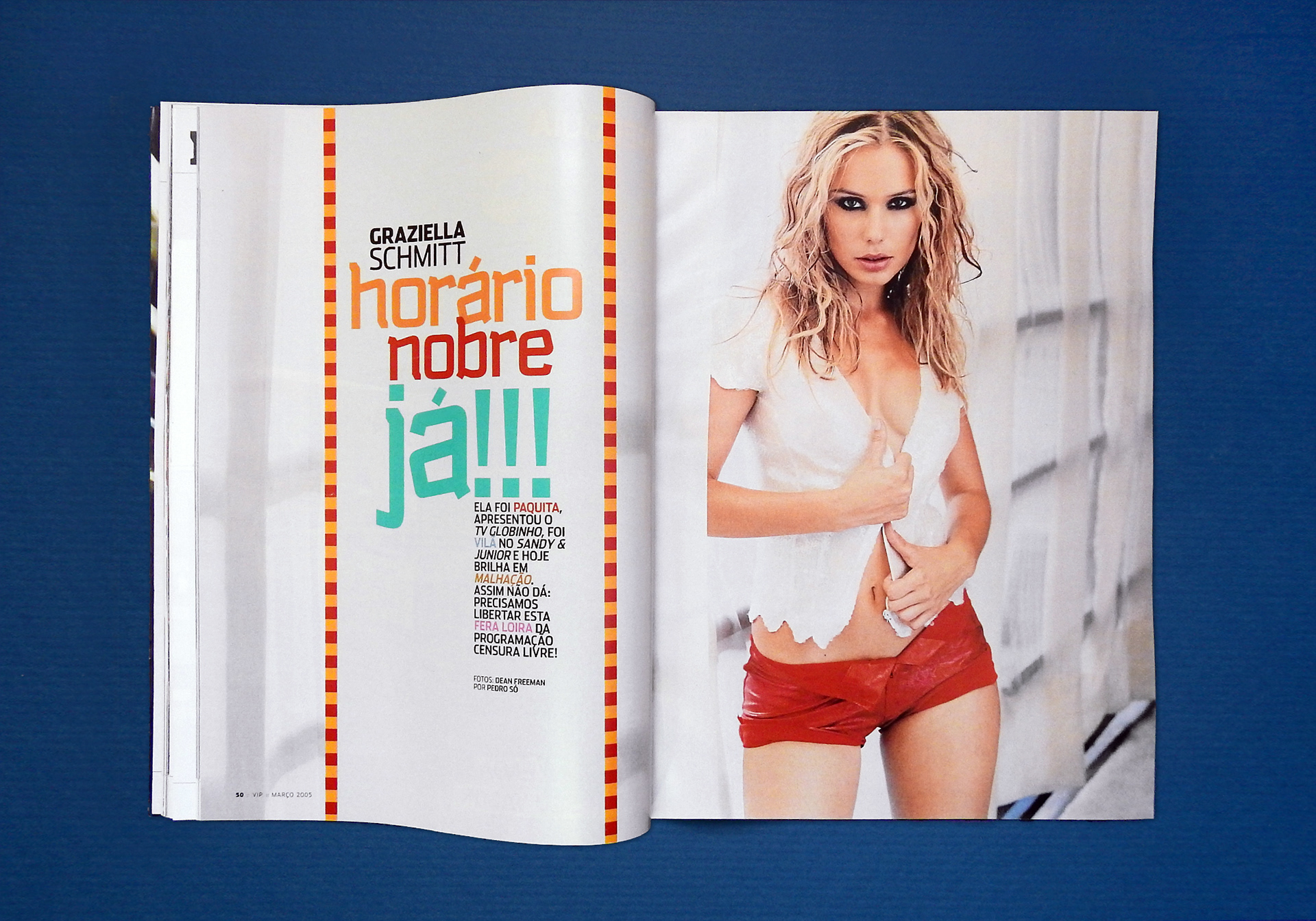
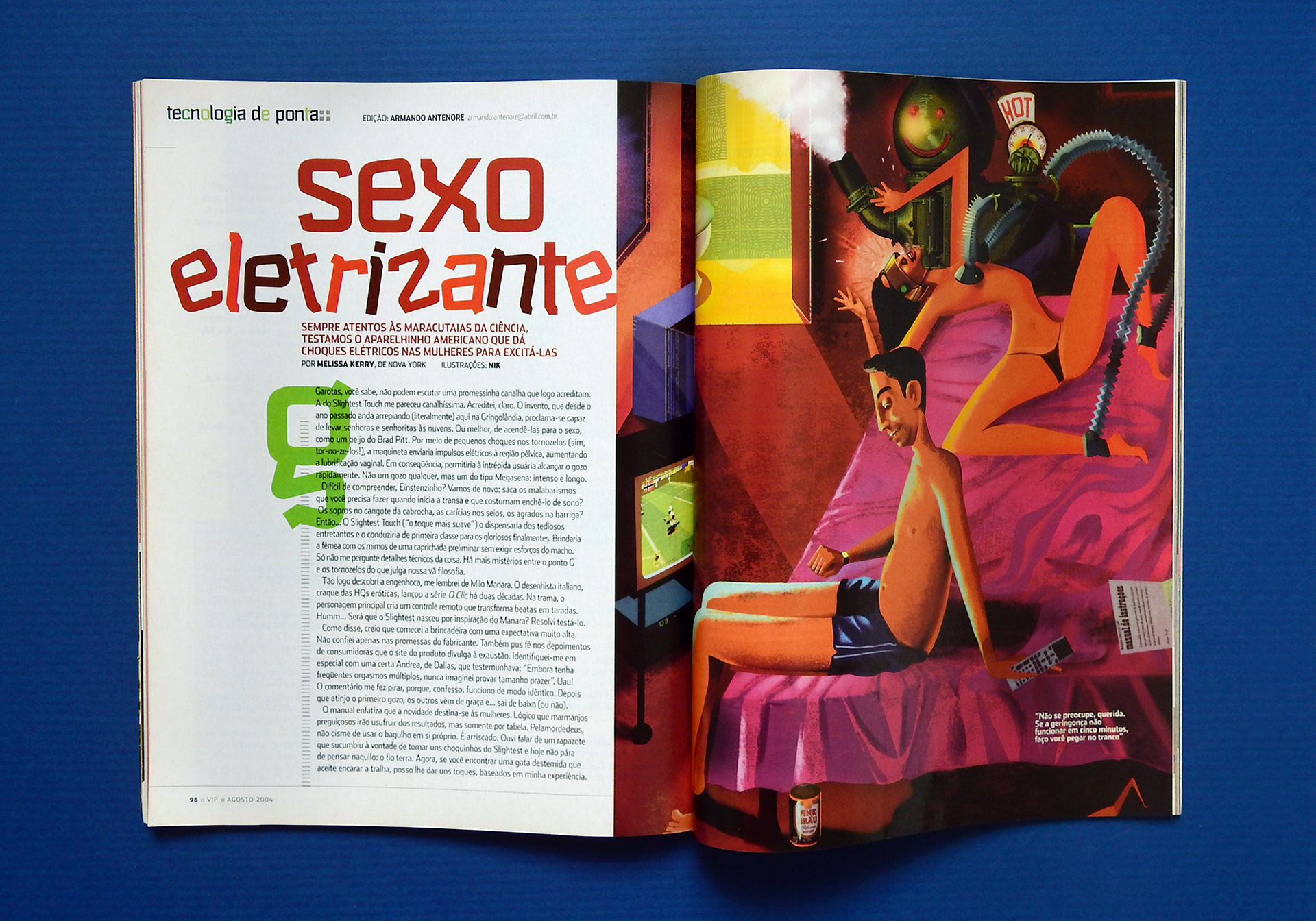
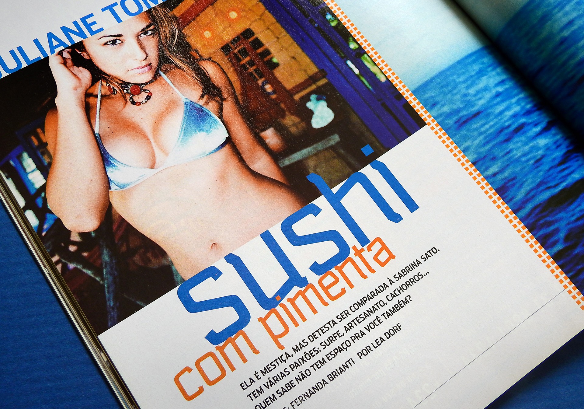
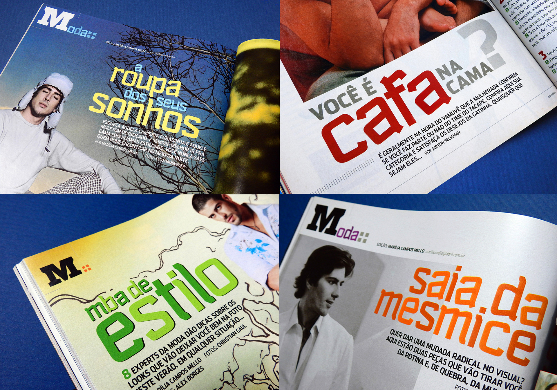
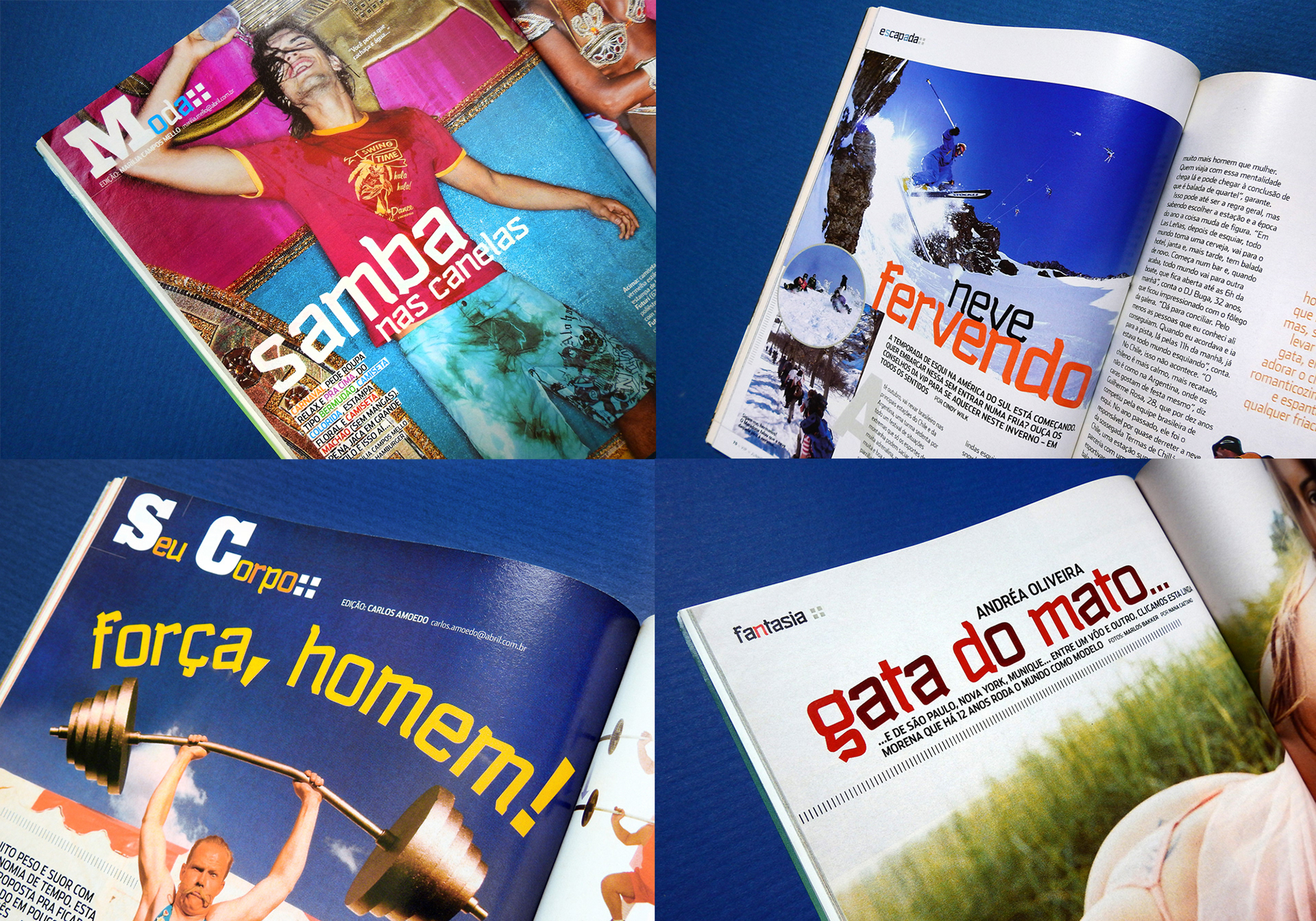
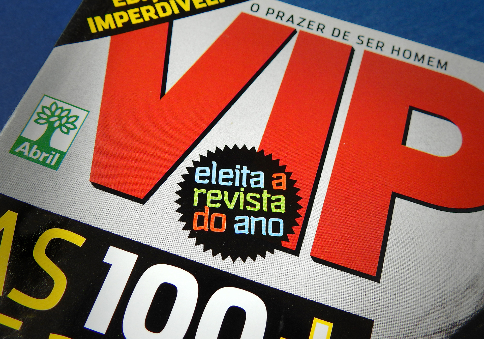
VIP is a male magazine from Abril Publishers, leader of its segment in Brazil. In 2004, the magazine was redesigned by Saulo Ribas, and I was commissioned to create a exclusive display typeface. The briefing was to have an innovative and audacious design. The outcome was Smoking (tuxedo in Portuguese). It should also be a good match to Stainless (from Font Bureau), which was selected as body text and headline font. The intended use was for sections headings and section headlines. In some random occasions it was also used as headline font for cover stories. As requested, only lowercase letters were designed, both in regular and bold weights. For the sections headings, I have also designed some Slab Serif capital letters (A/B/C/M/P/S/V) in order to work together with Smoking.