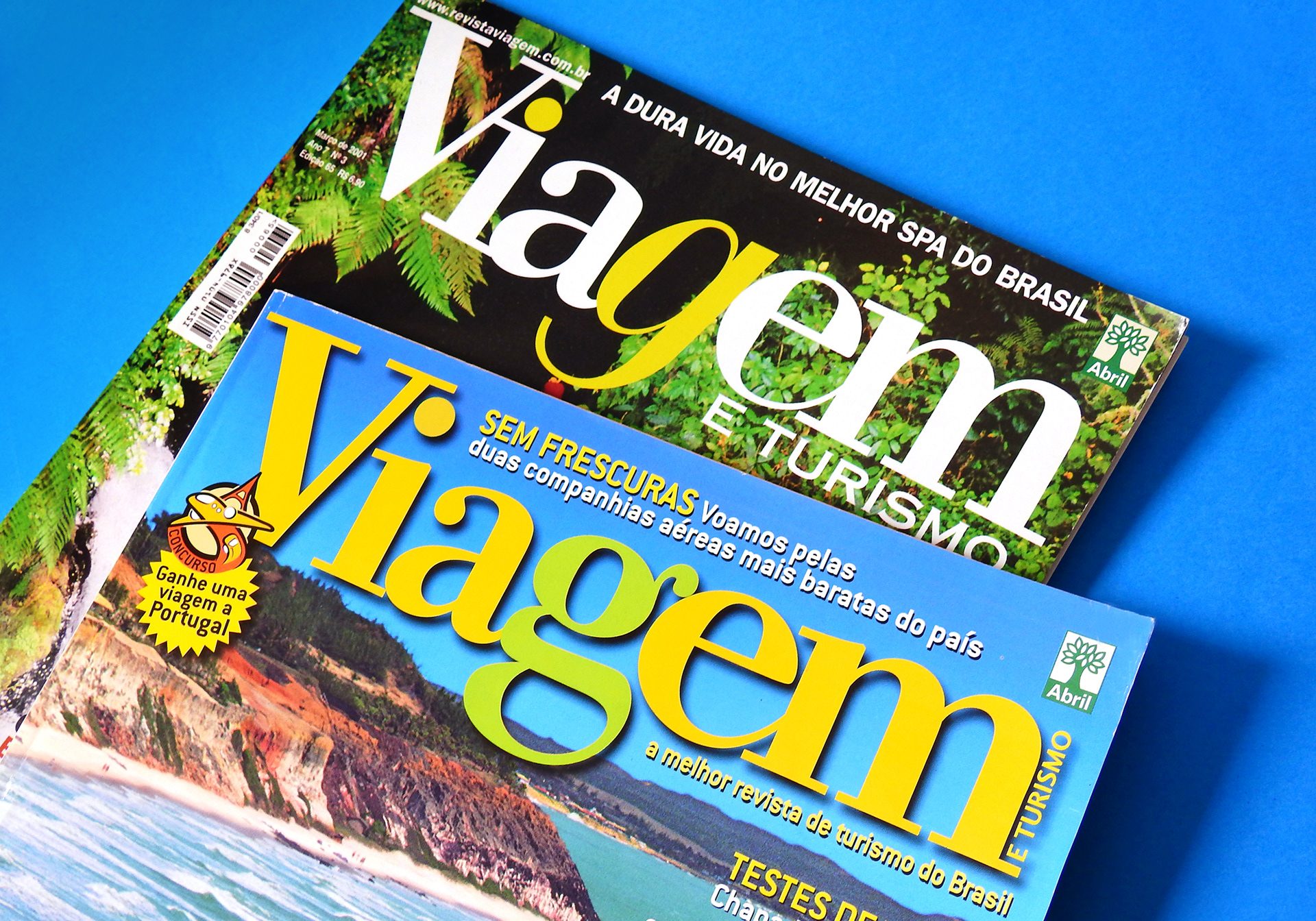
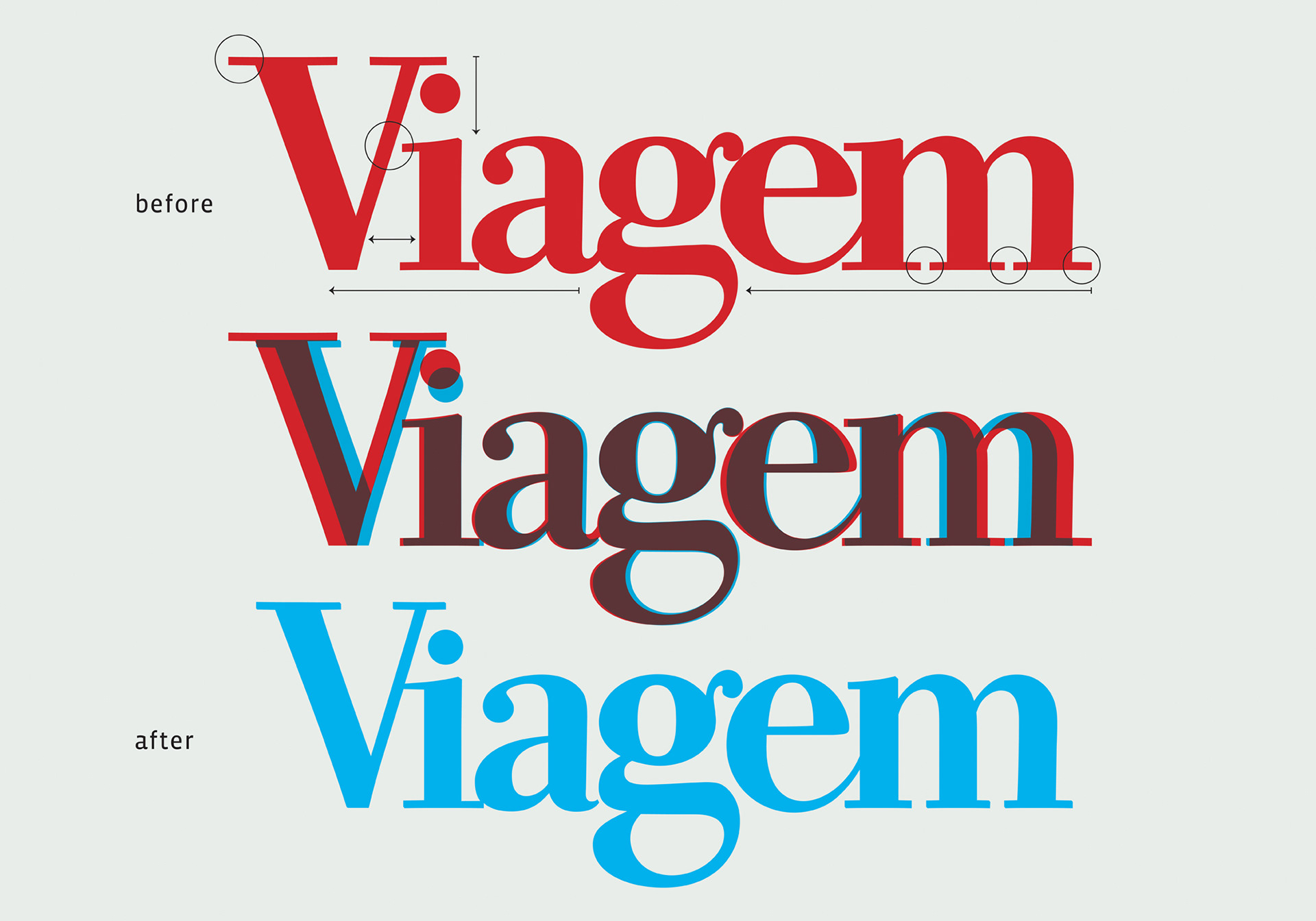
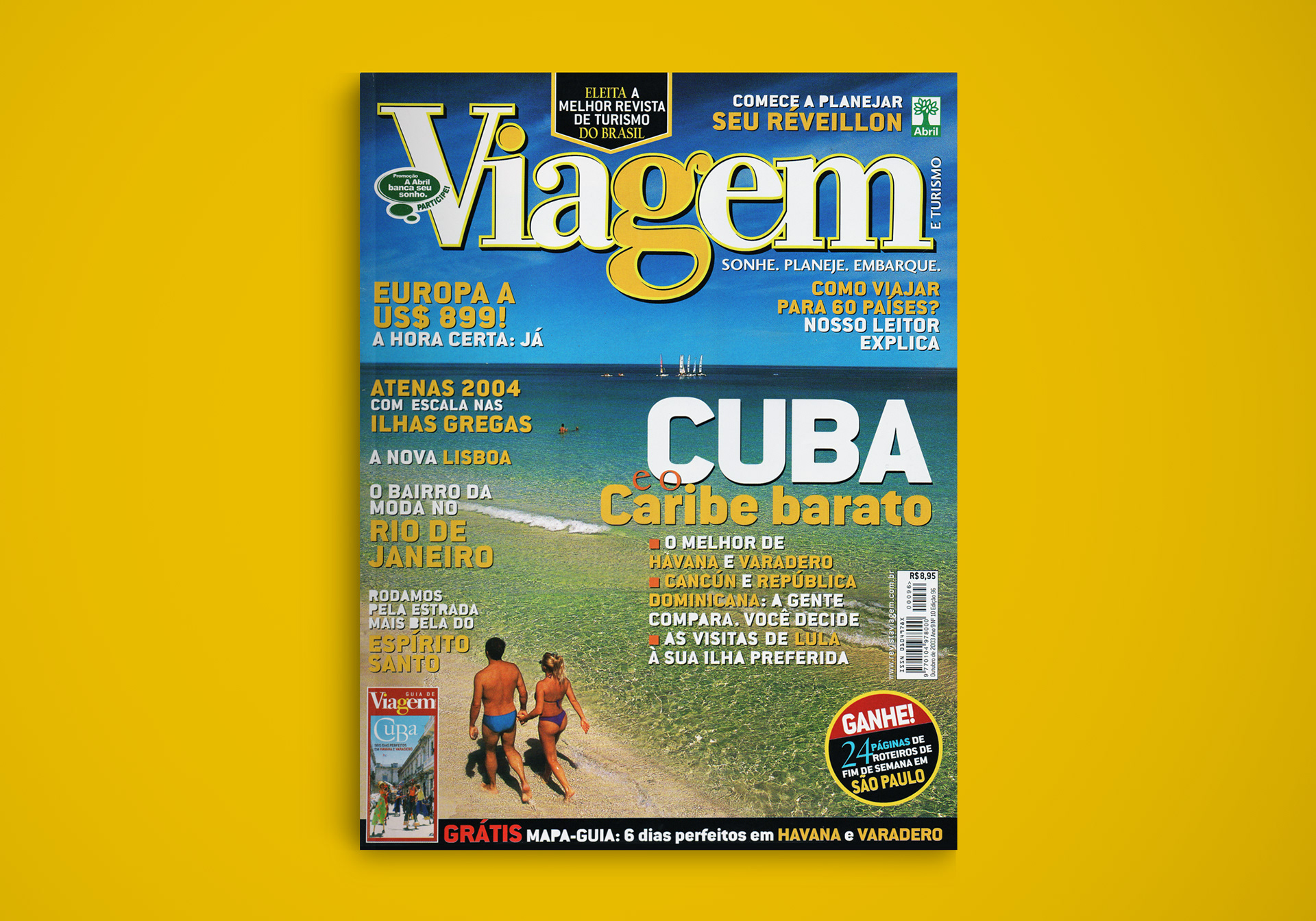
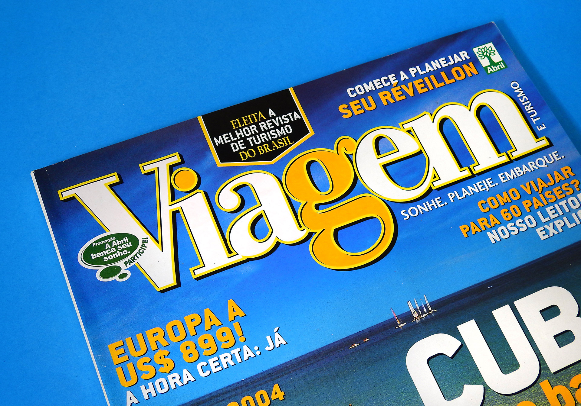
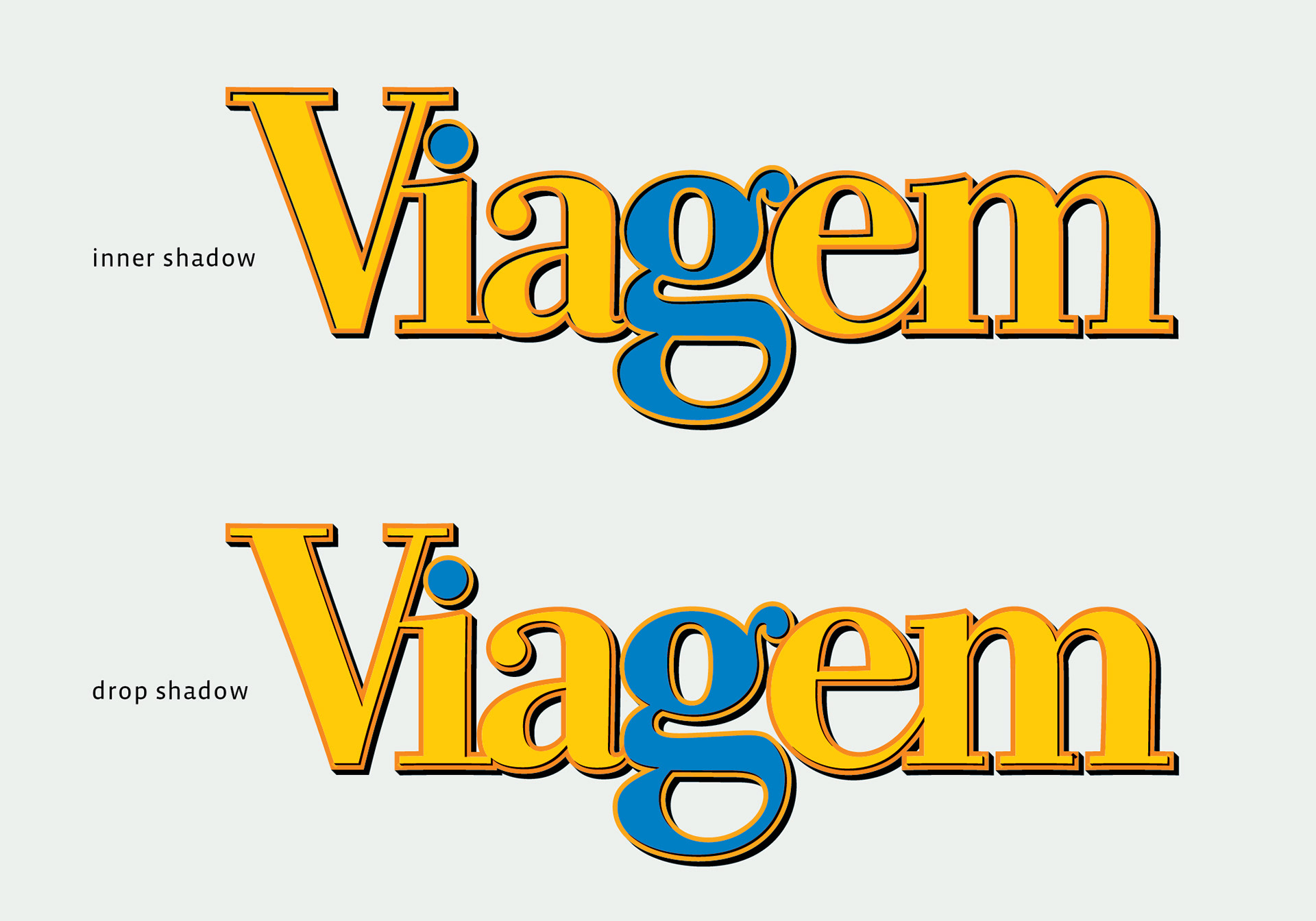
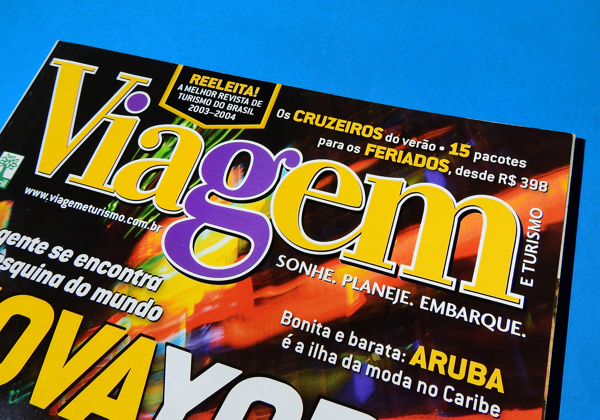
VIAGEM E TURISMO is a Brazilian monthly travel magazine, published by Editora Abril. For many years, the logotype was set on a customized version of Bodoni Old Style, with a single story italic lowercase g. Later on, they decided to change it to upright lowercase g. In 2003, the art director Ubirajara Correia commissioned me to make a layered version of their logotype. First, I made some adjustments on the letterforms that I felt that did not work well on the previous version, such as reducing the height in general, shortening some serifs and changing the widths of some letters. Then I produced two options of shadowing: one with drop shadow and other with inner shadow. They started with the inner shadow variant, but months later adopted the drop shadow variant as the official logo.