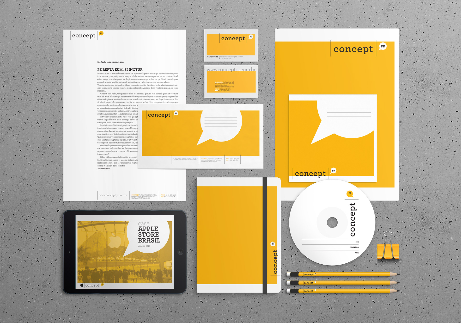
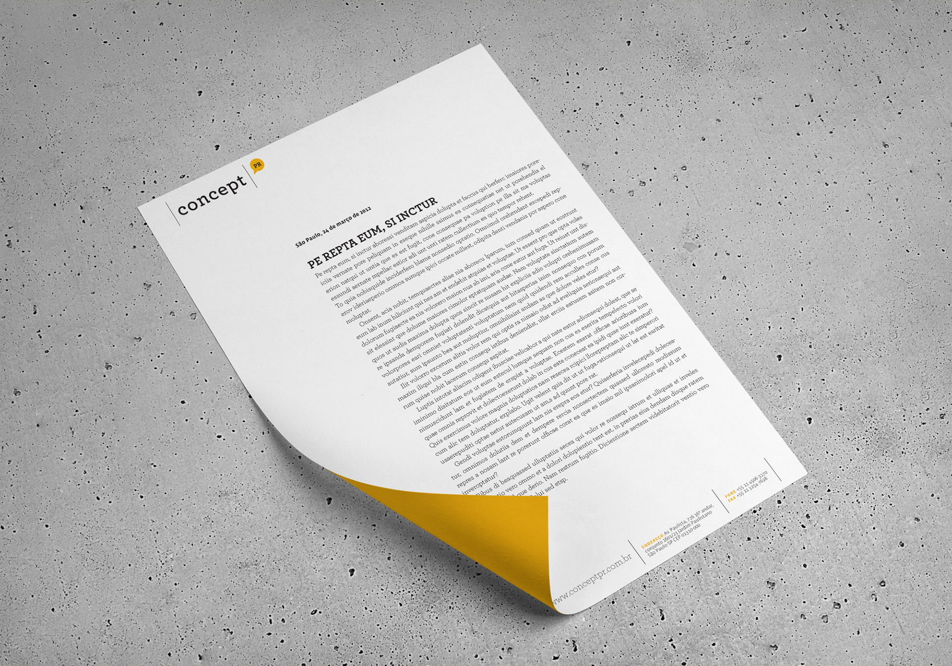
Concept is a PR agency based in São Paulo, Brazil. As part of a remodeling process of the company — which included moving to a new building — they commissioned me to redesign their identity. During their day-to-day activities, it was noted that most of the graphic materials included the identity of Concept PR plus the identity of clients. So, in order to avoid visual conflicts between both visual languages, the approach was to have a minimalist design with clean typography and solid colours.
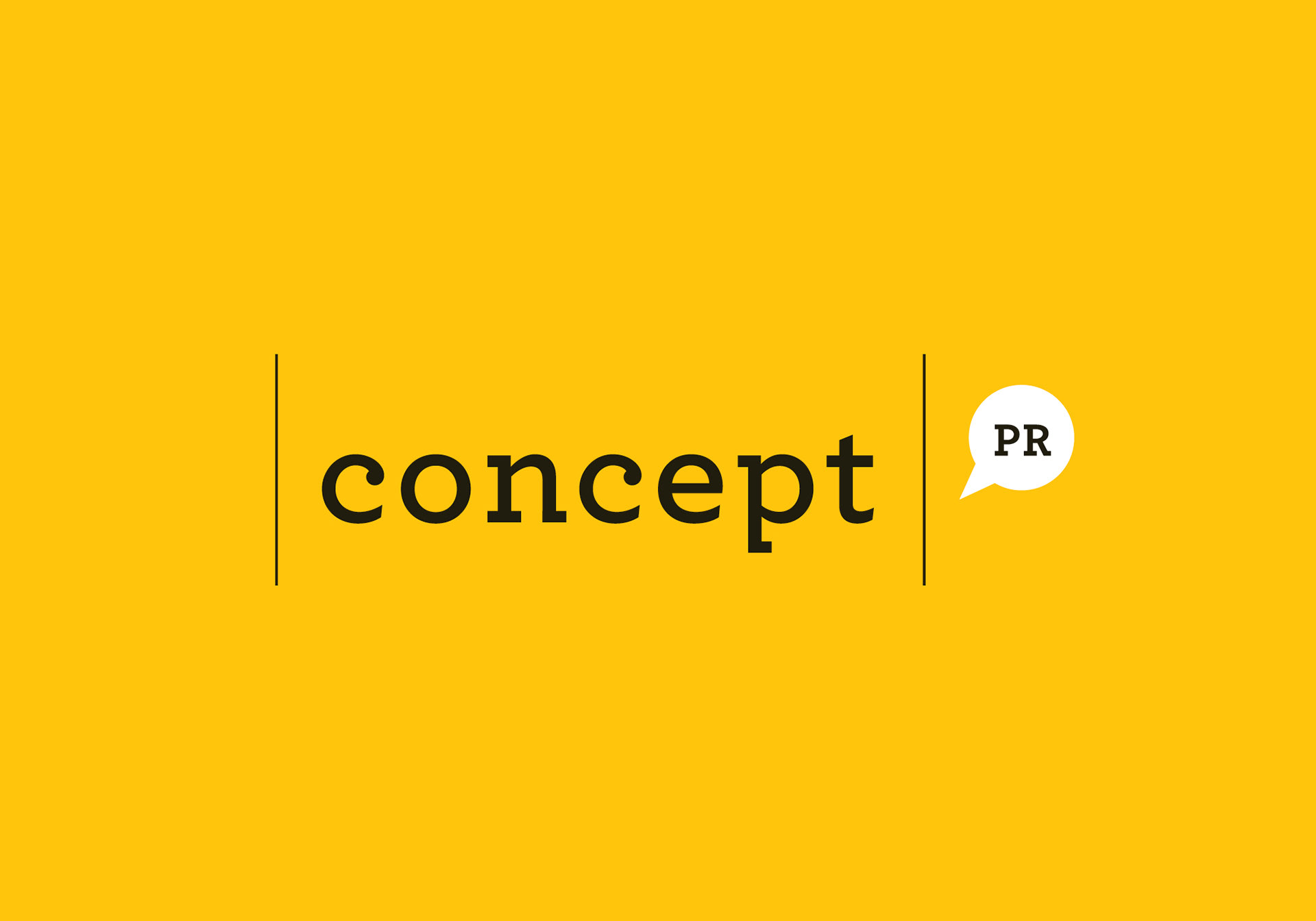
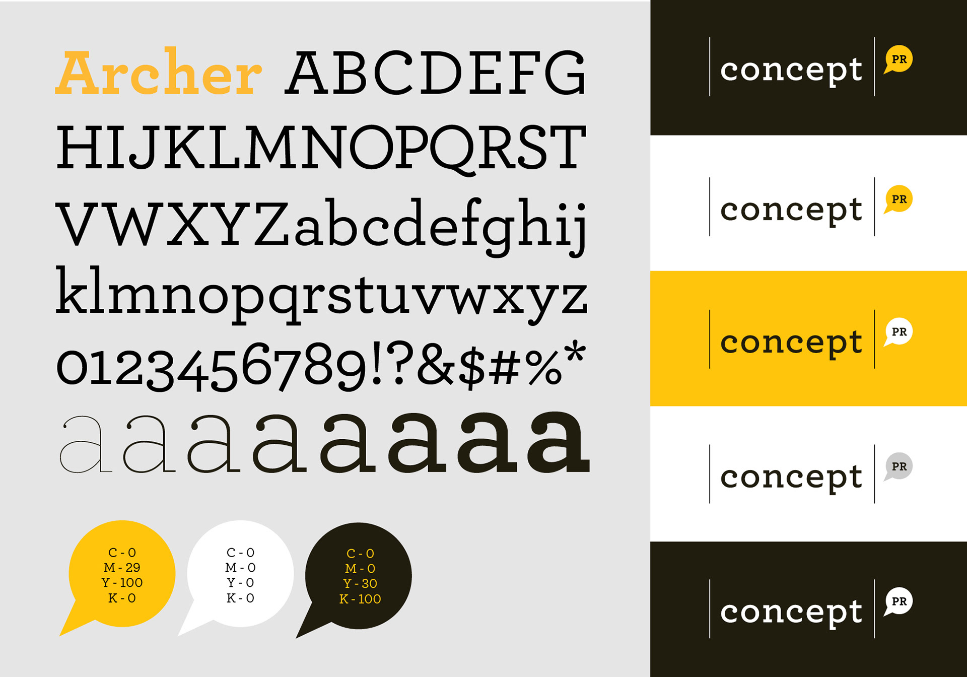
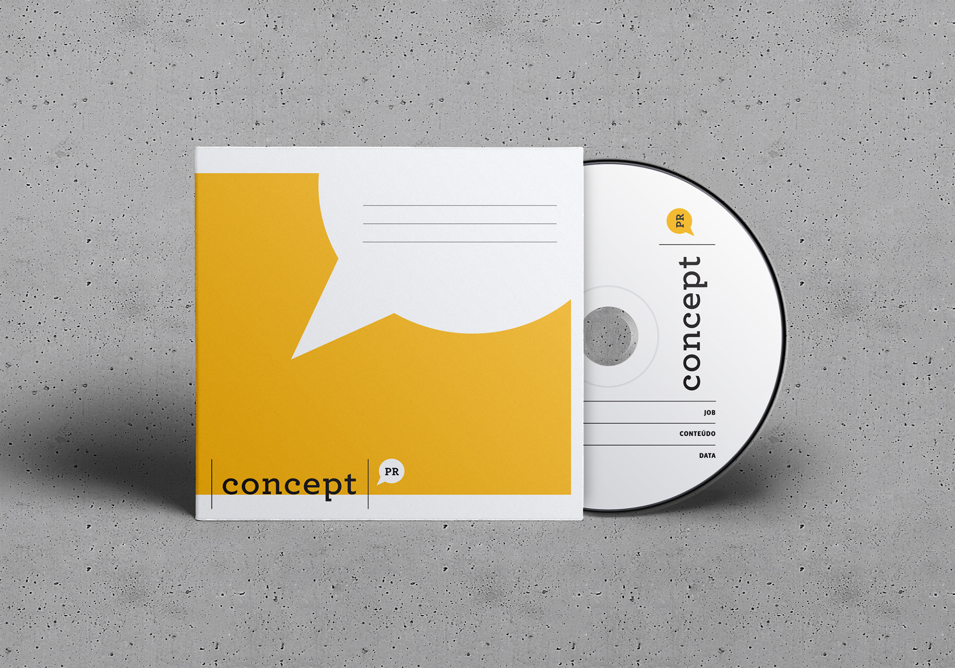
A quick research revealed the most of their clients (and potential ones) would have predominance of green, red or blue on their brands. Therefore, the dark yellow was chosen as the main colour of the palette. Archer was the official typeface for stationary and slide presentations, and for the logotype it was slightly customized by partially removing serifs from letters n and p.
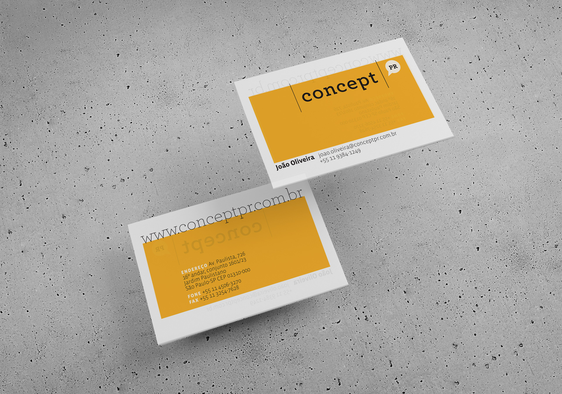
The briefing included instructions to facilitate the process of printing presentations and releases on laser printers, and that is the reason why the images on slides are wrapped around a box, instead of having full screen images. The business card was conceived on a thick translucent paper. Thus, if you put Concept PR business card over the client's card it reveals info from the client, reinforcing the idea that Concept PR would always work together with their clients.